Minimalism
Japanese
For the Japanese company, a specialist in the fields of photography, medicine and printing, together with architects from The Design Group we created a comprehensive system of directional and functional signage that perfectly captures the spirit of the brand and harmonizes with the atmosphere of the modern and minimalist office.
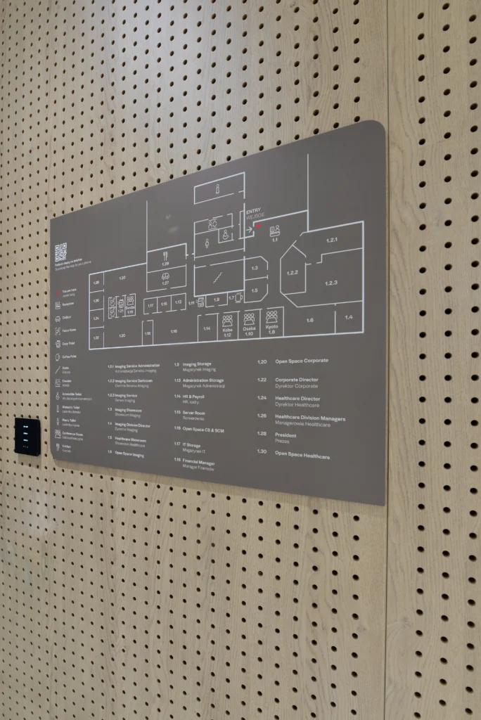
Harmonious fit
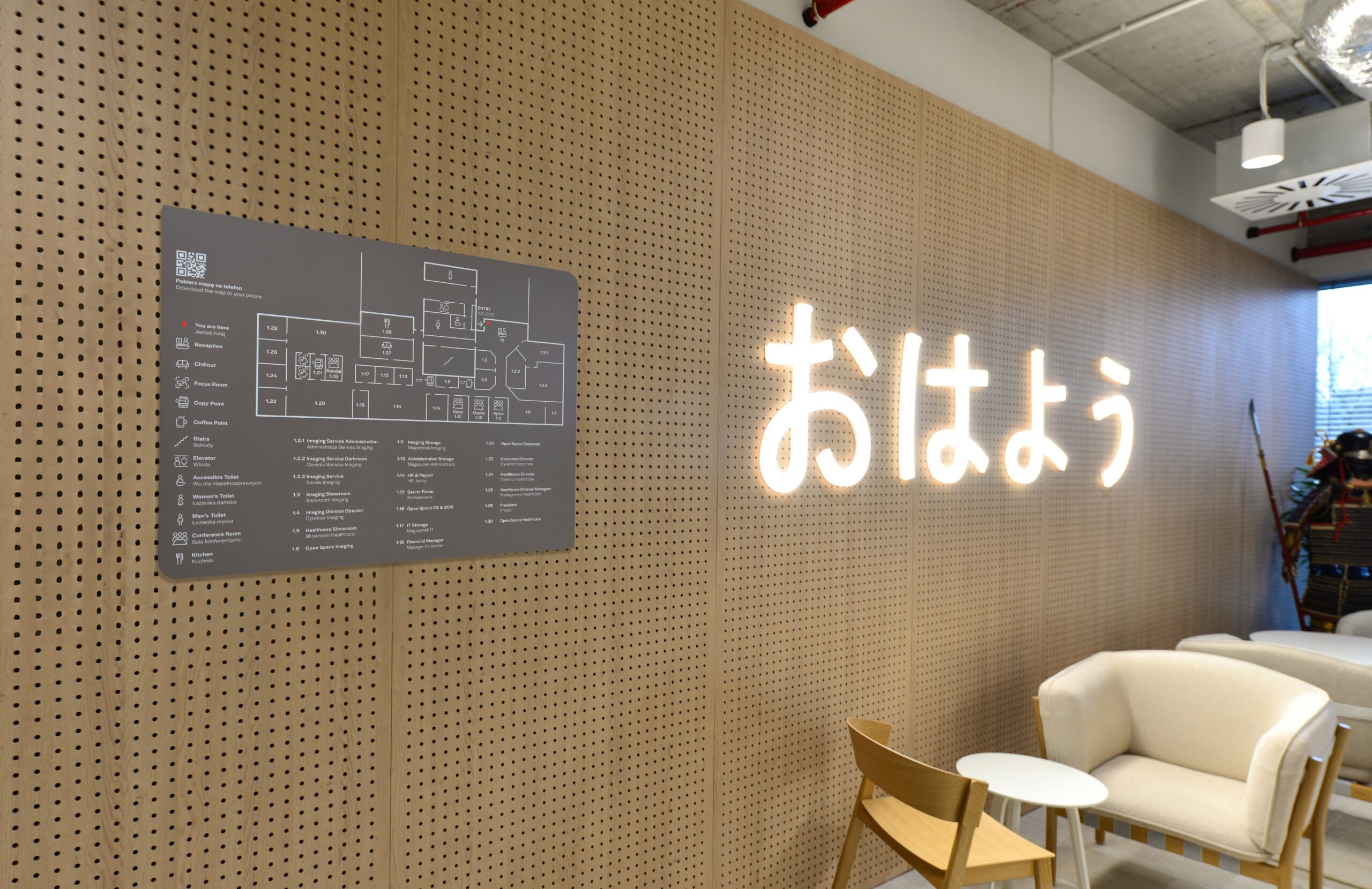
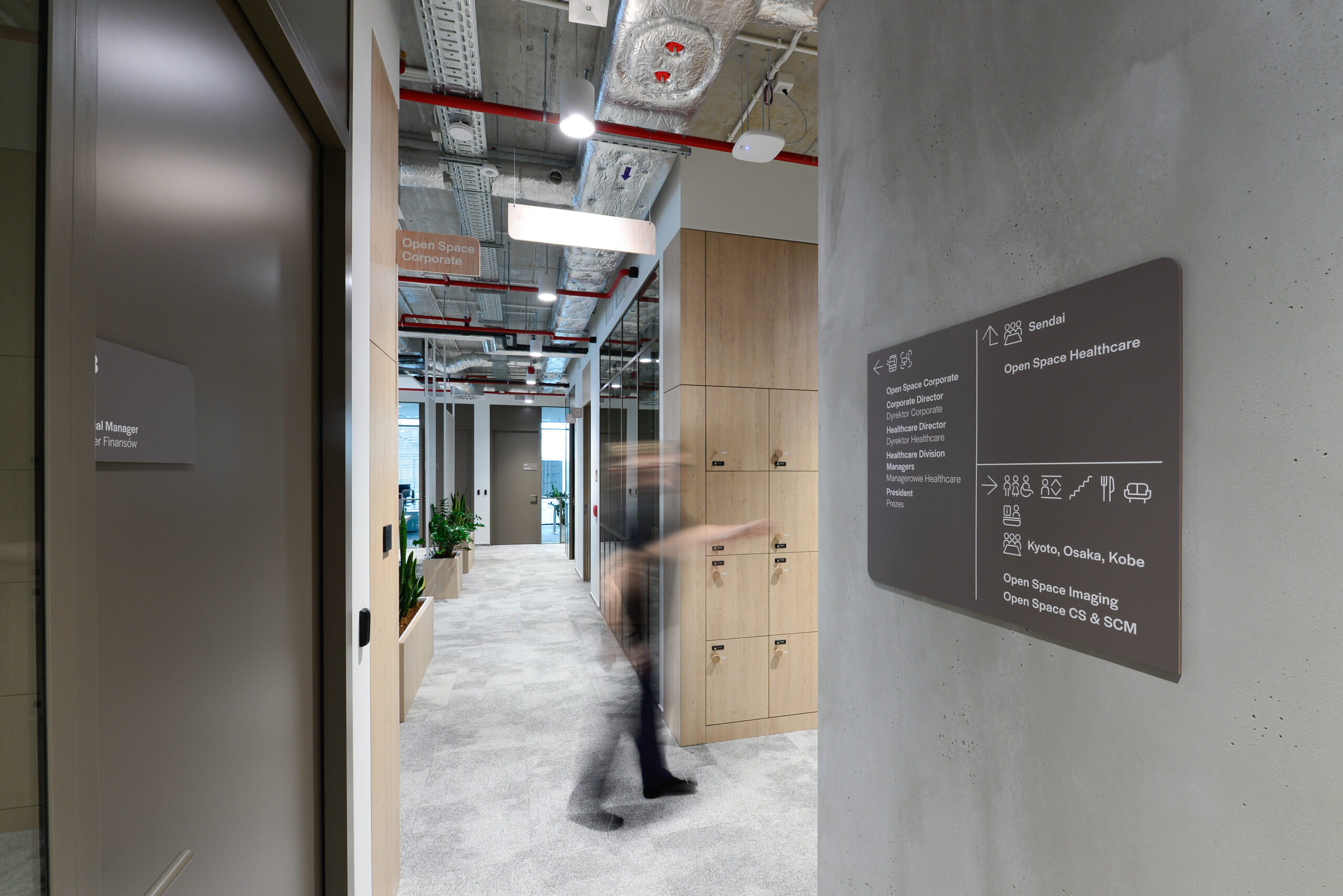
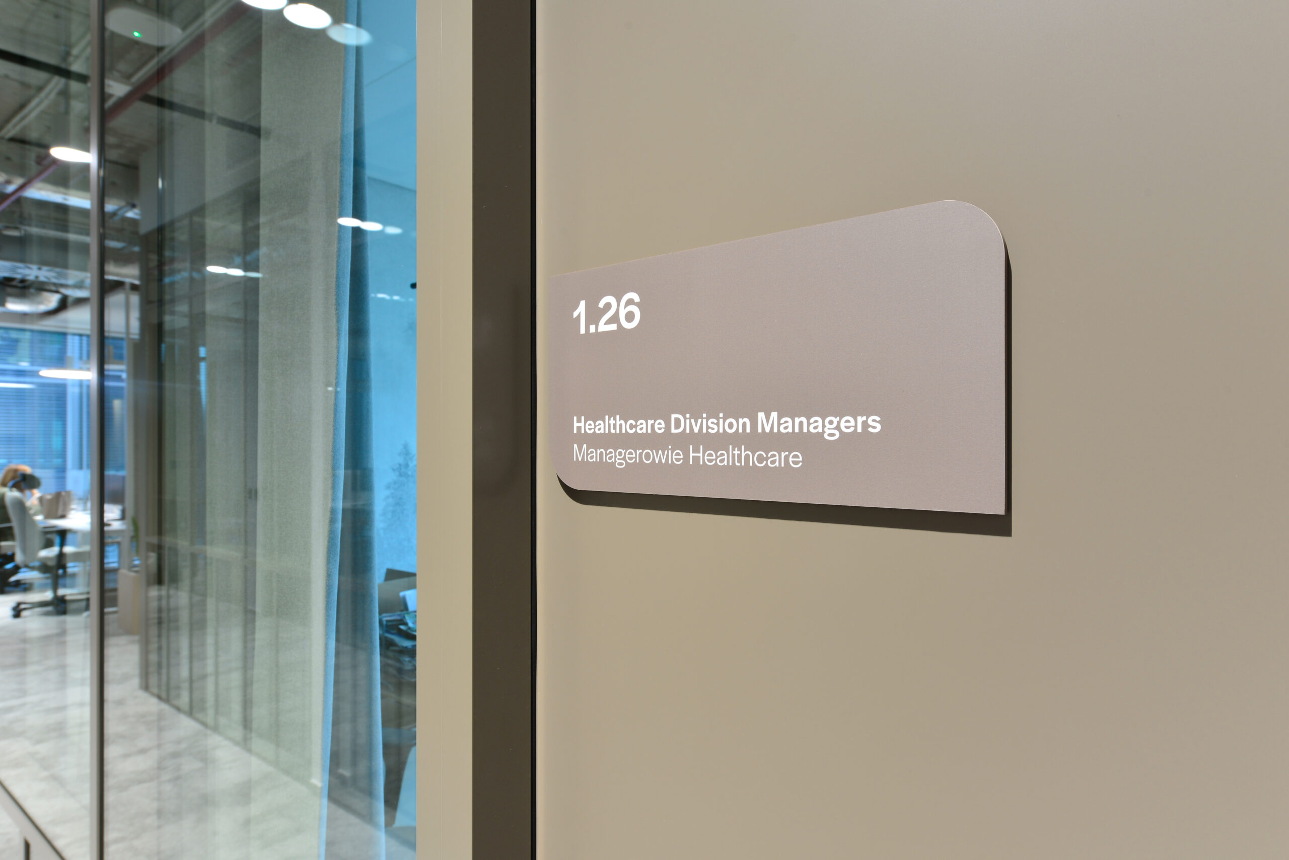
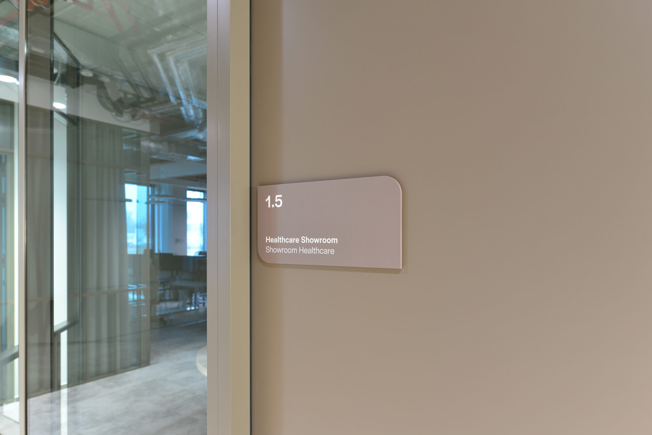
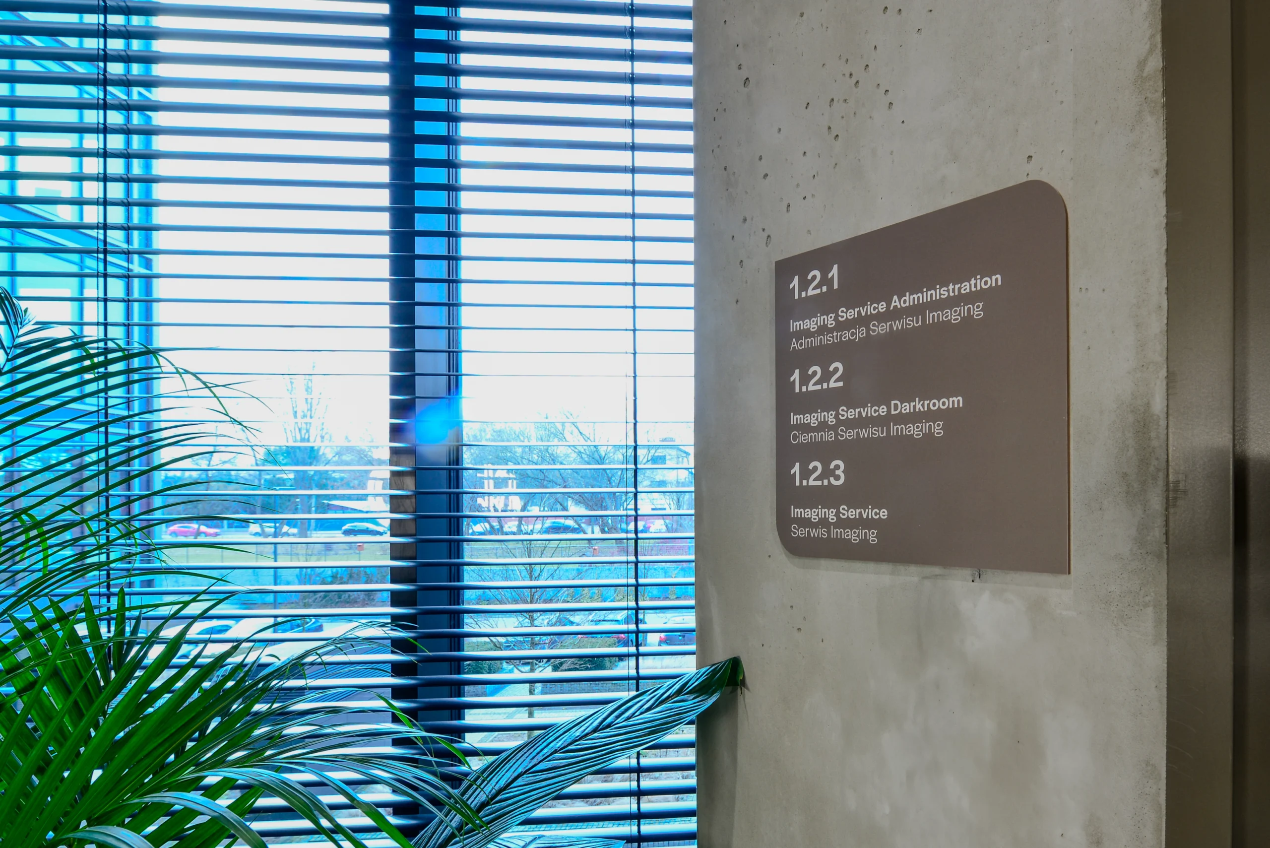
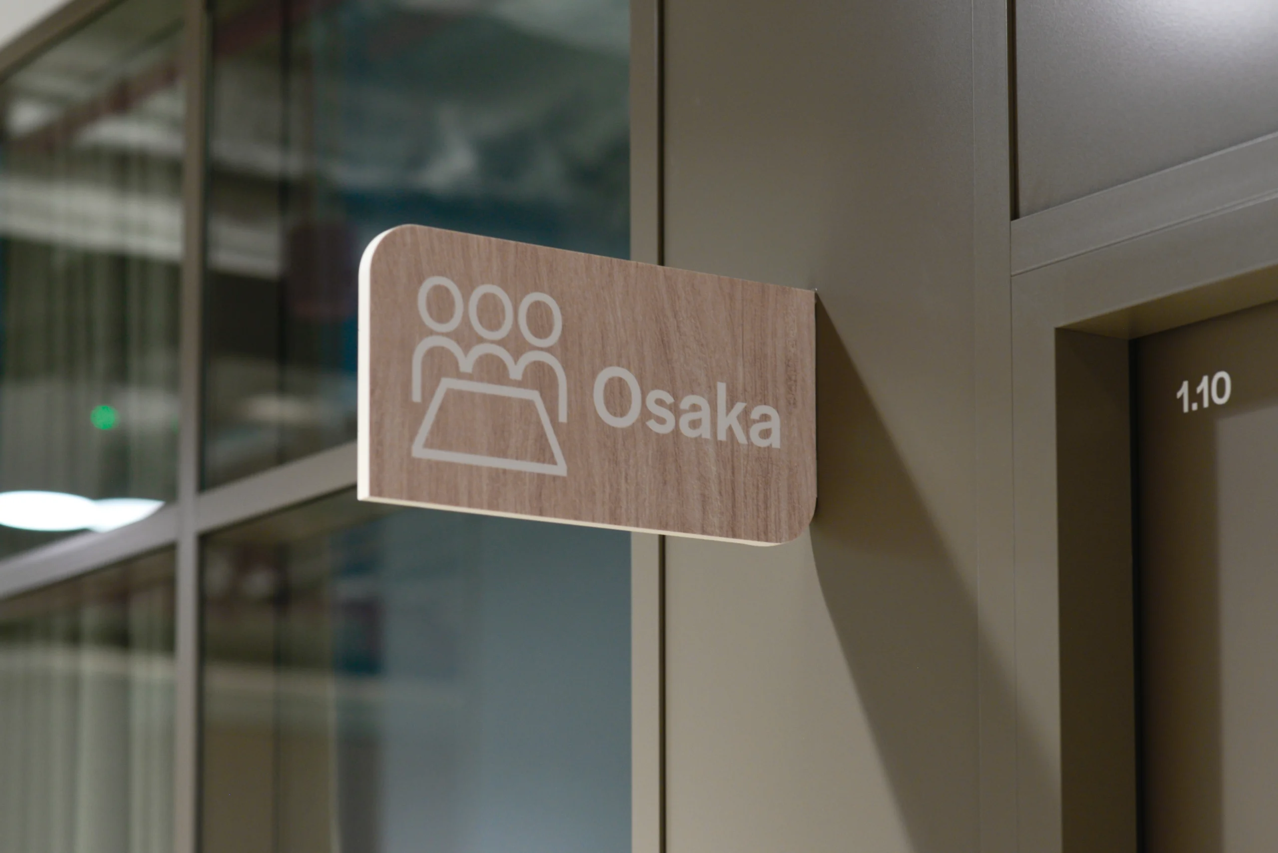
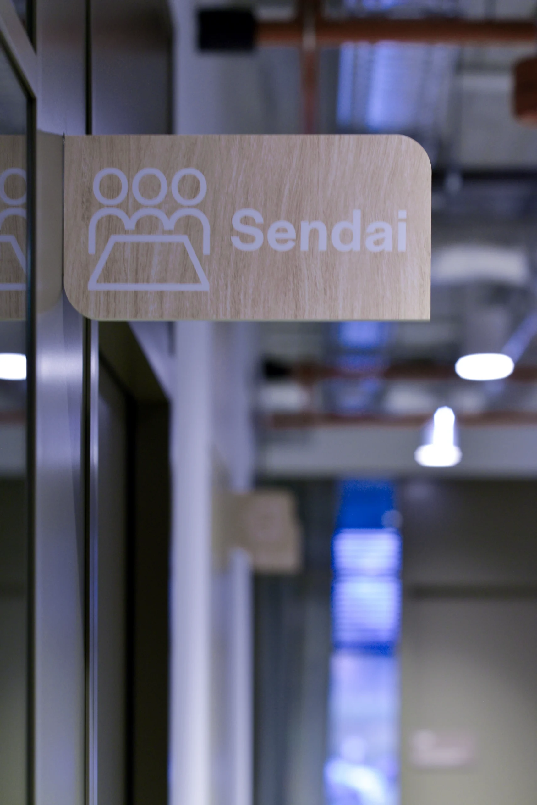
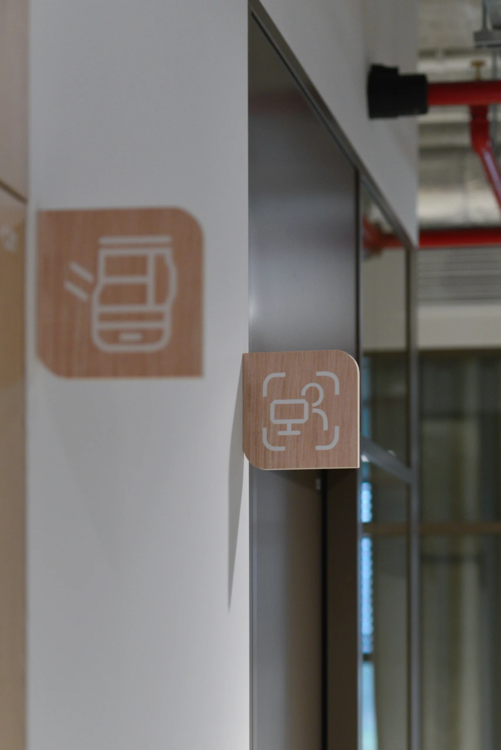
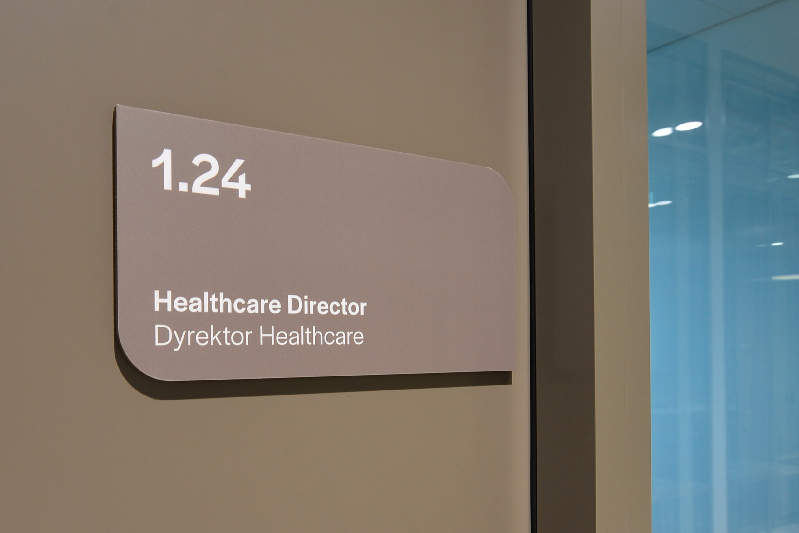
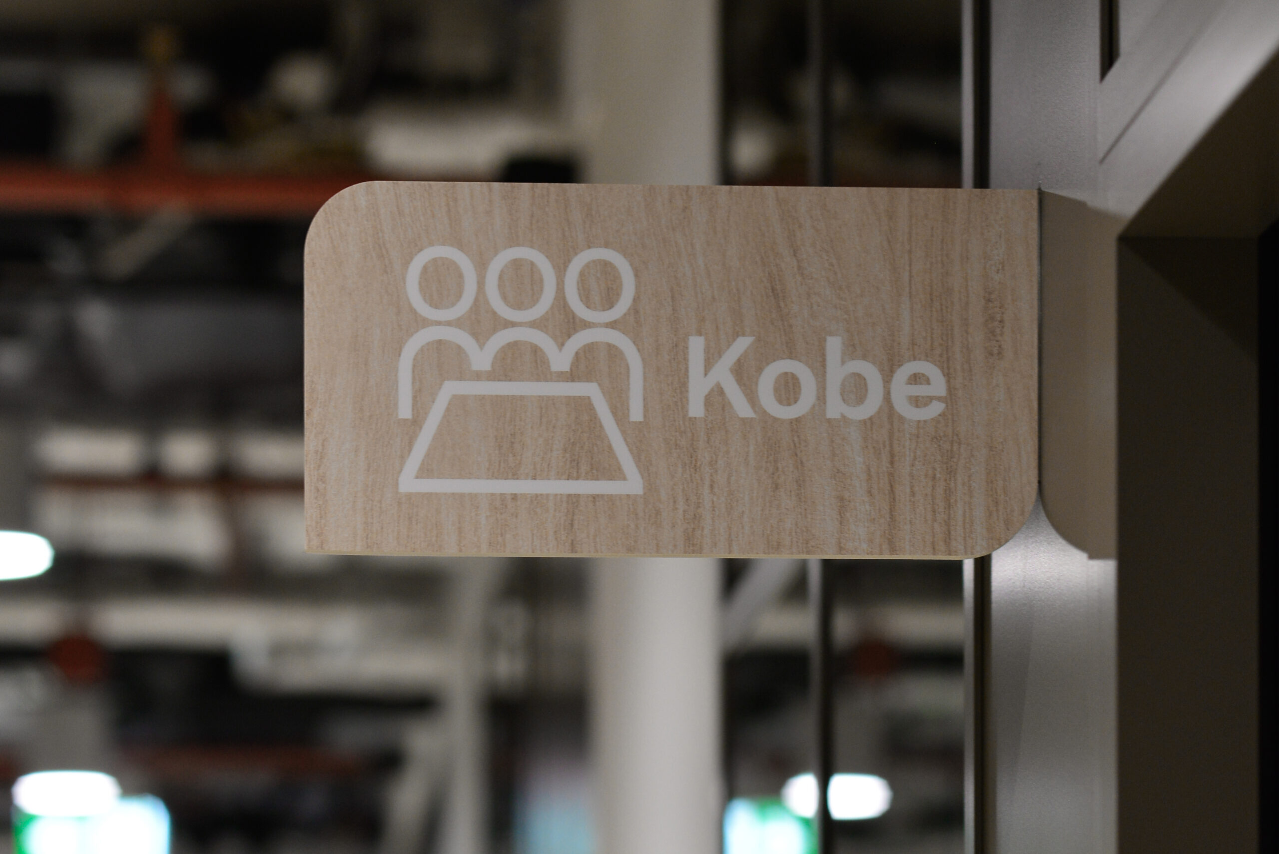
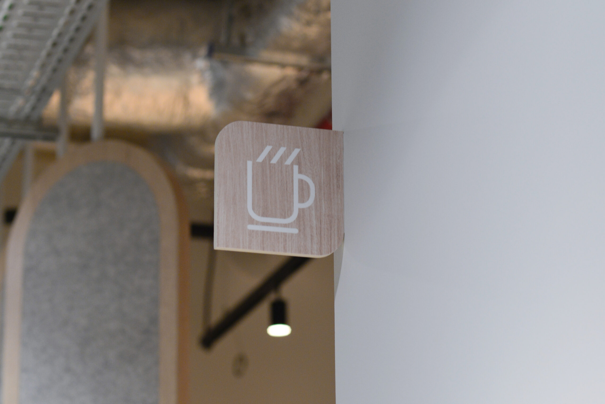
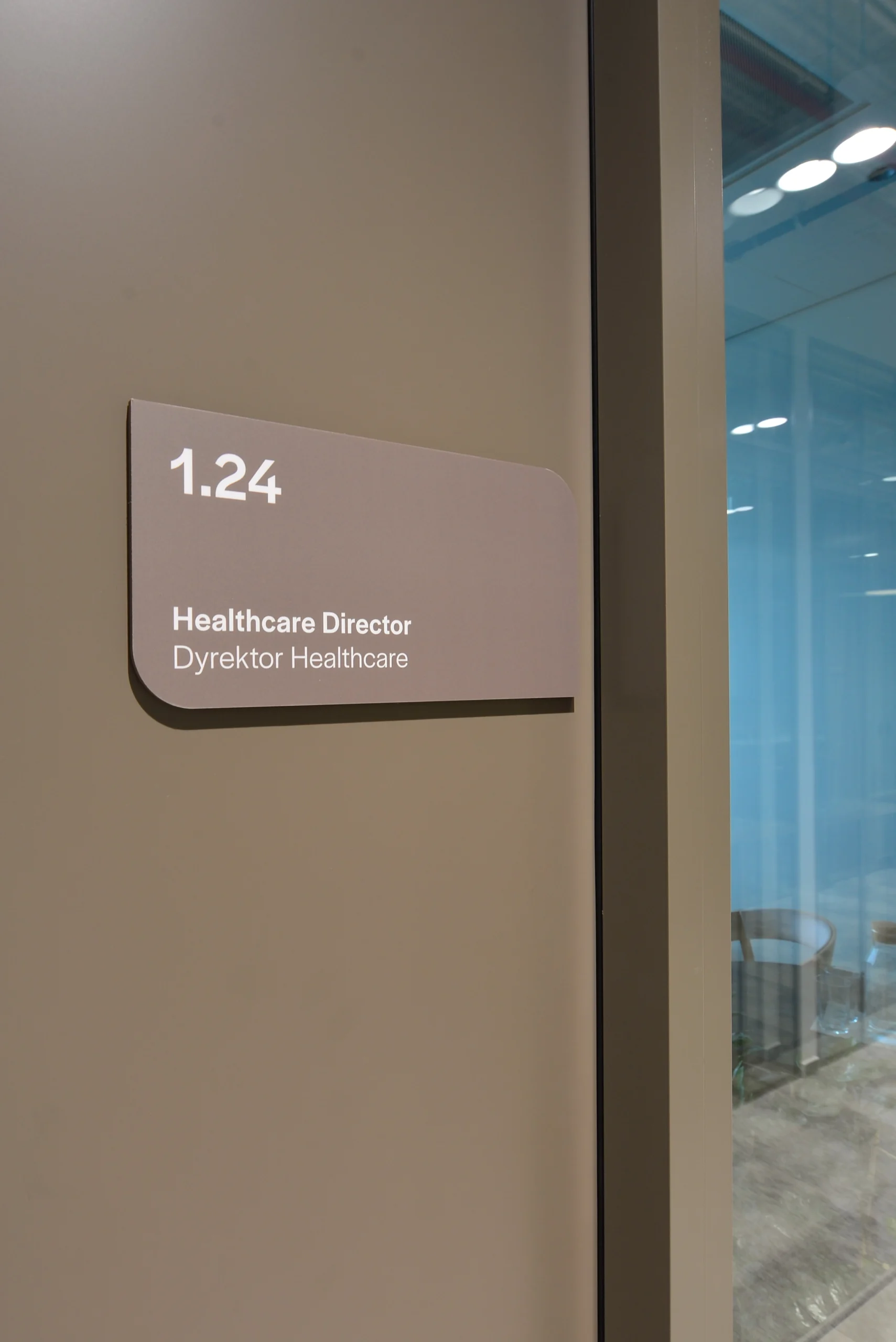
A key aspect of the project, was to incorporate the distinctive features of the brand in the design of the pictograms and the entire signage system. The curves of the icons and the information carriers themselves (maps, directional signs, semaphores and door plates) were designed to harmoniously relate to the shape of the company’s logo, which created a coherent whole with the visual identity. In addition, the color scheme of the materials was adapted to the tones of the office, which harmonizes with the minimalist style of the interior.
Clear pictograms
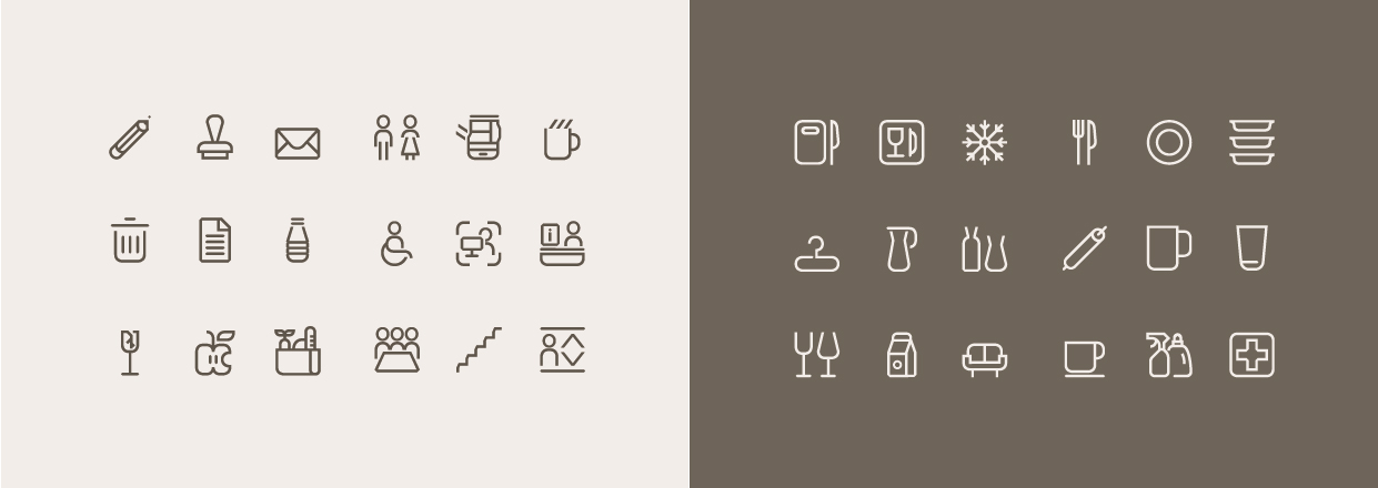

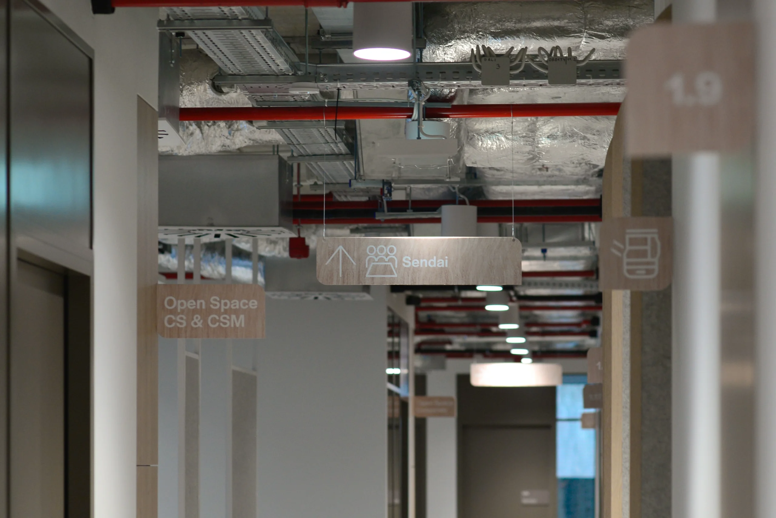
During the design process, we paid special attention to the legibility and aesthetics of the pictograms, which are crucial to the effectiveness of wayfinding in the office. The clarity and crispness of each sign was intended to provide users with easy orientation in the office space and increase comfort in moving around.
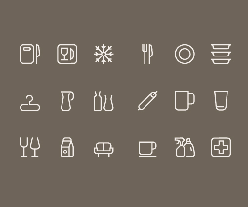
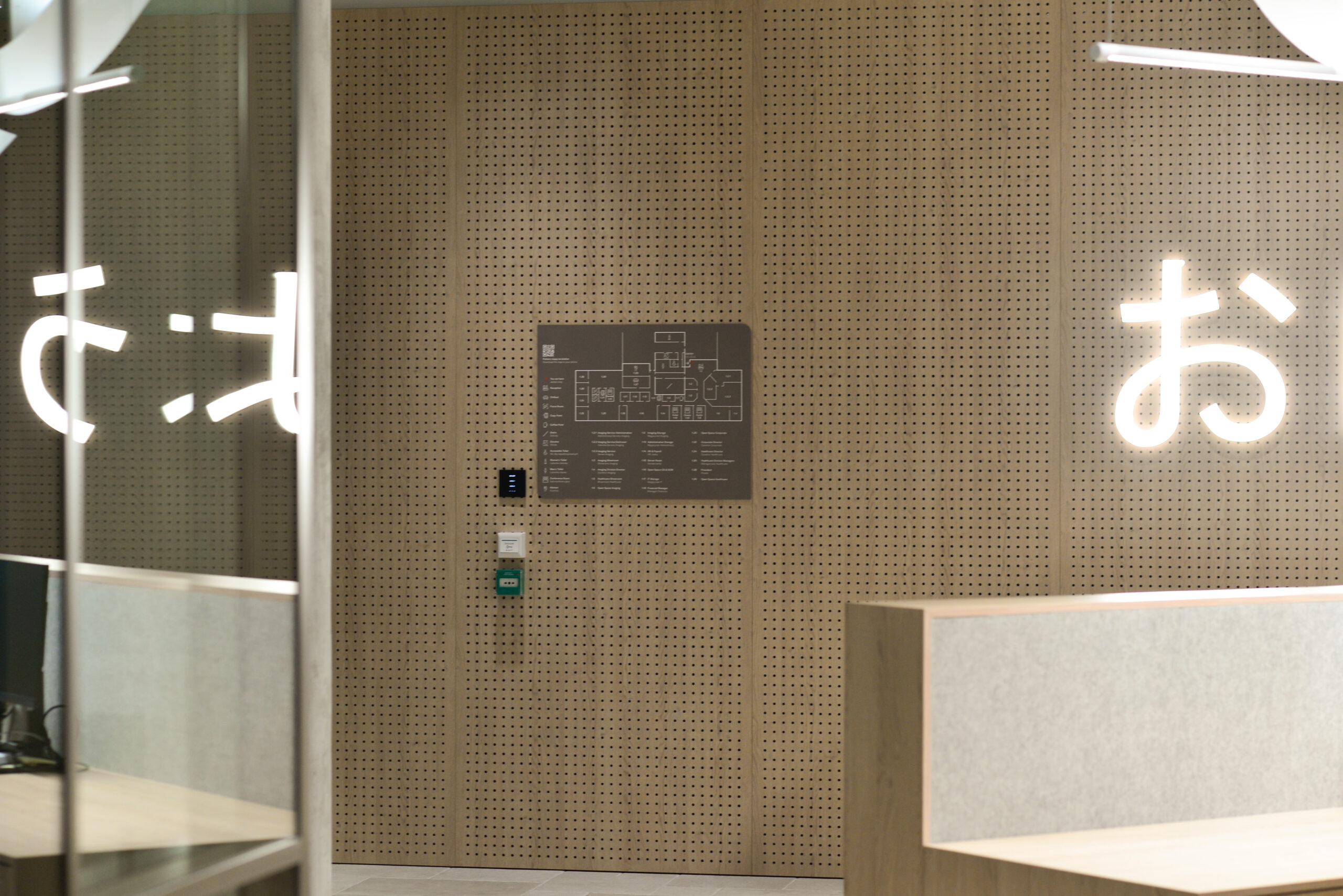
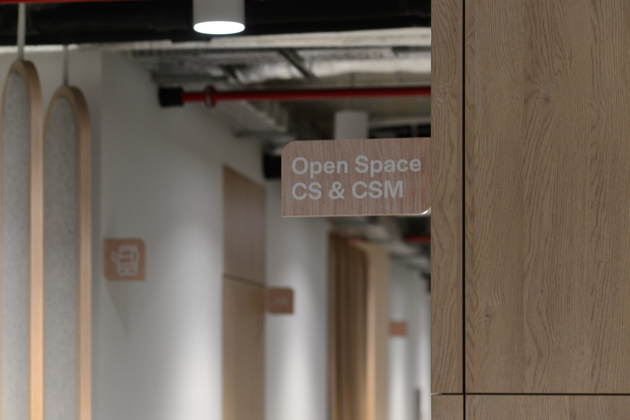
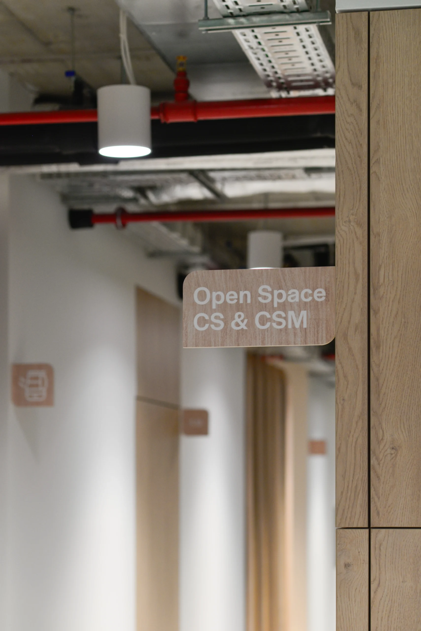
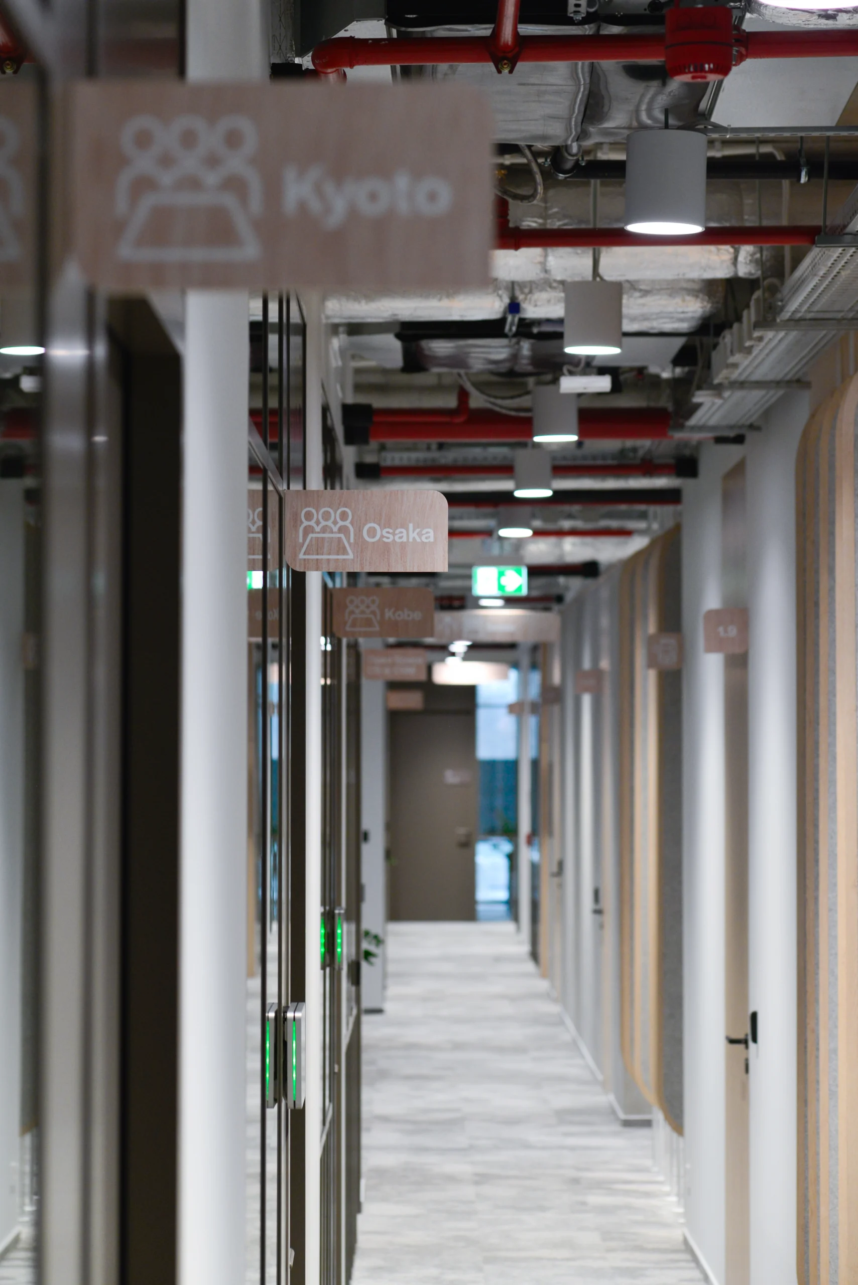
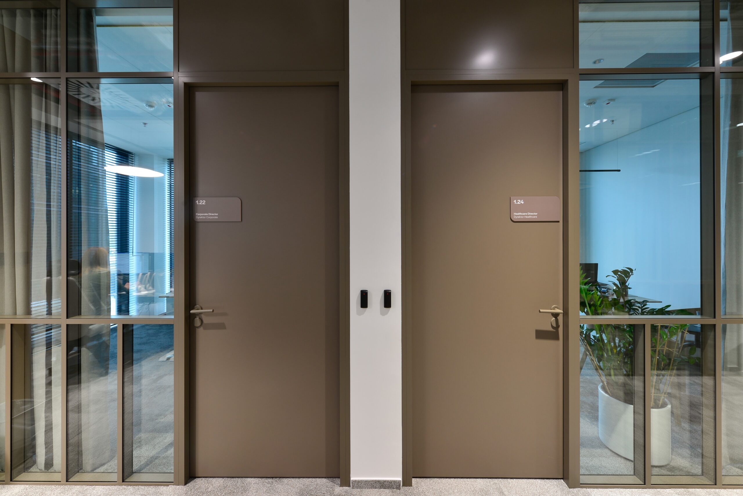
Maps, directional signs and room signage were carefully selected to blend perfectly with the color palette of the doors and doorframes, adding harmony to the entire space. The semaphores and directional signs, placed under the ceiling, were made of a material that blends in perfectly with the furniture furnishings in the office. As a result, all these elements blended naturally into the interior, creating a sense of integrity and aesthetic coherence.
Less is more
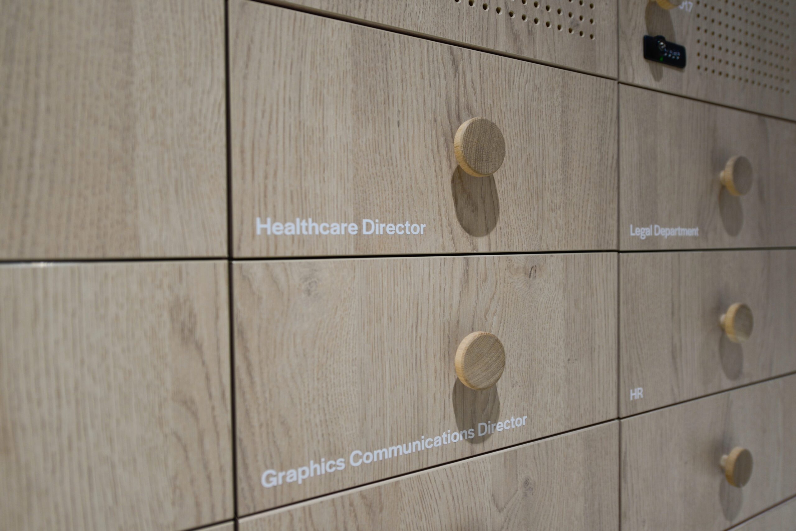
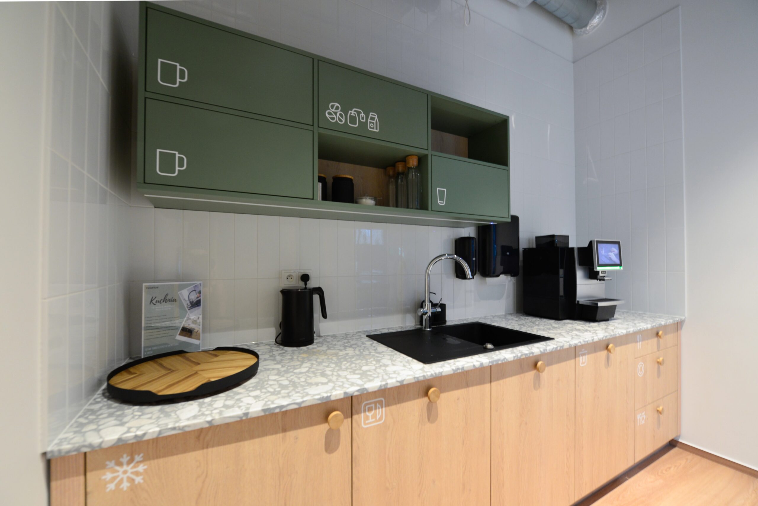
Minimalist design, reflecting the “less is more” principle, is often associated with Japanese values such as tranquility, balance, naturalness and purity of form. The office’s signature minimalist style translates into clear and elegant signage, making each room easy to locate. Our comprehensive system, which also includes signage for kitchen cabinets, staff cabinets and desk numbering, not only emphasizes the company’s professionalism, but also captures its character by introducing the brand to every corner of the office in a subtle but convincing way.

