Orange
Katowice
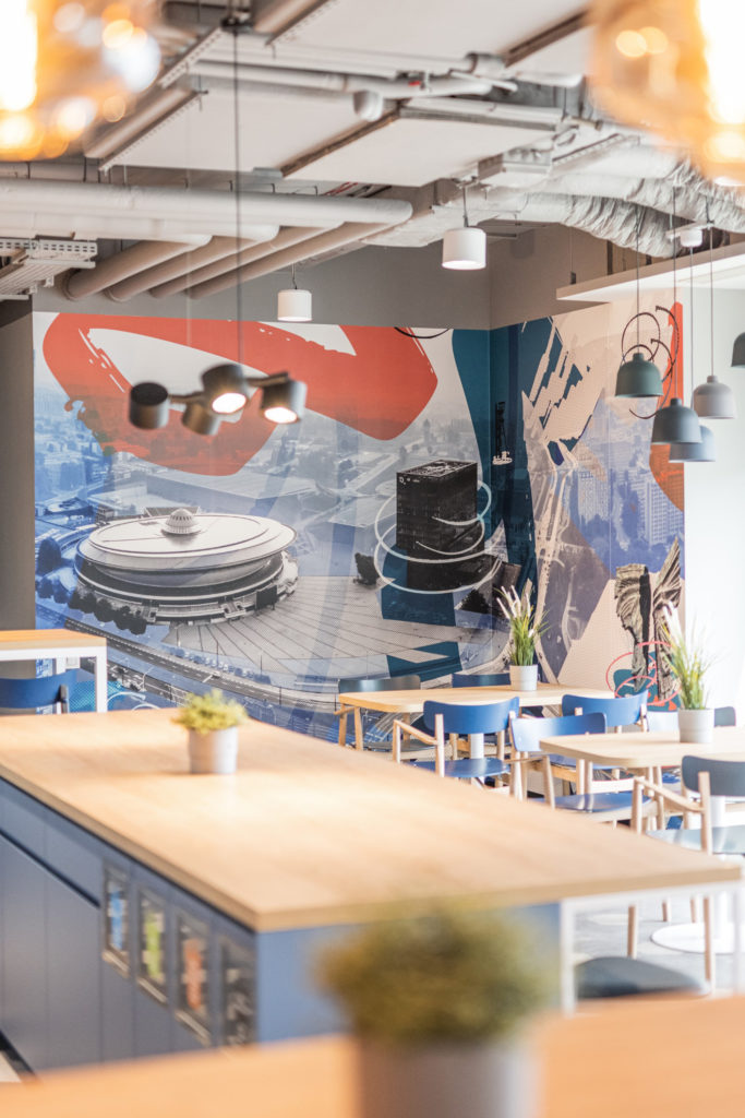
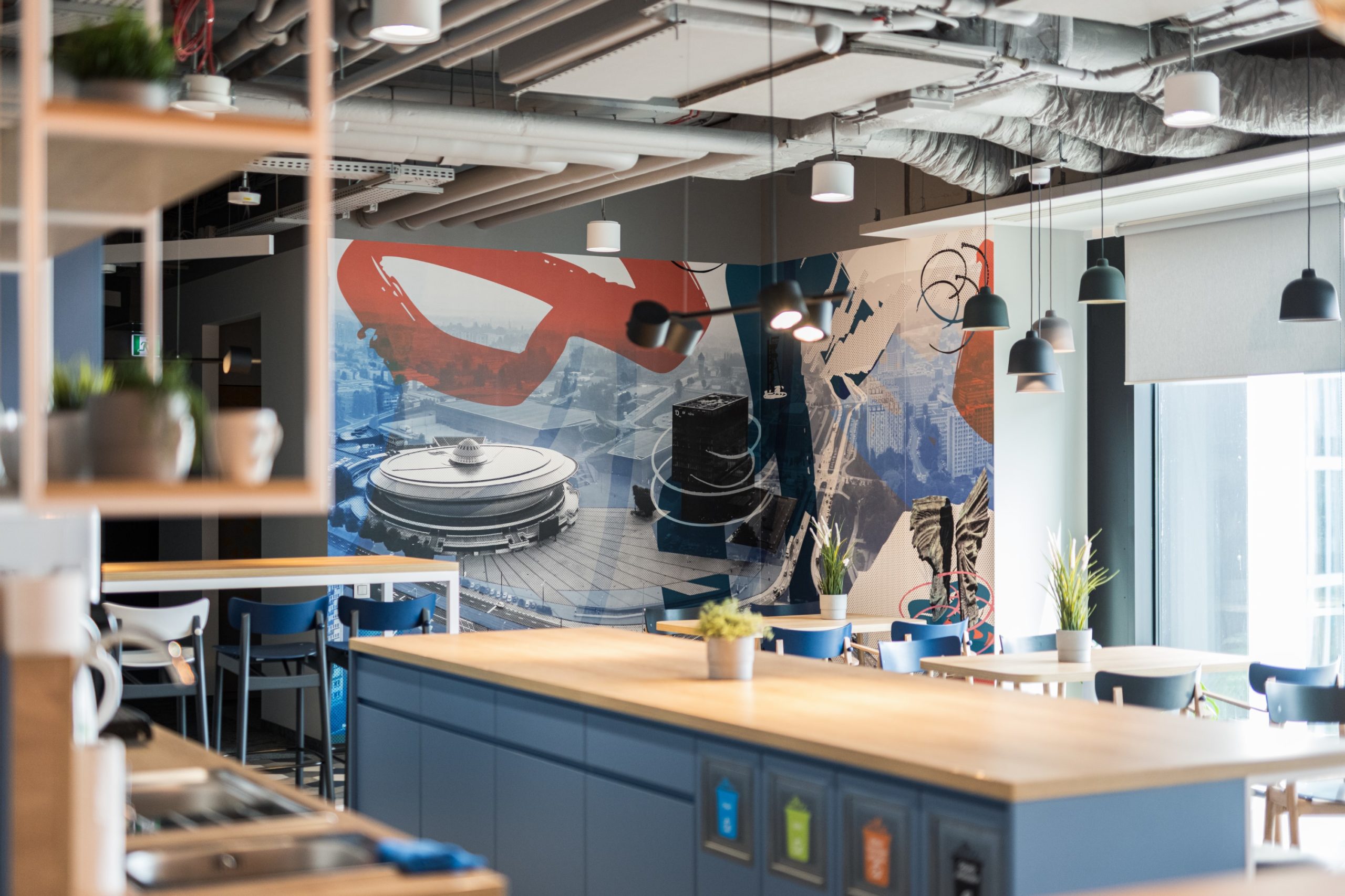
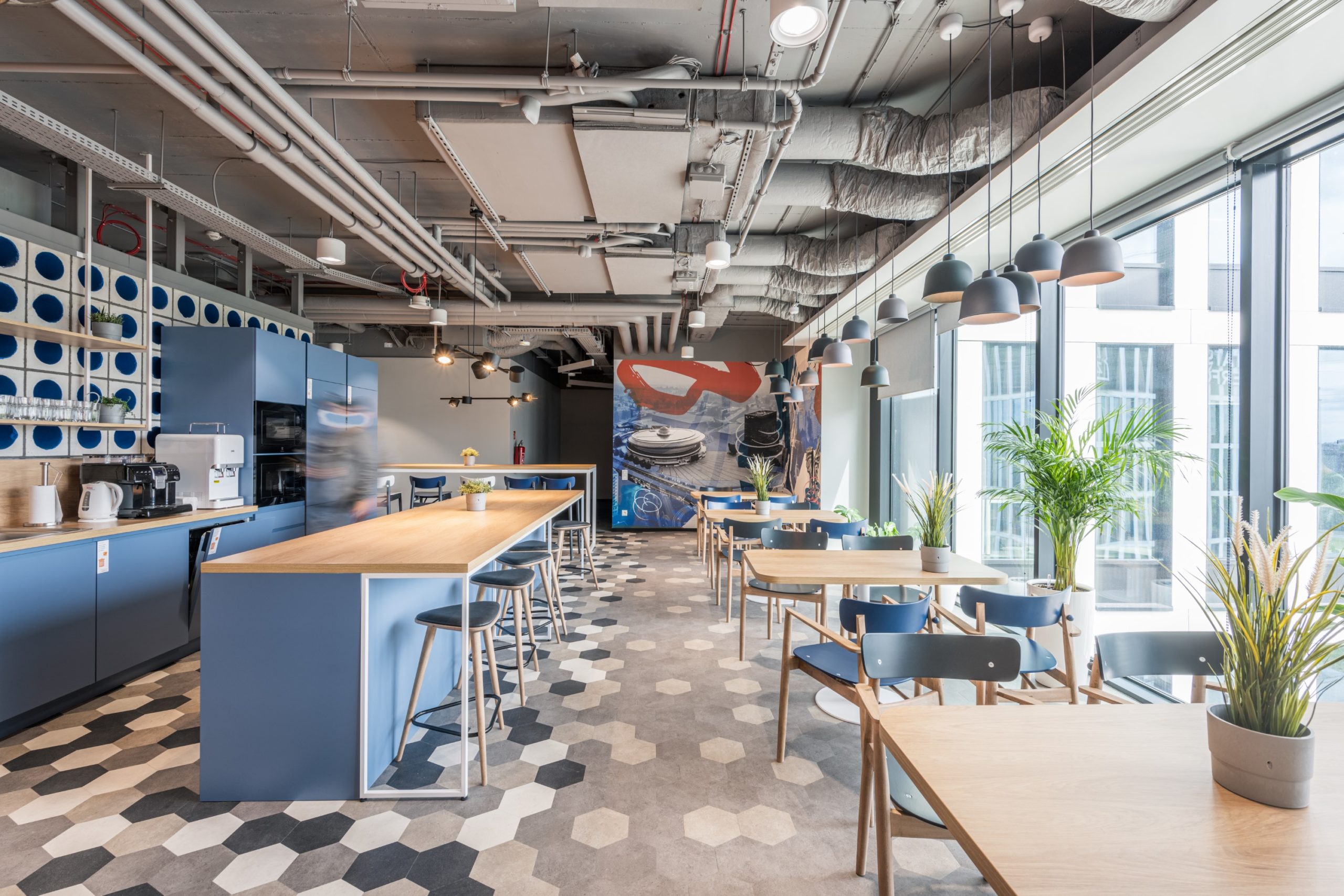
In the implementation of space branding on three floors of Orange’s office in Katowice, we wanted to reflect the dynamic nature of the brand and creatively refer to the history and present of the Upper Silesian capital.
Office building design: Group 5 @grupa5architekci
Office design: Jander Kabza Architects @jander_kabza_architekci
The scope of our implementation:
- original graphic designs
- wall-mounted in dining rooms
- original graphic designs
- walls in open space
- wall graphics in traffic routes
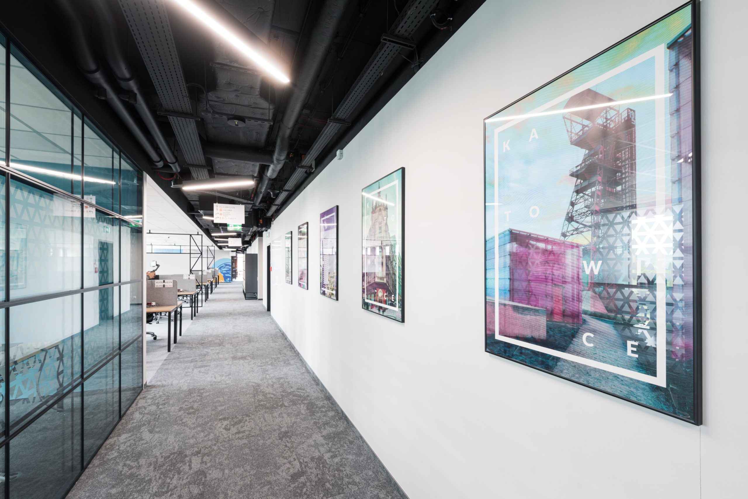
- graphics with Katowice motifs in the form of posters
stickers for lockers in changing rooms
What is space branding all about? First of all, it’s about an individual approach to each office and the company that occupies it. In our realizations we move between minimalist, sparing forms and crazy, artistic designs.
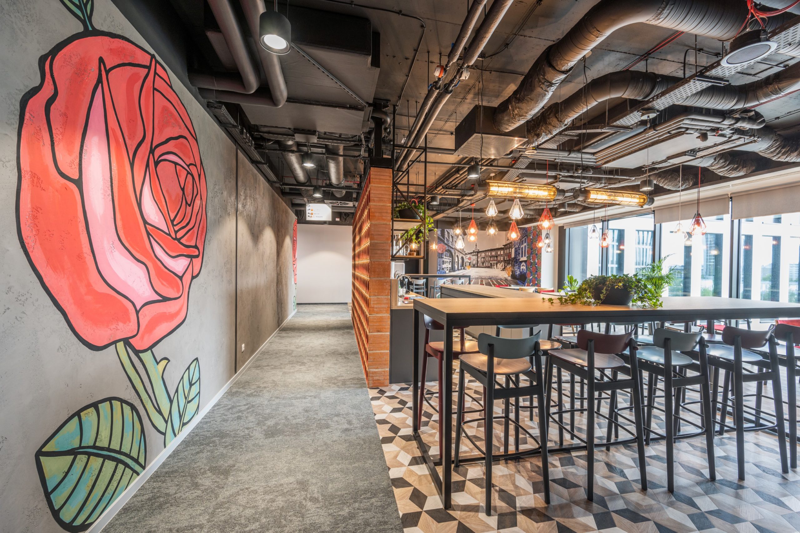
Such is the one realized for Orange in Katowice! In it, we took care of personalizing the space of the new office located on three floors – each of which is dedicated to Katowice and Silesia.
Modernist Katowice
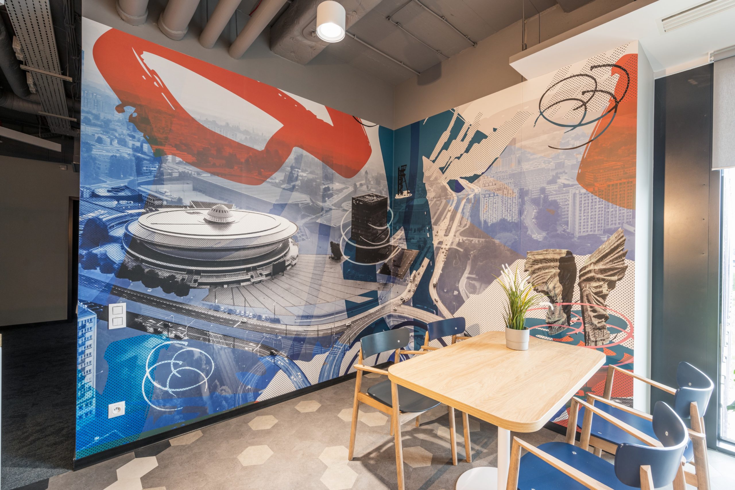
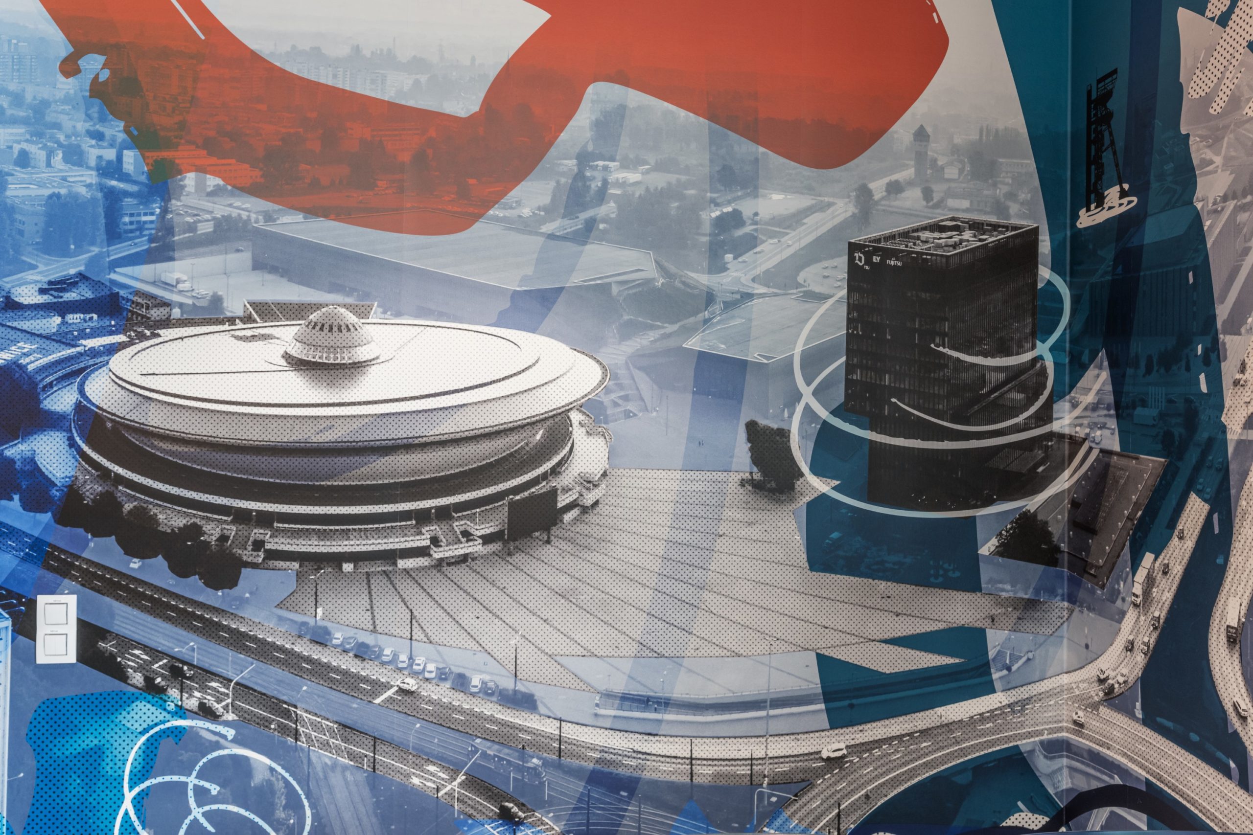
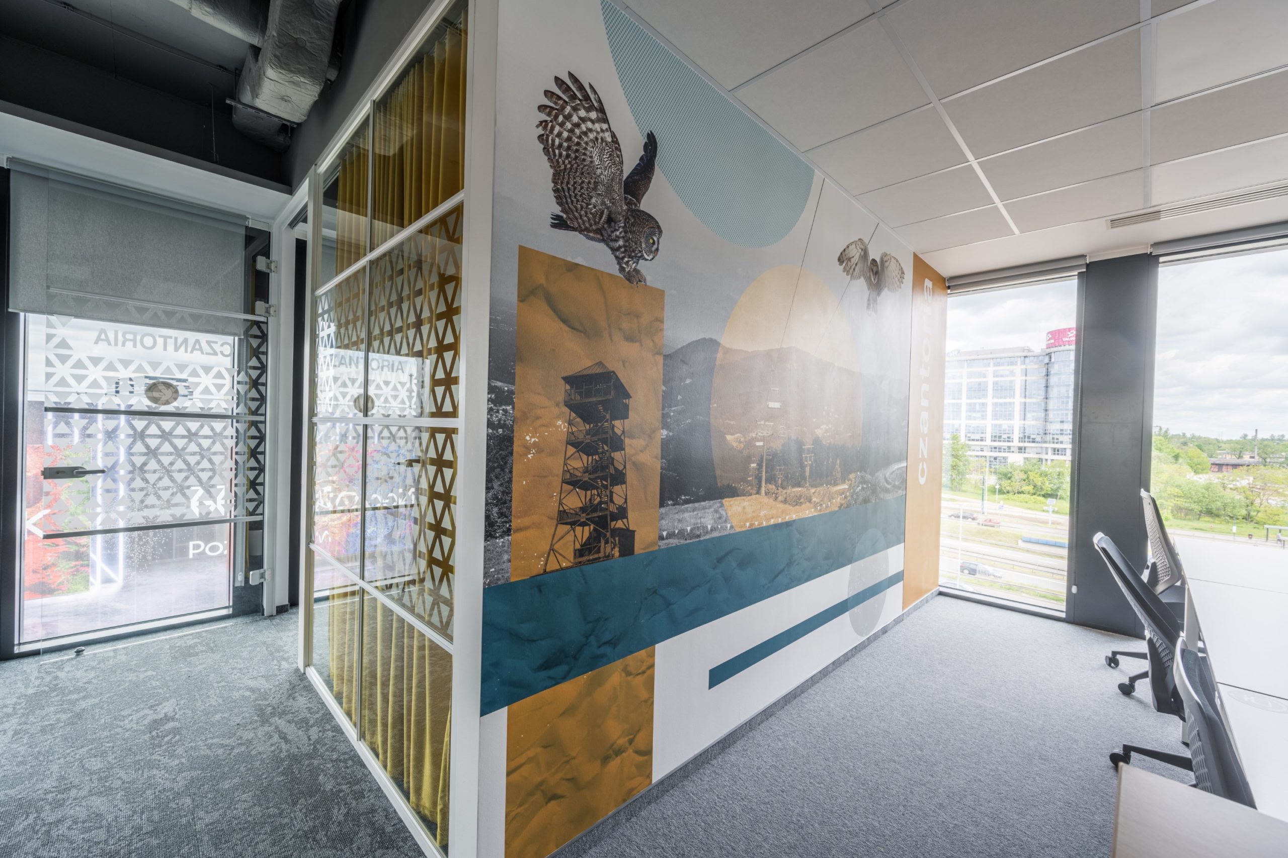
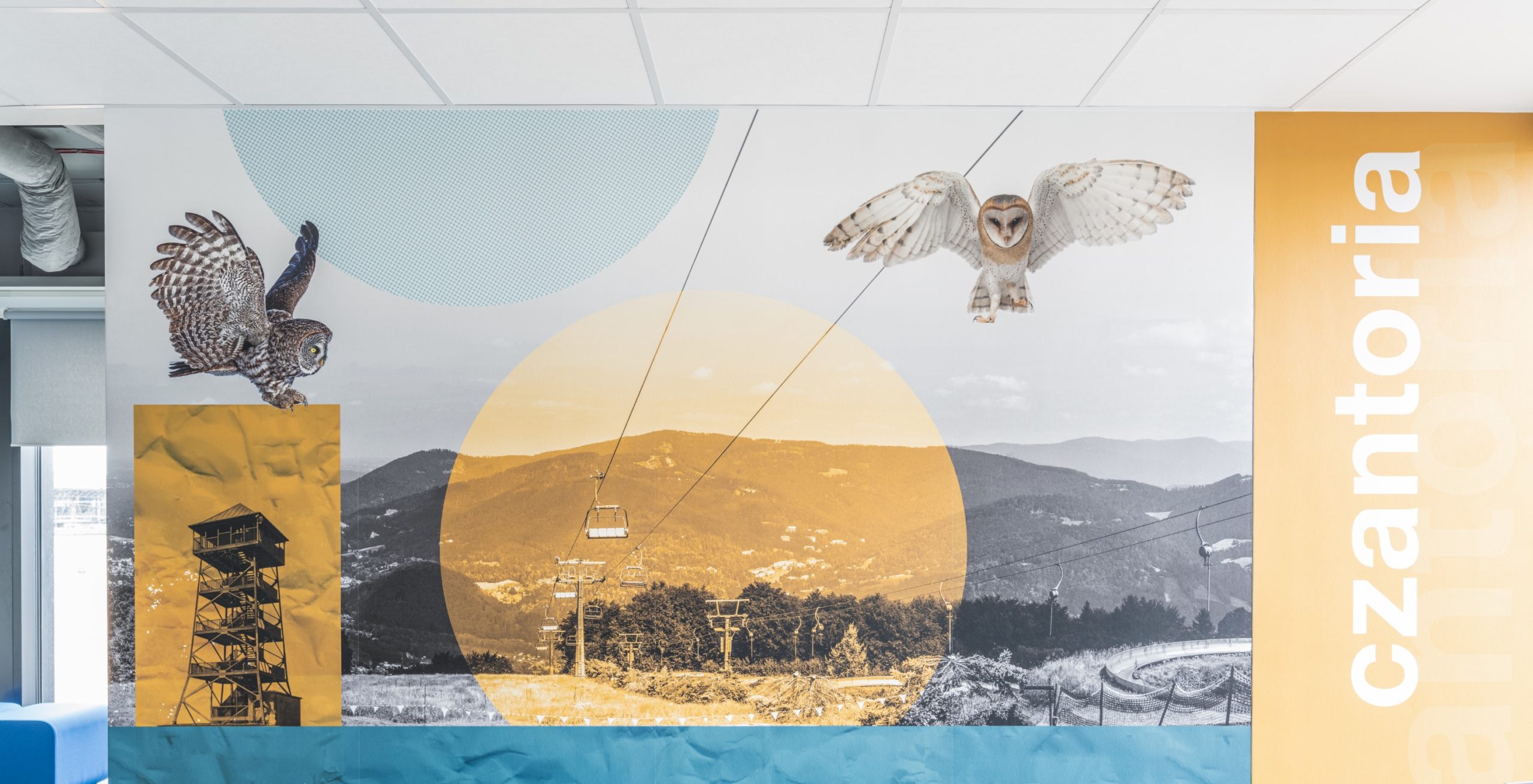
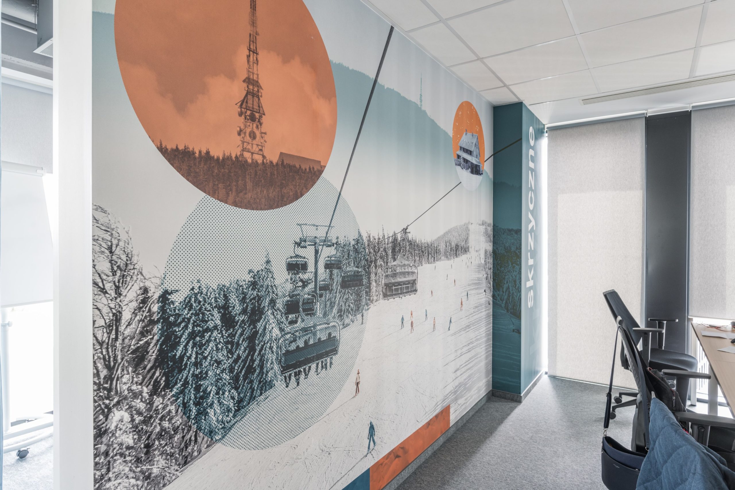
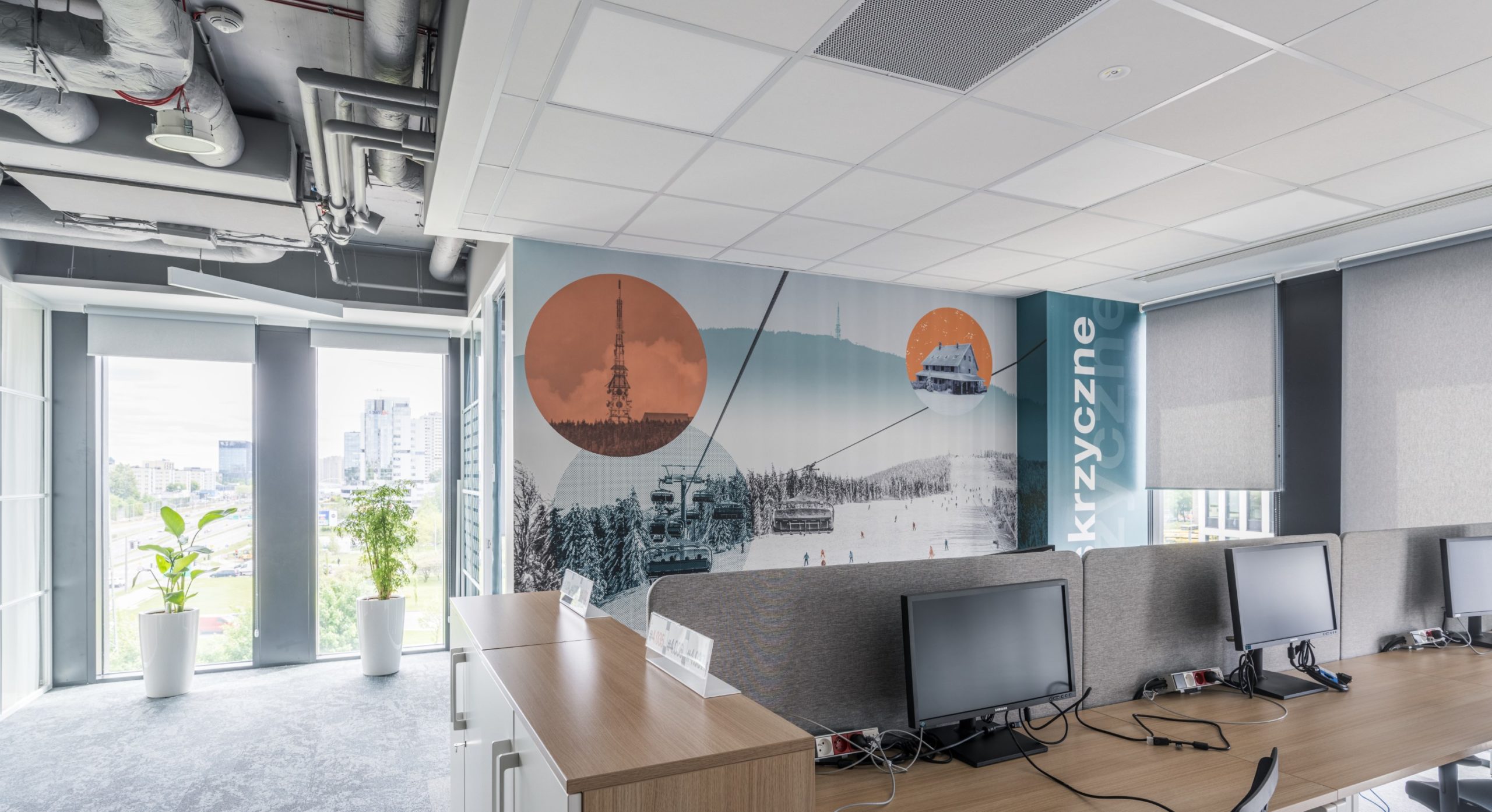
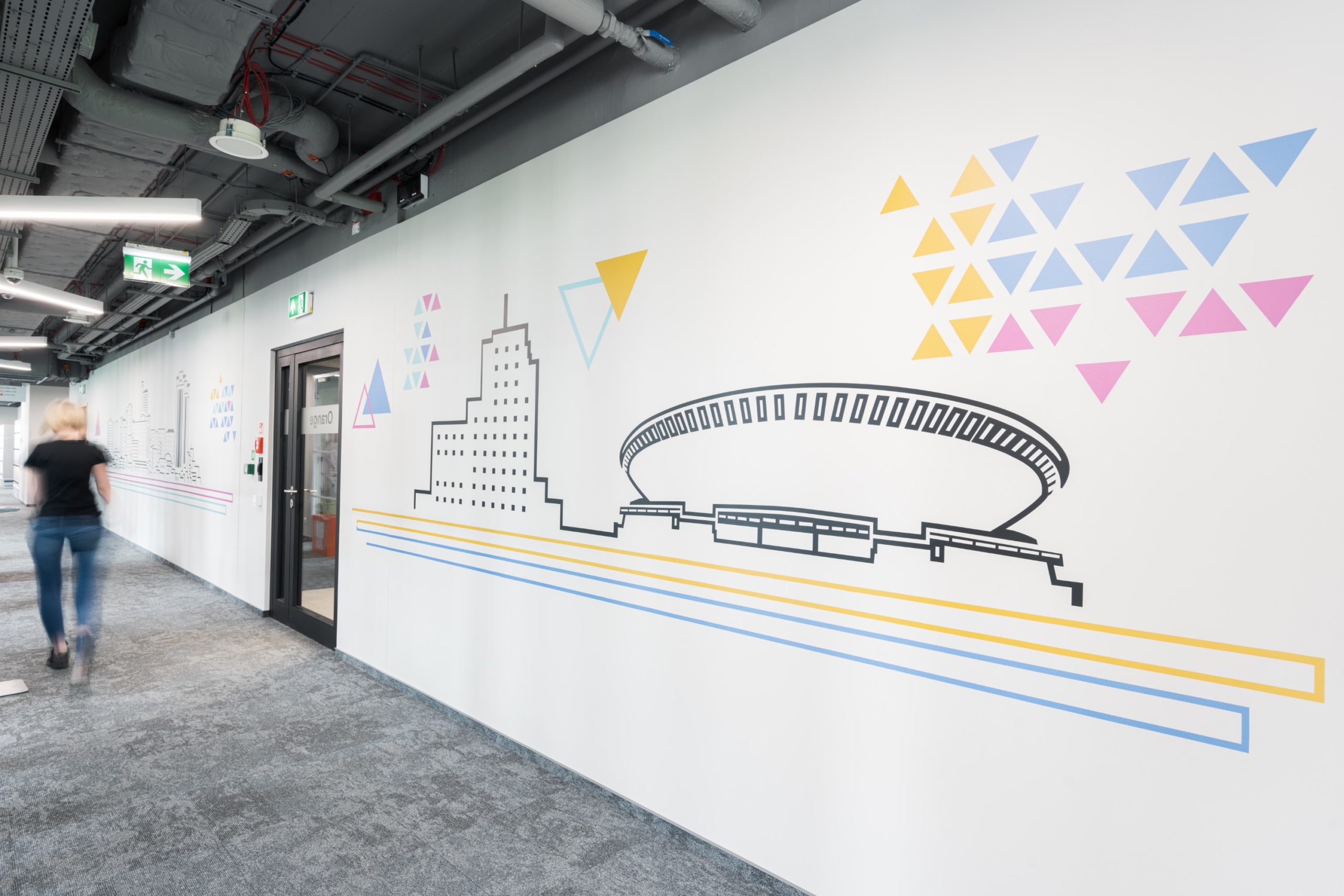
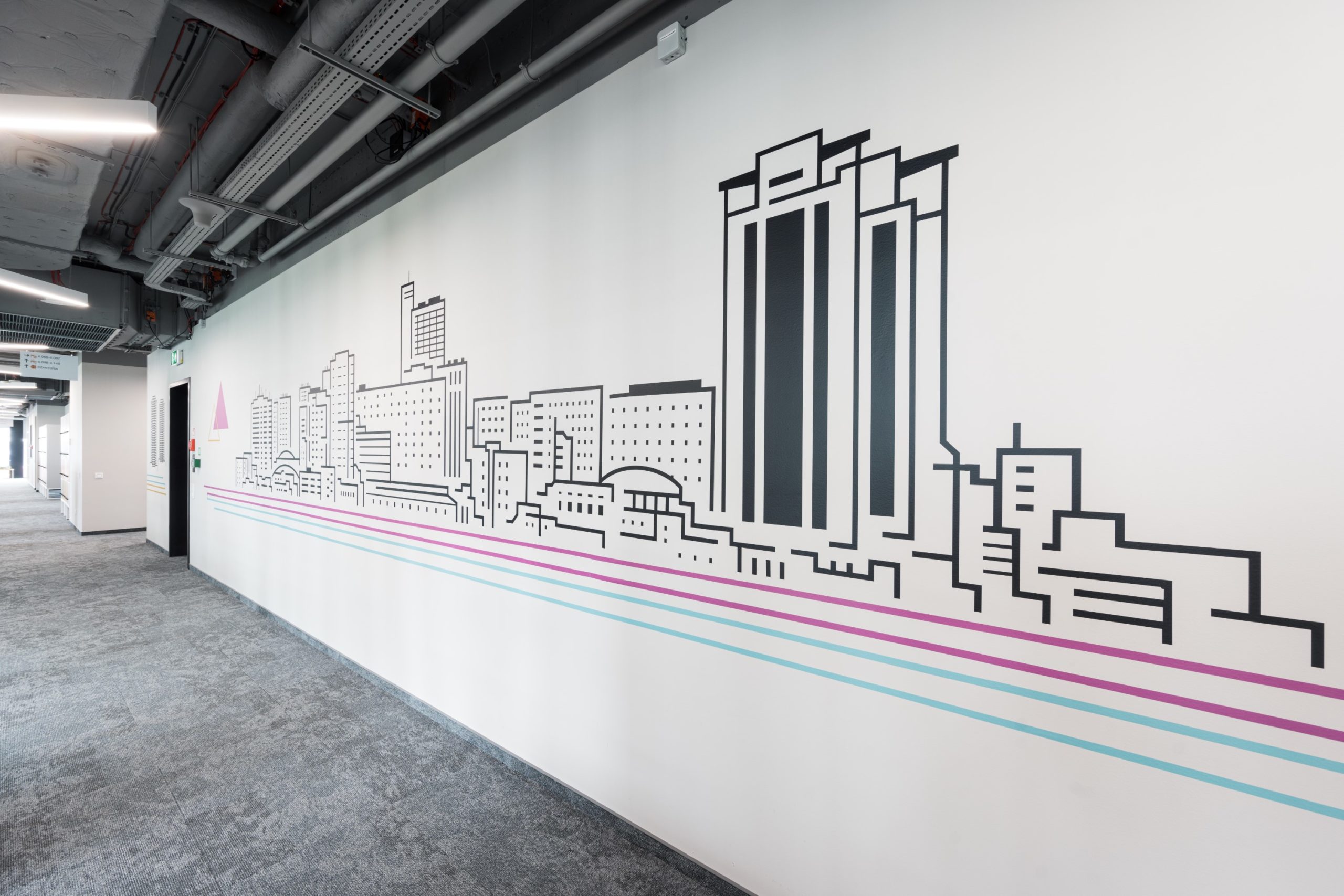
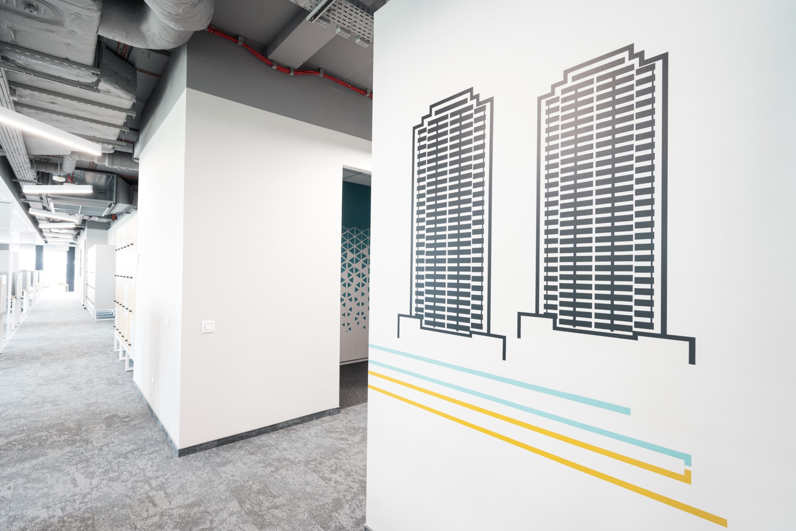
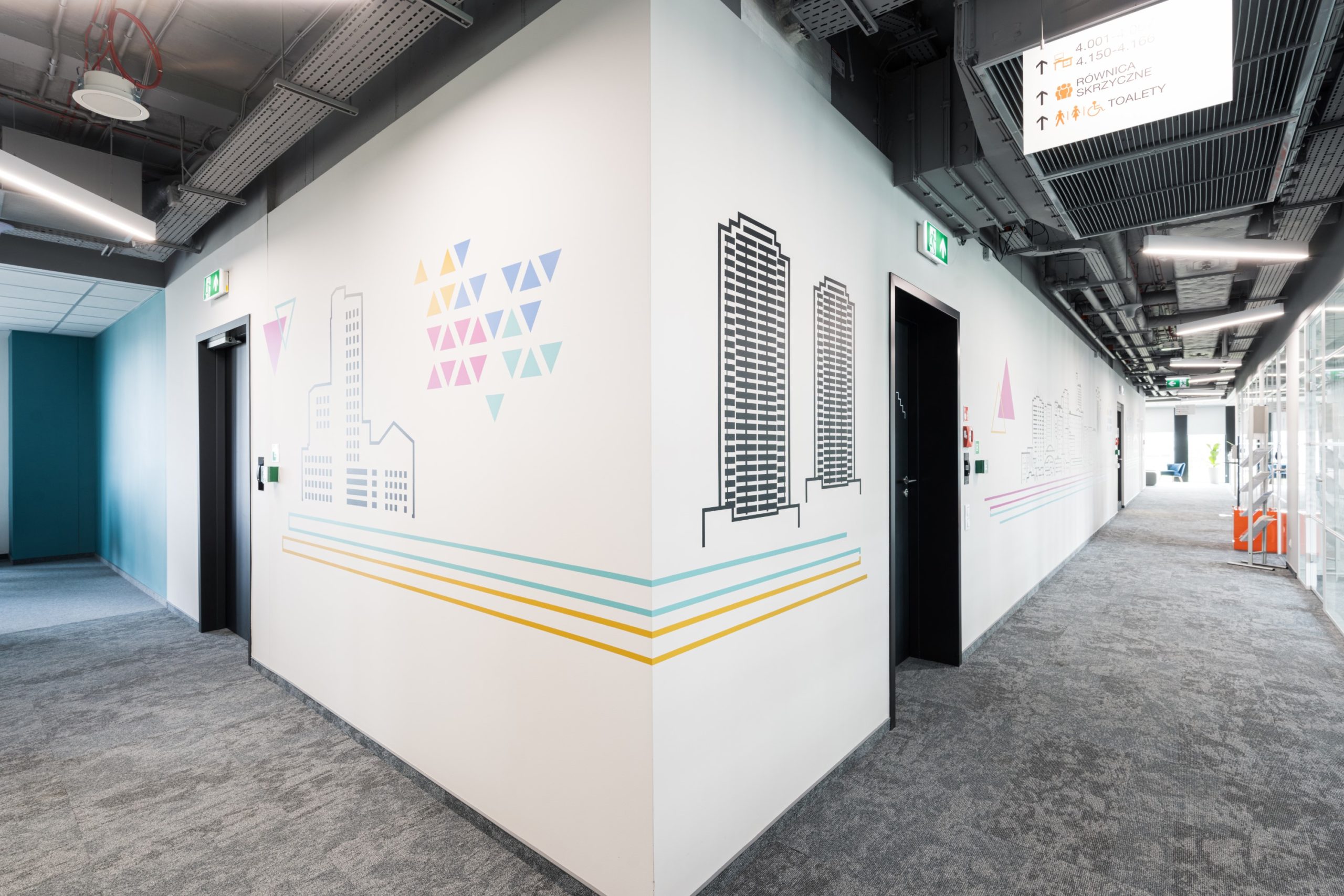
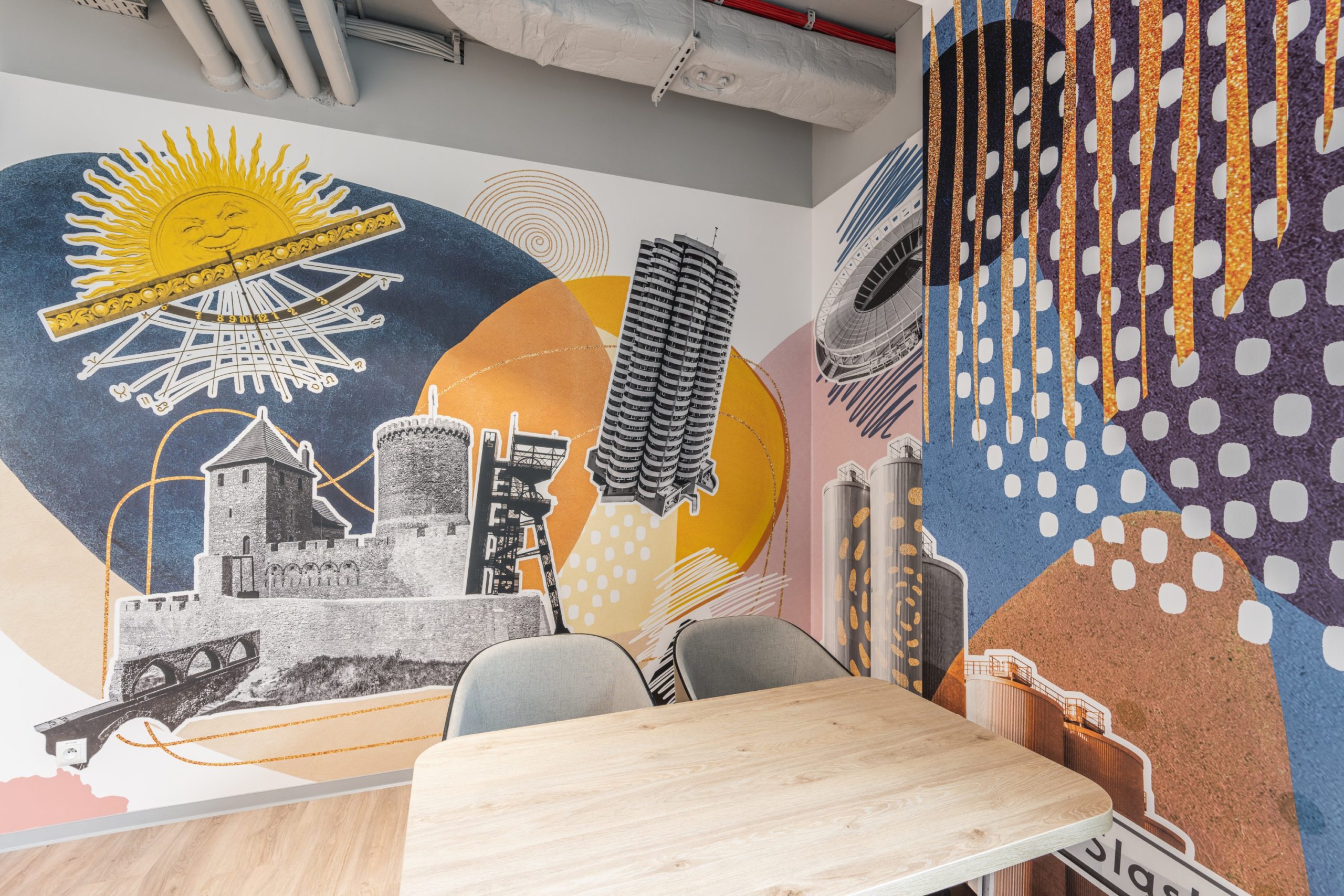
The fourth floor of the office refers to the rich modernist architectural heritage of Katowice. We enchanted the dining and kitchen area with a collage of 1970s architectural landmarks, including Katowice’s Spodek. The multicolored wall graphics are alluded to by linear motifs with silhouettes of modernist buildings, which decorate the walkway connecting this common area with the office area. Complementing the whole are two collages in the open space areas depicting Czantoria and Skrzyczne with symbols characteristic of these peaks.
Workers' Katowice
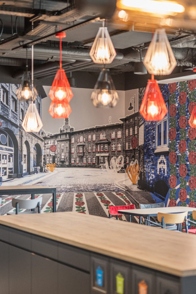
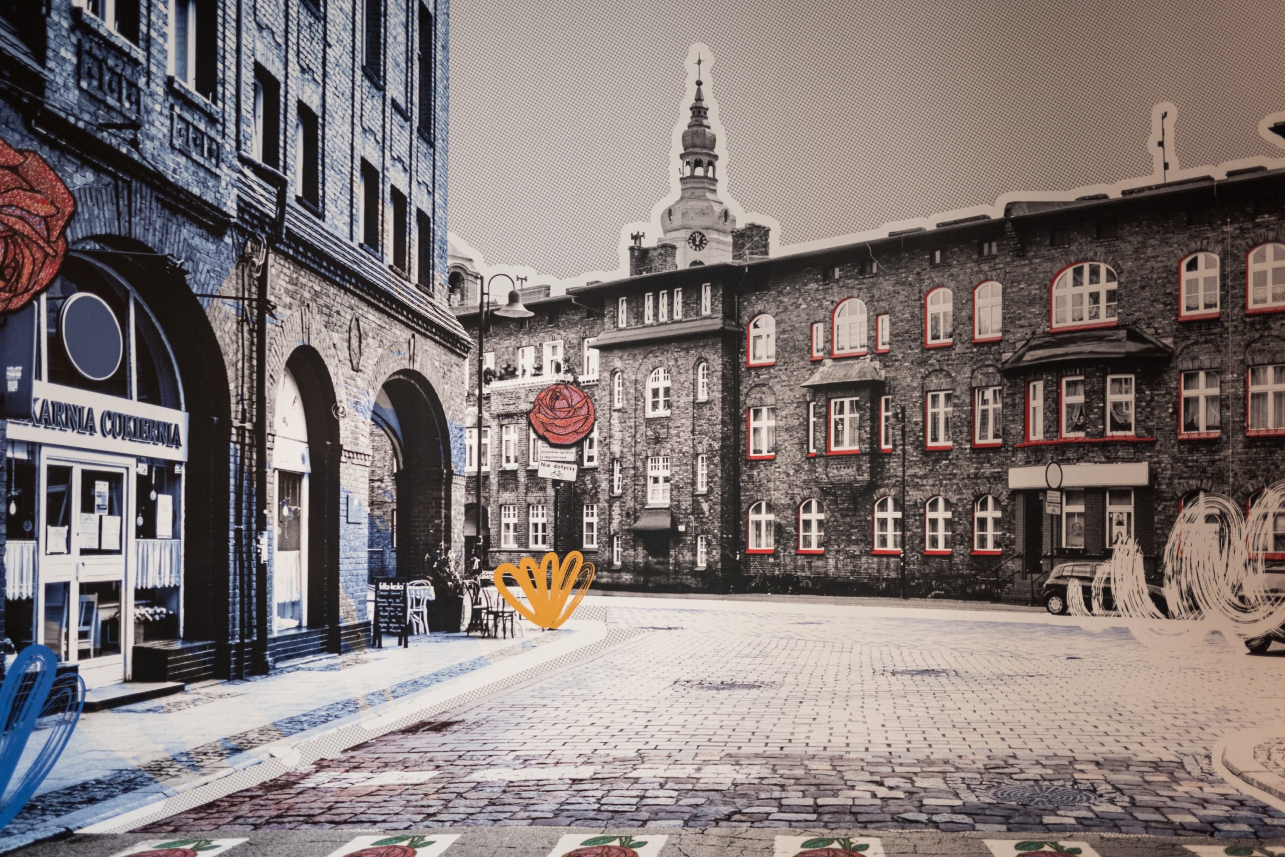
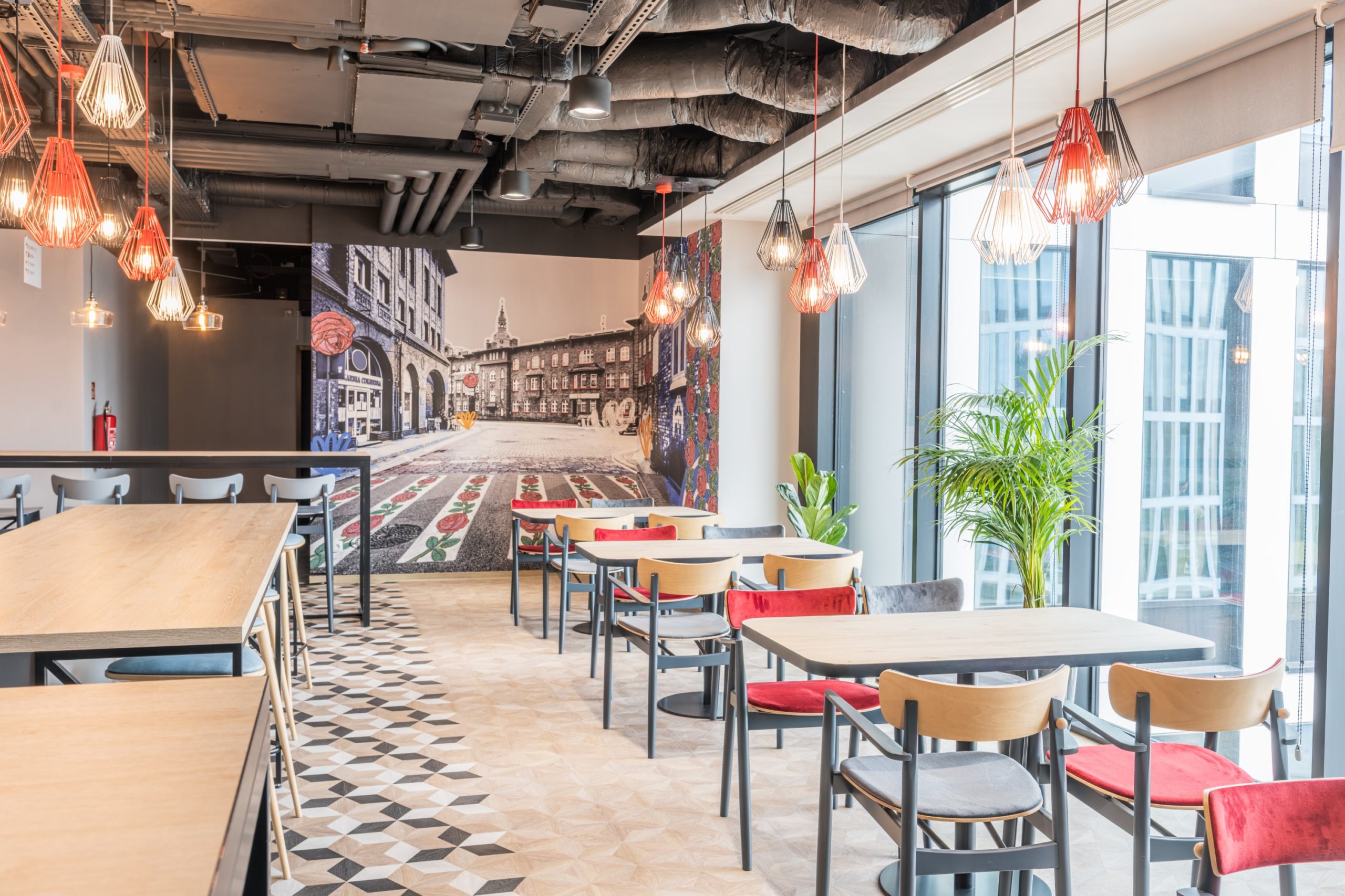
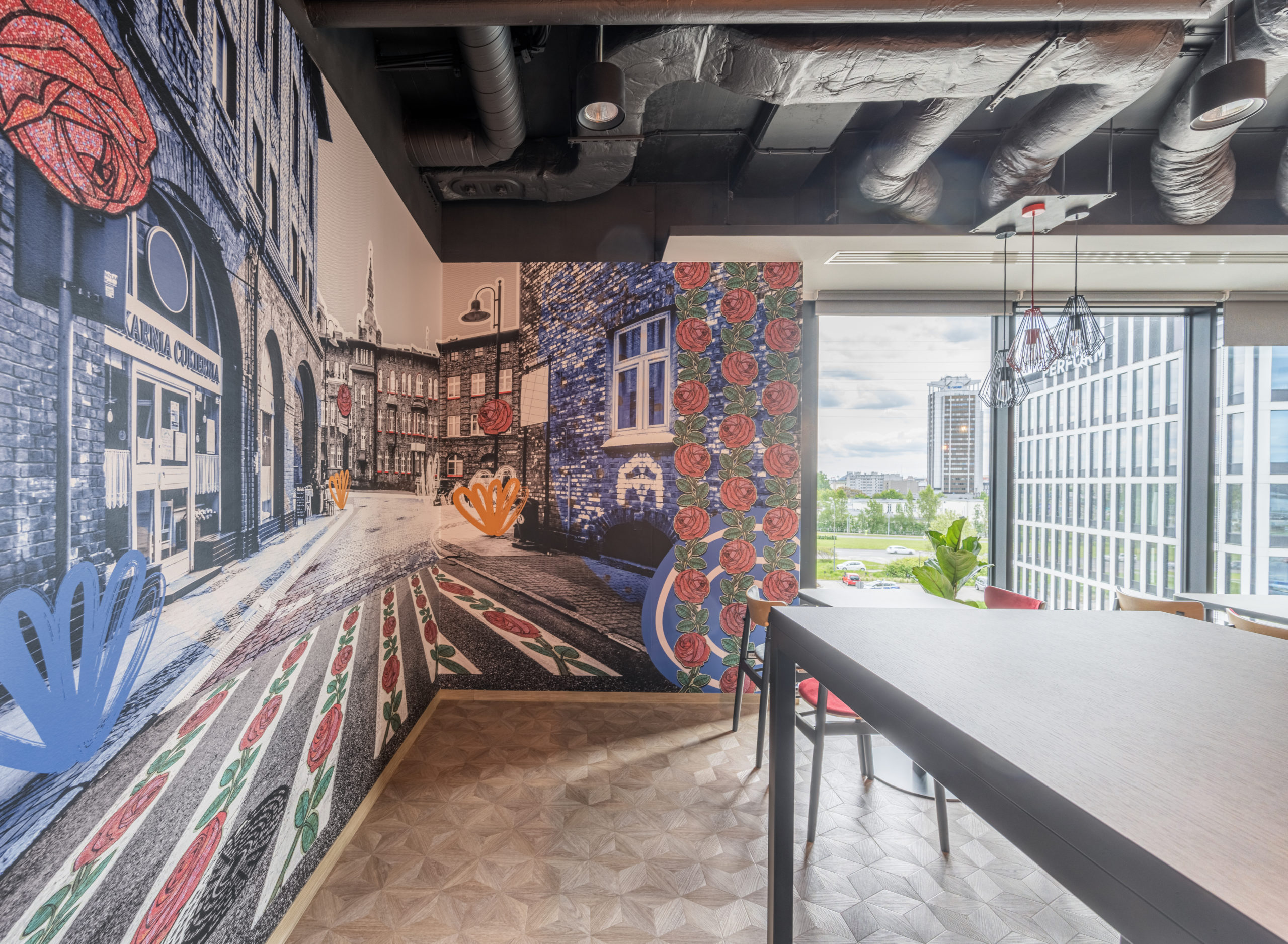
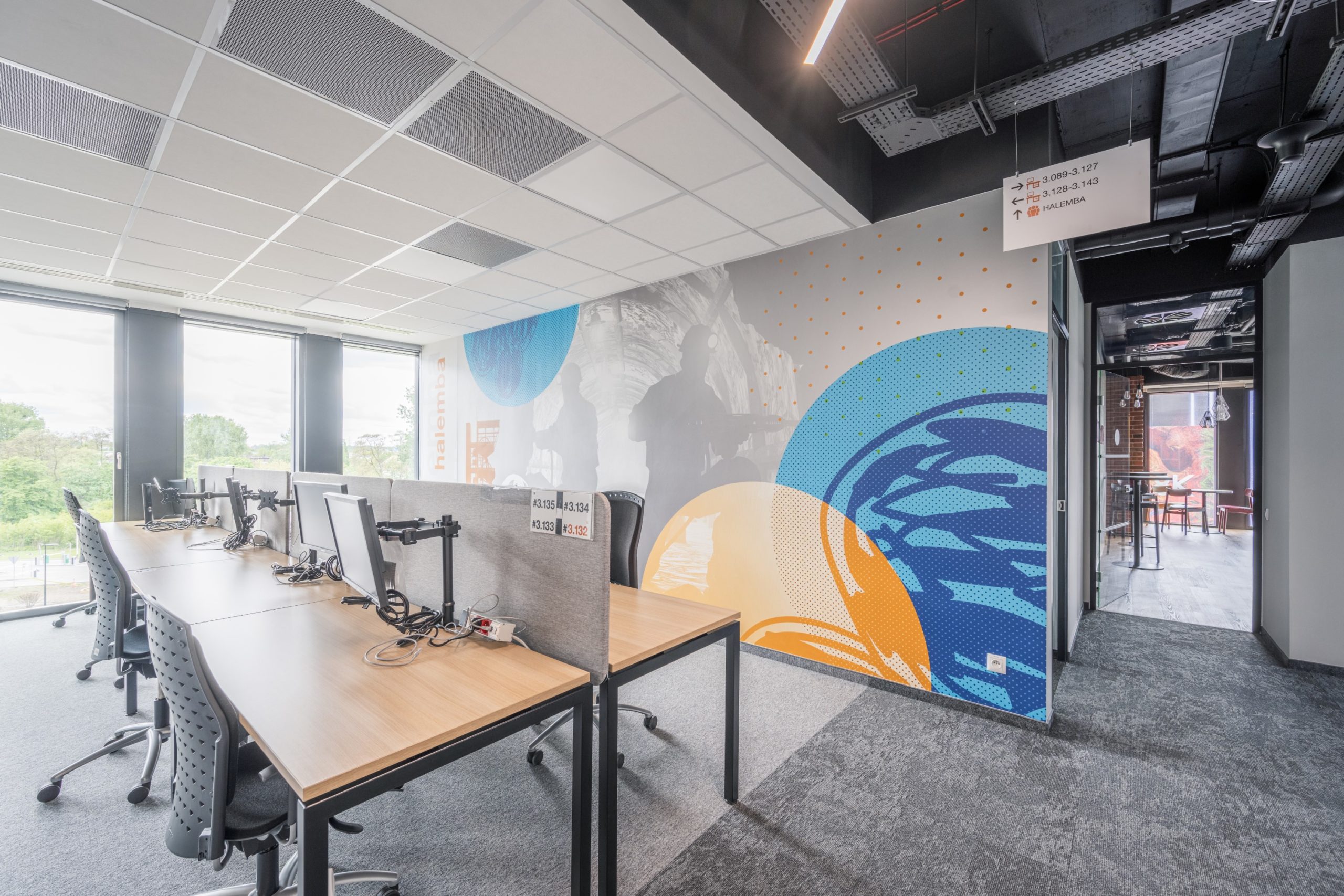
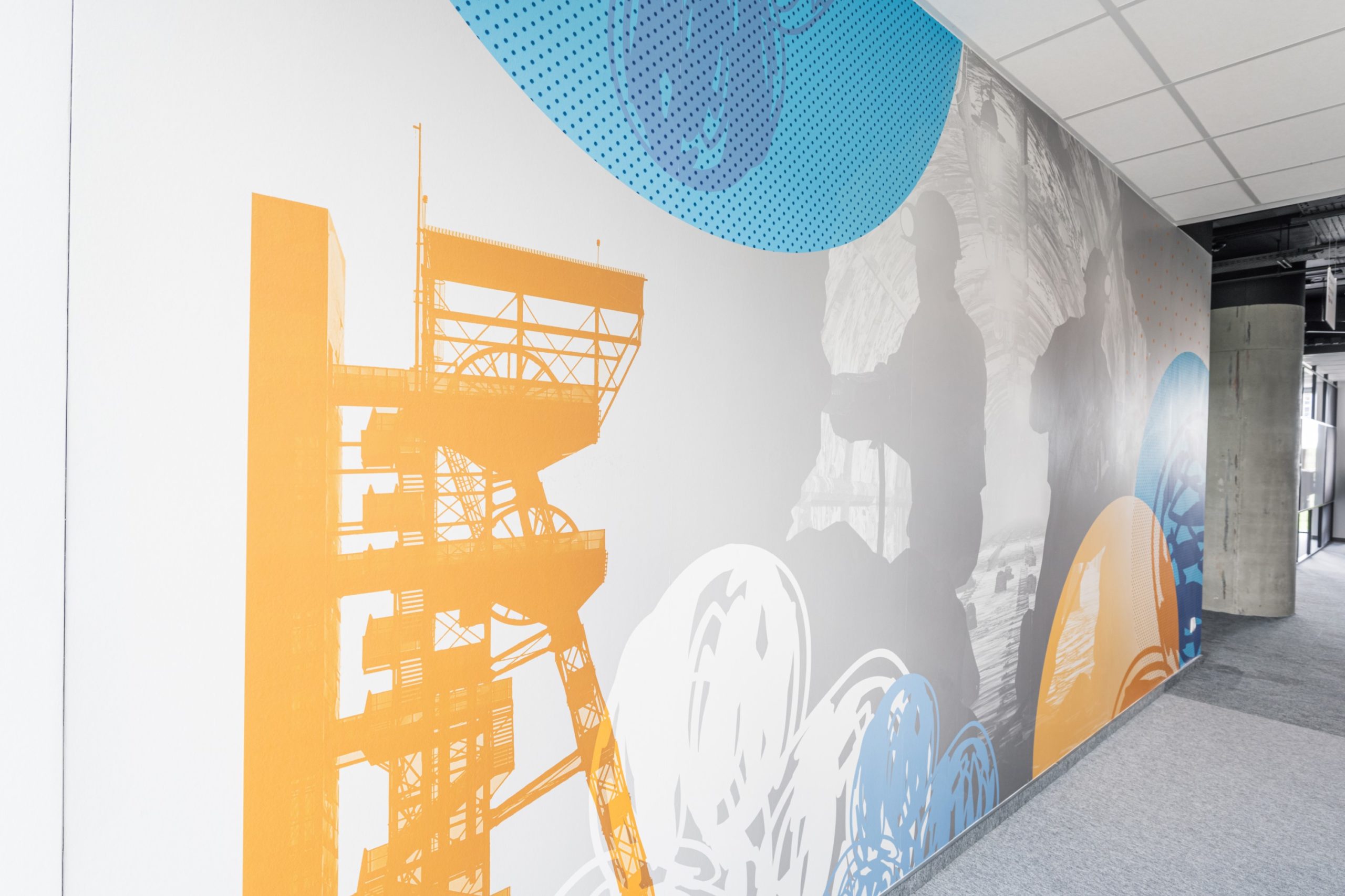
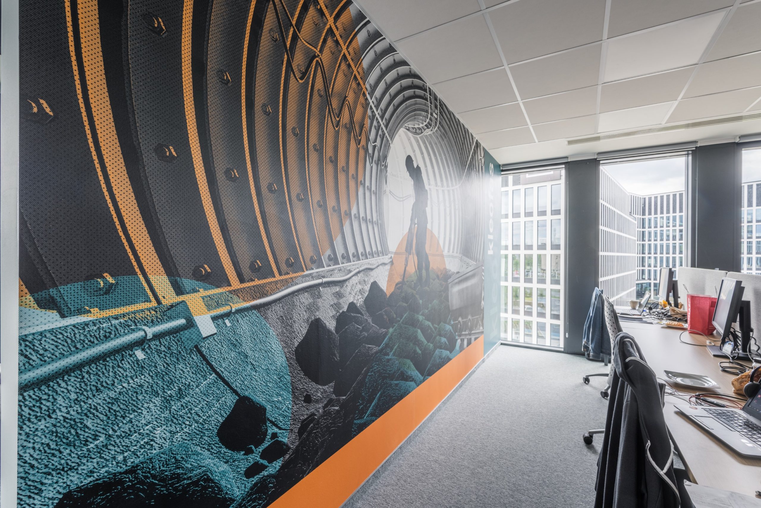
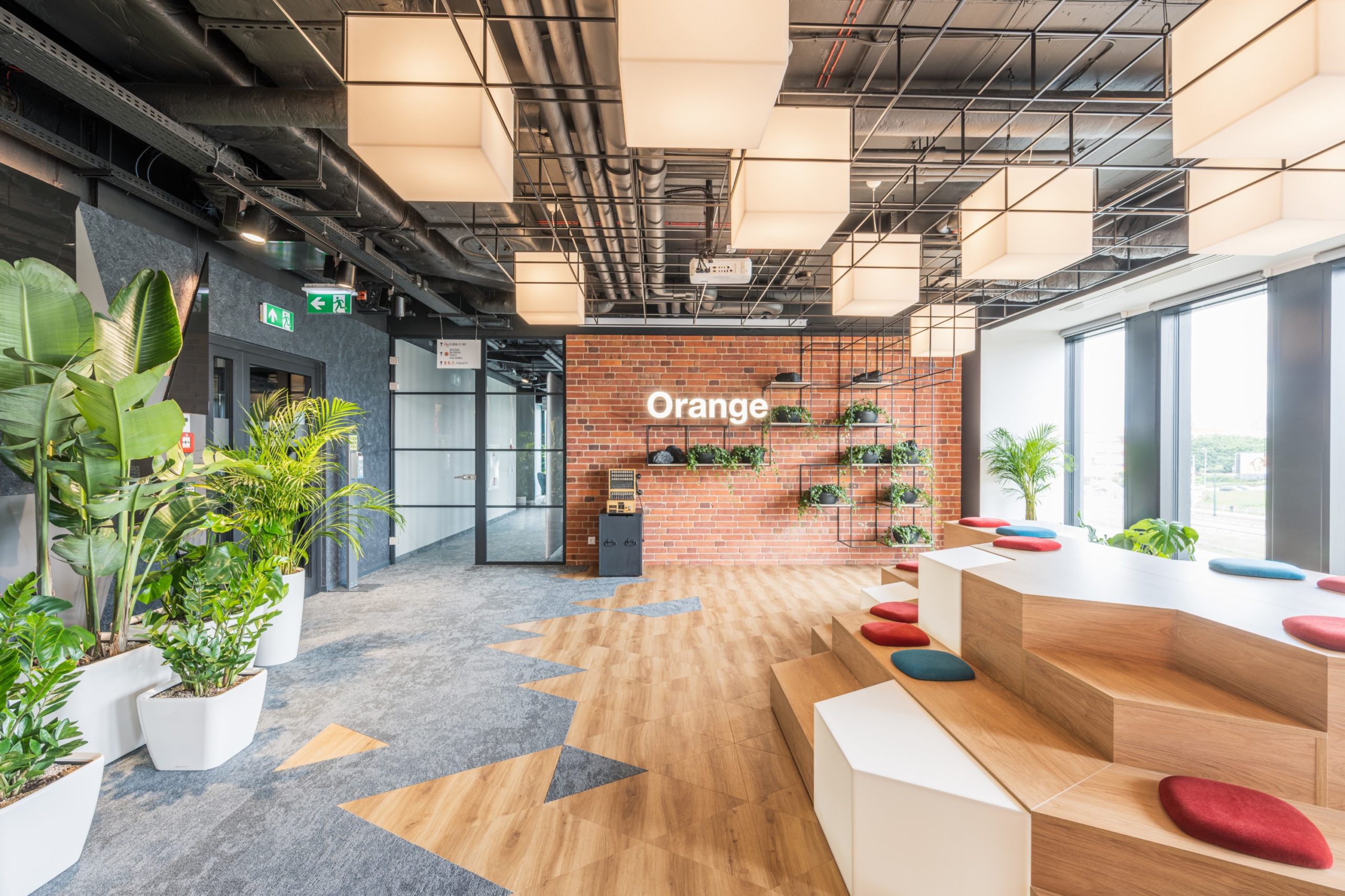
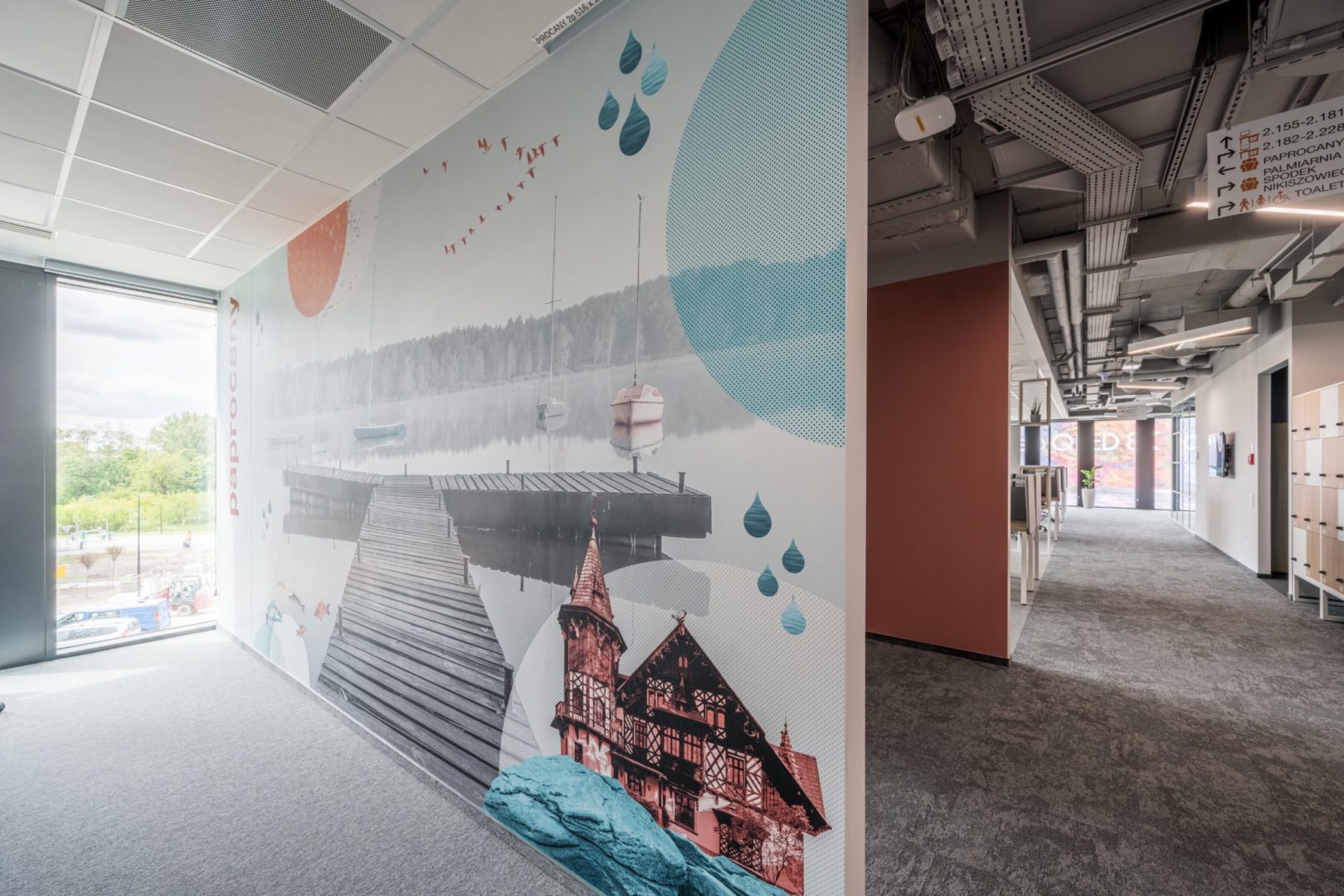
On the third floor of the office building, we decided to pay tribute to working-class Katowice – with its industrial red-brick architecture and the mines that shaped the region. Take a tour of the working-class Nikiszowiec district and the Kleofas and Hamelba mines.
Katowice modern
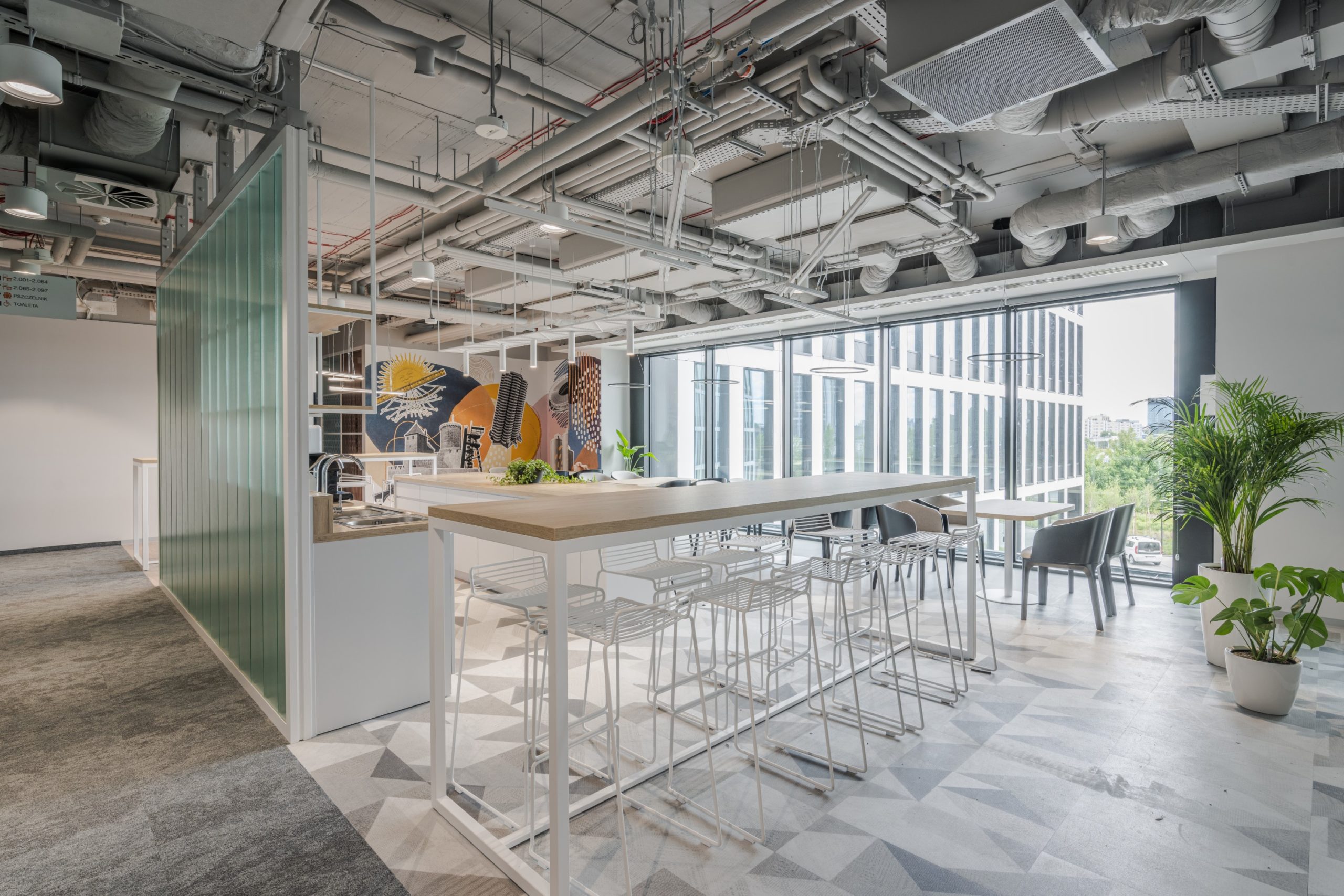
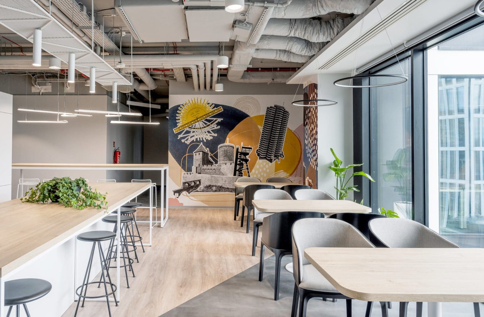
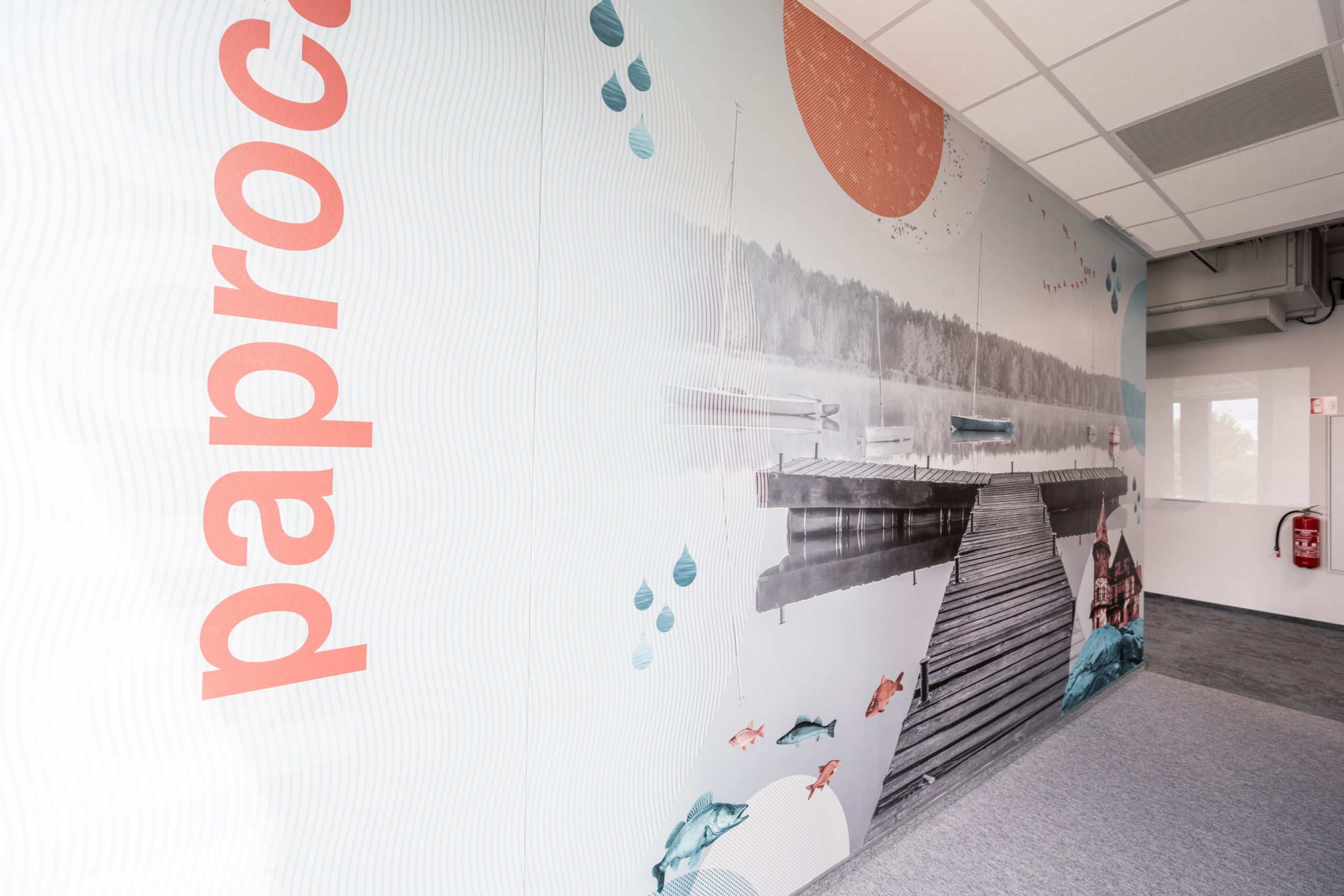
On the second floor, we made a collage with recognizable Silesian locations in the kitchen and dining room, and hung posters with the architecture of Katowice in the passageways. What do you think of such a bold combination of vector graphics and photographs? It’s a good way to identify the office not only with the brand, but also with the place where it is located. Locality above all!
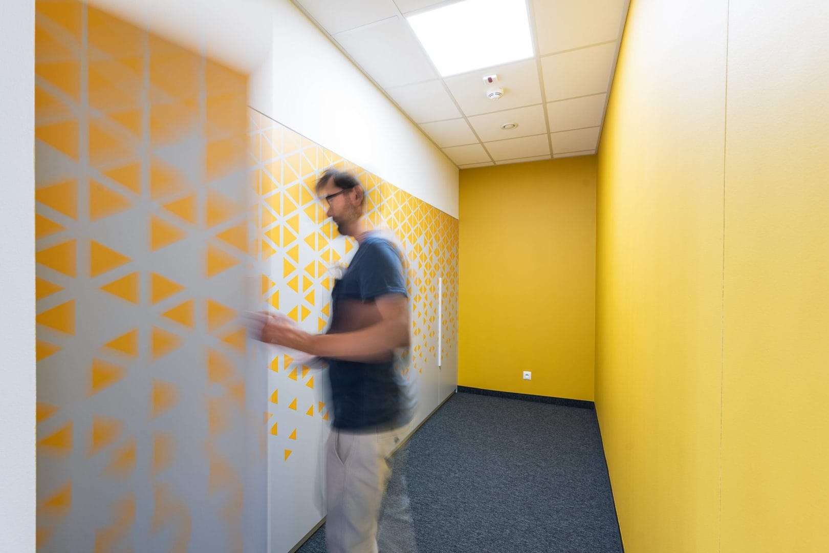
Checkrooms
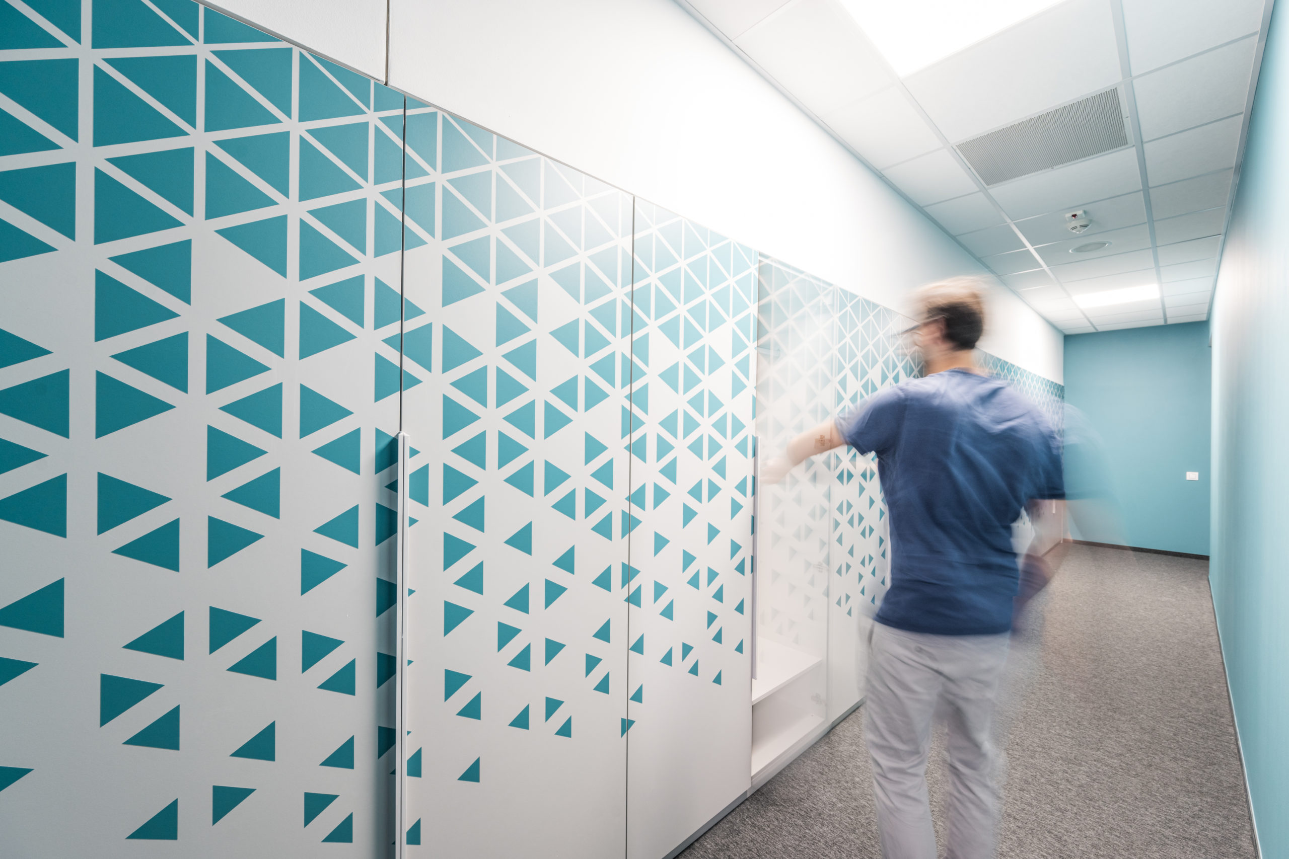
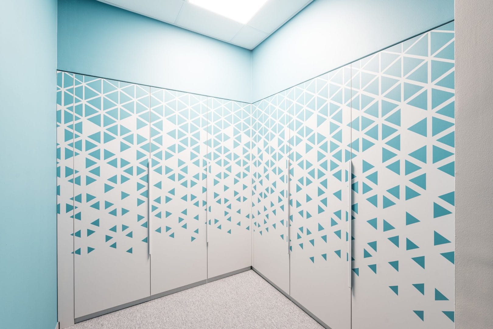
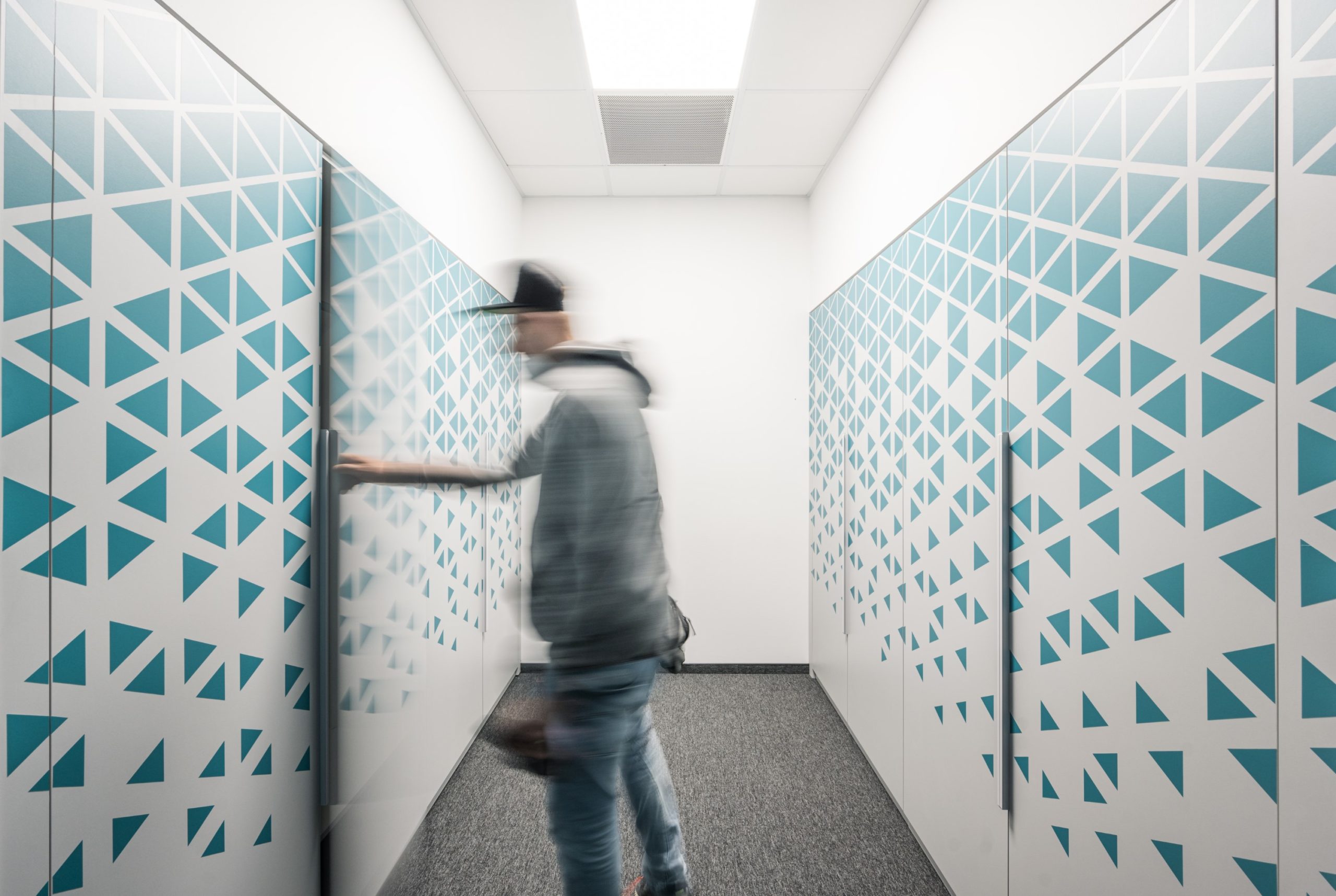
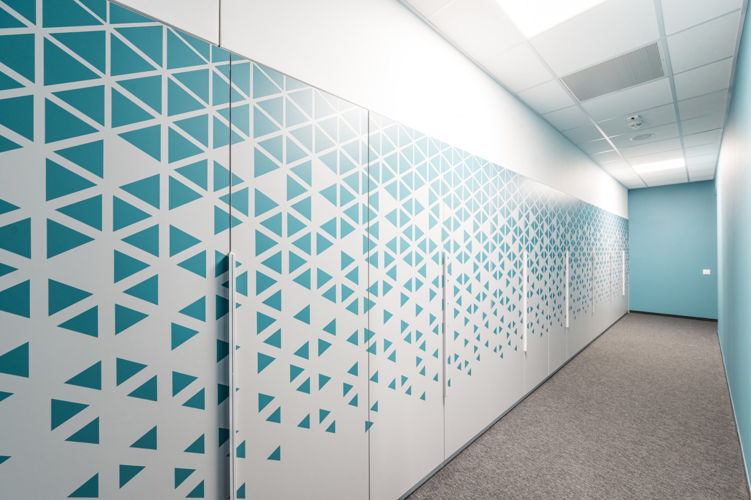
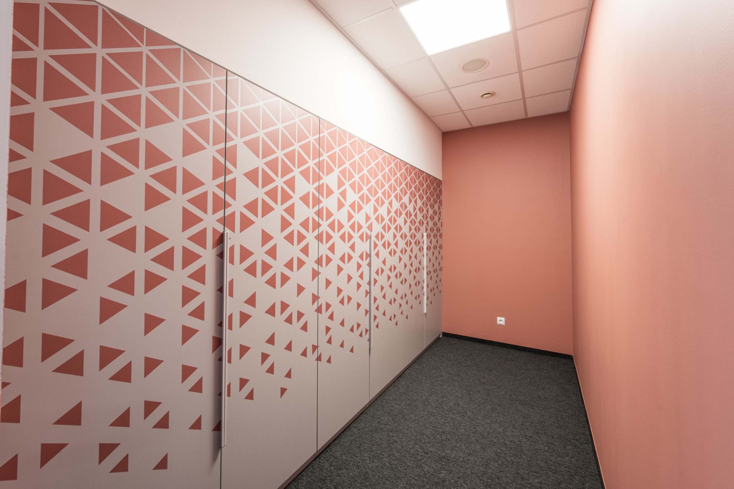
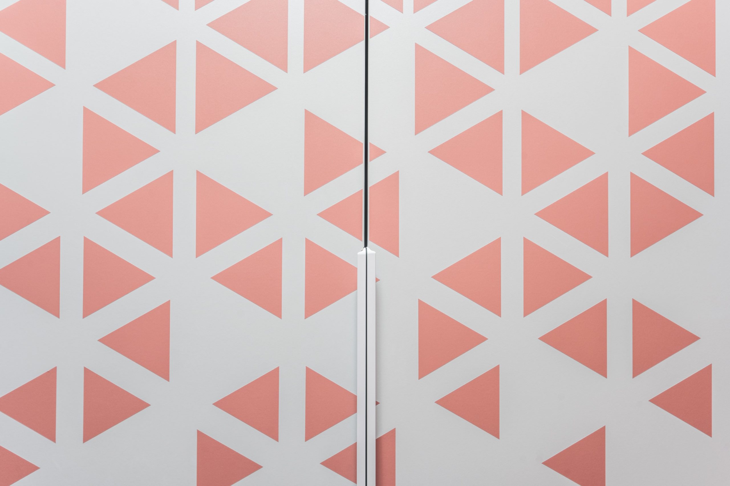
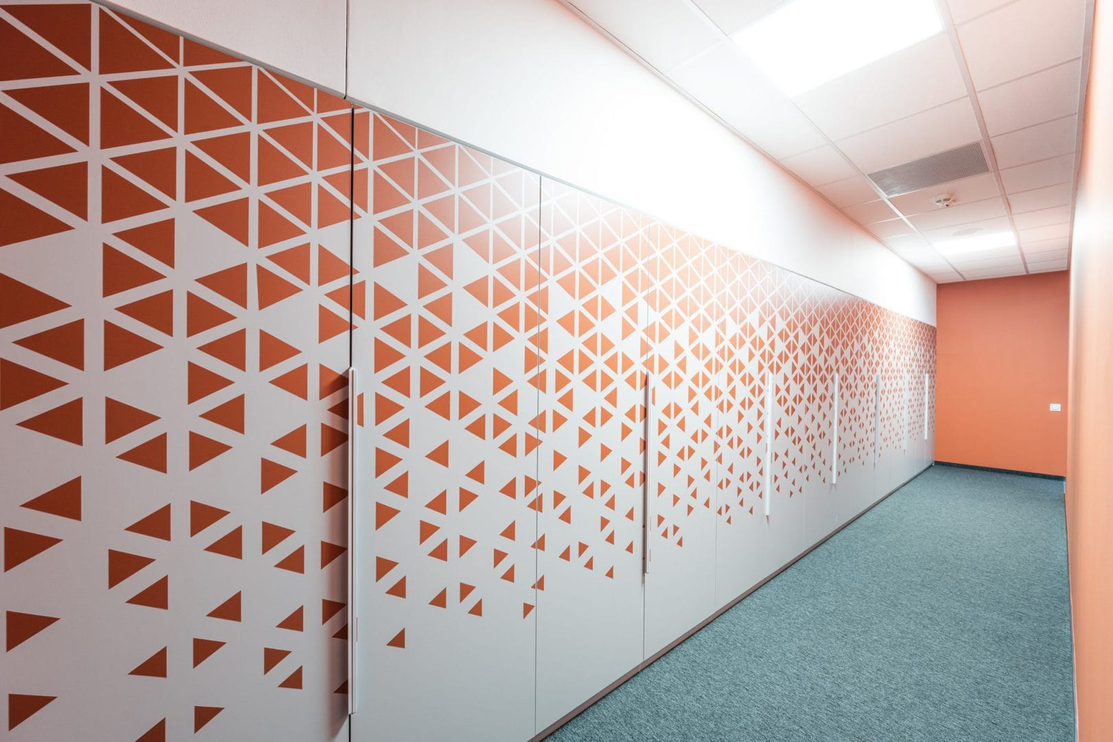
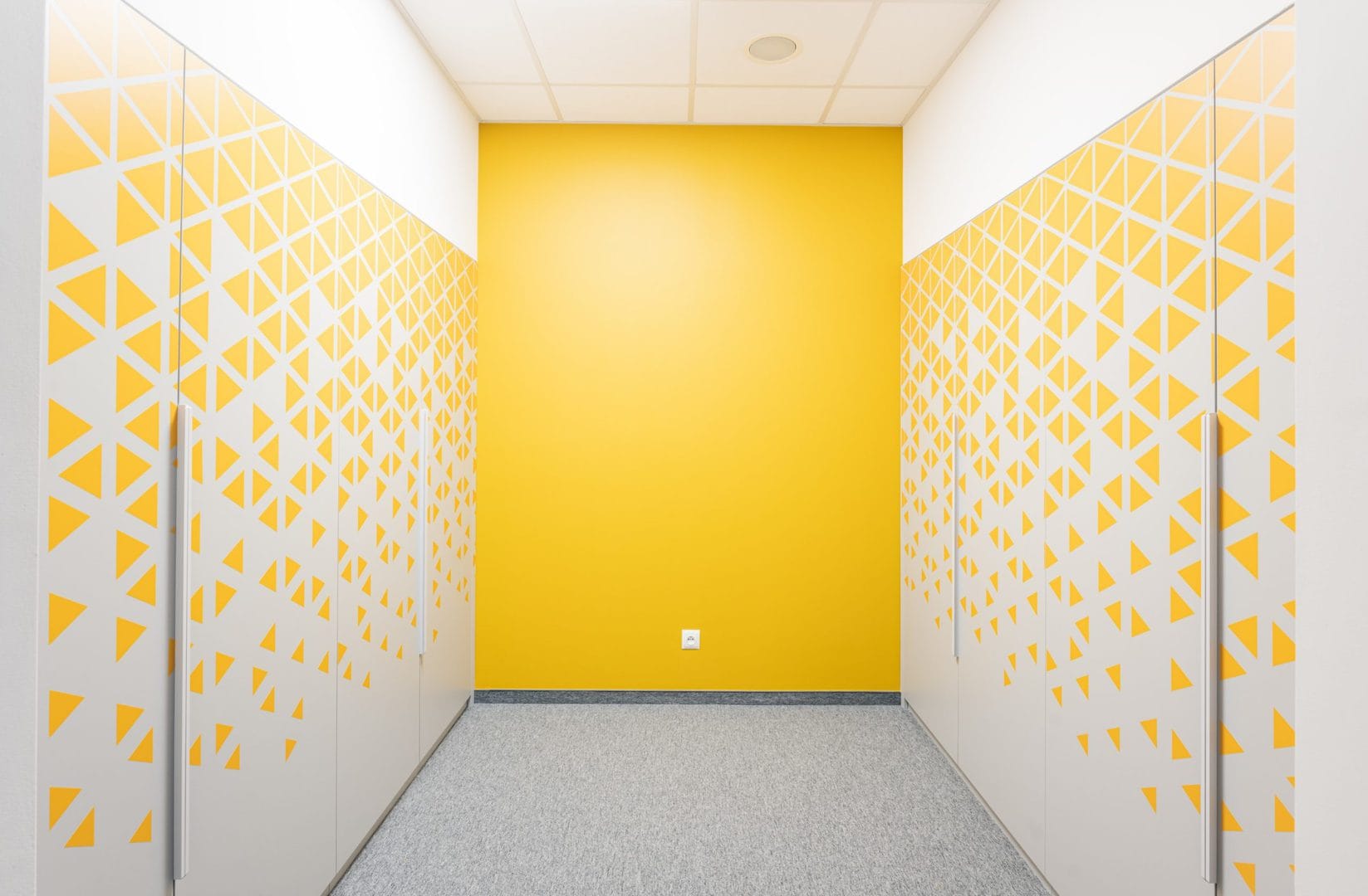
We also found a way to make the locker room with its numerous gray cabinets more attractive. We designed a consistent pattern of stickers for the cabinets, which refers to similar geometric forms that exist in the office on the glazing.
