Space branding inspired by pop culture
Poznan
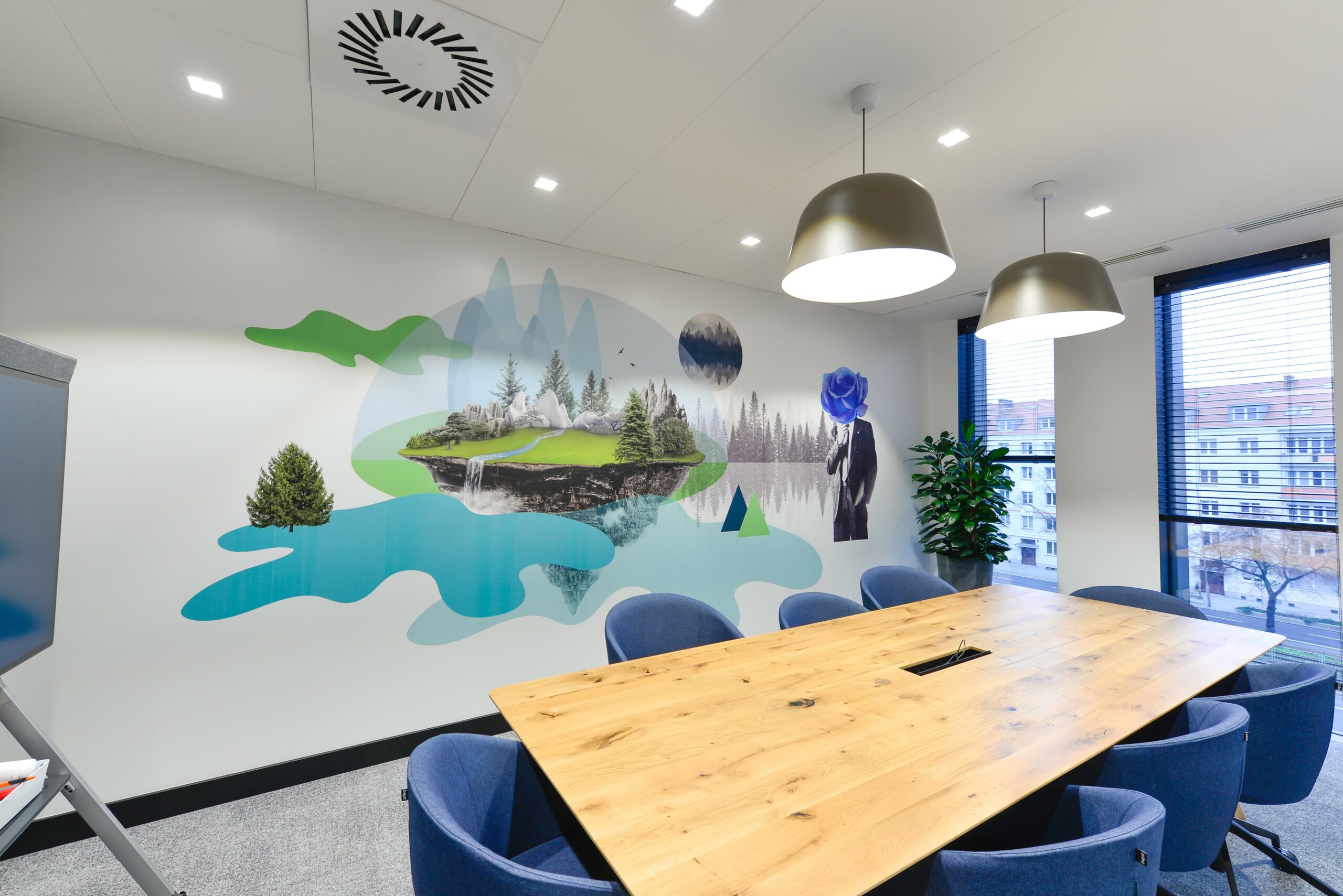
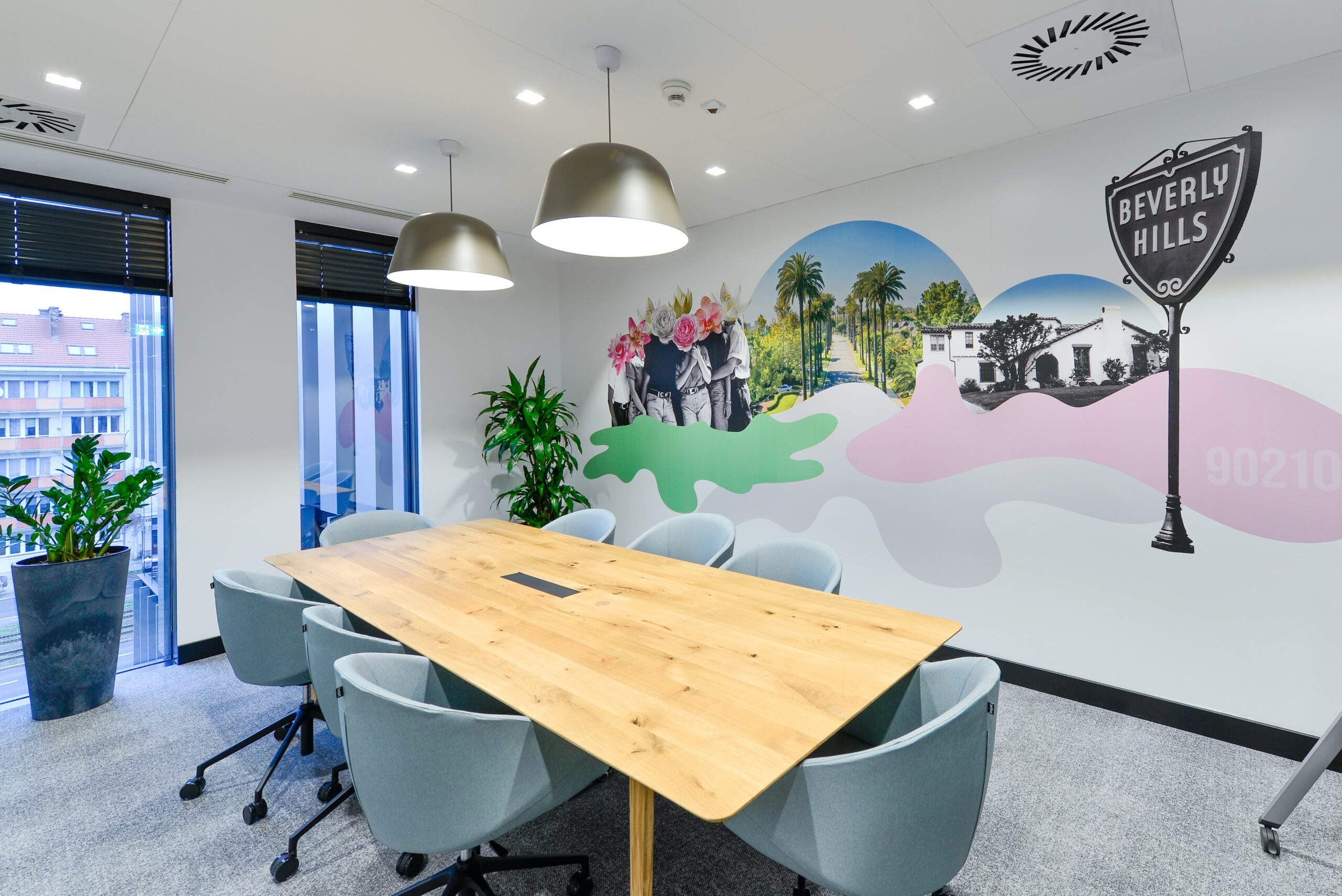
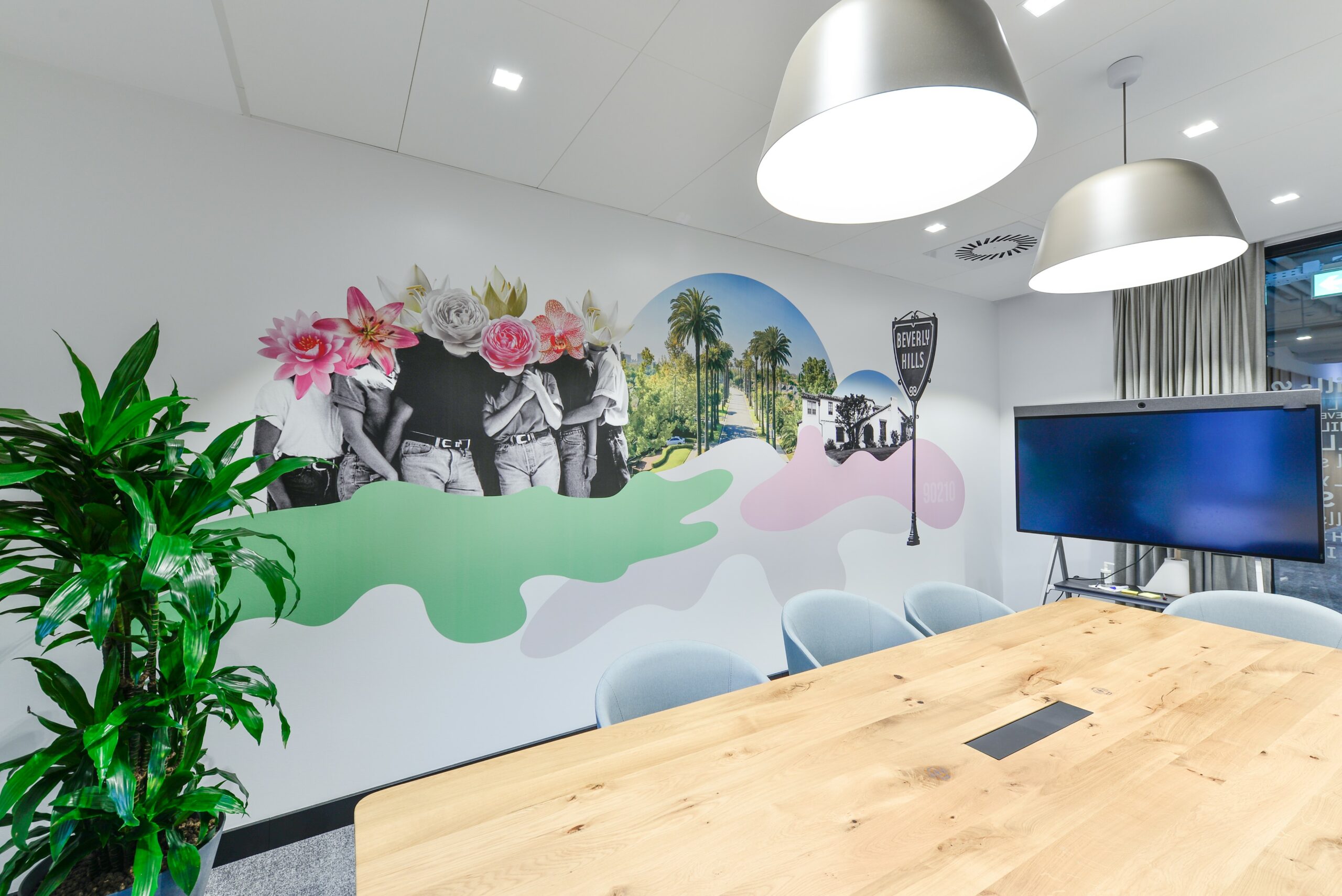
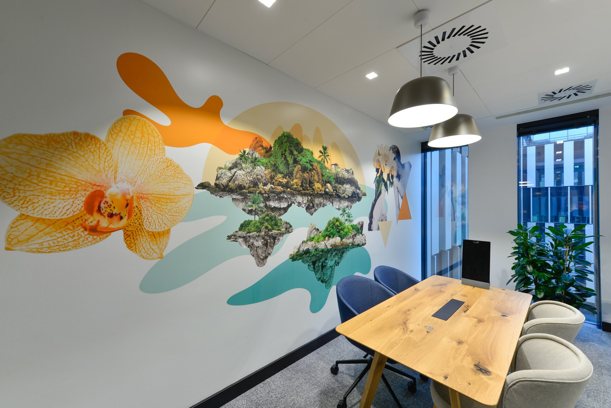
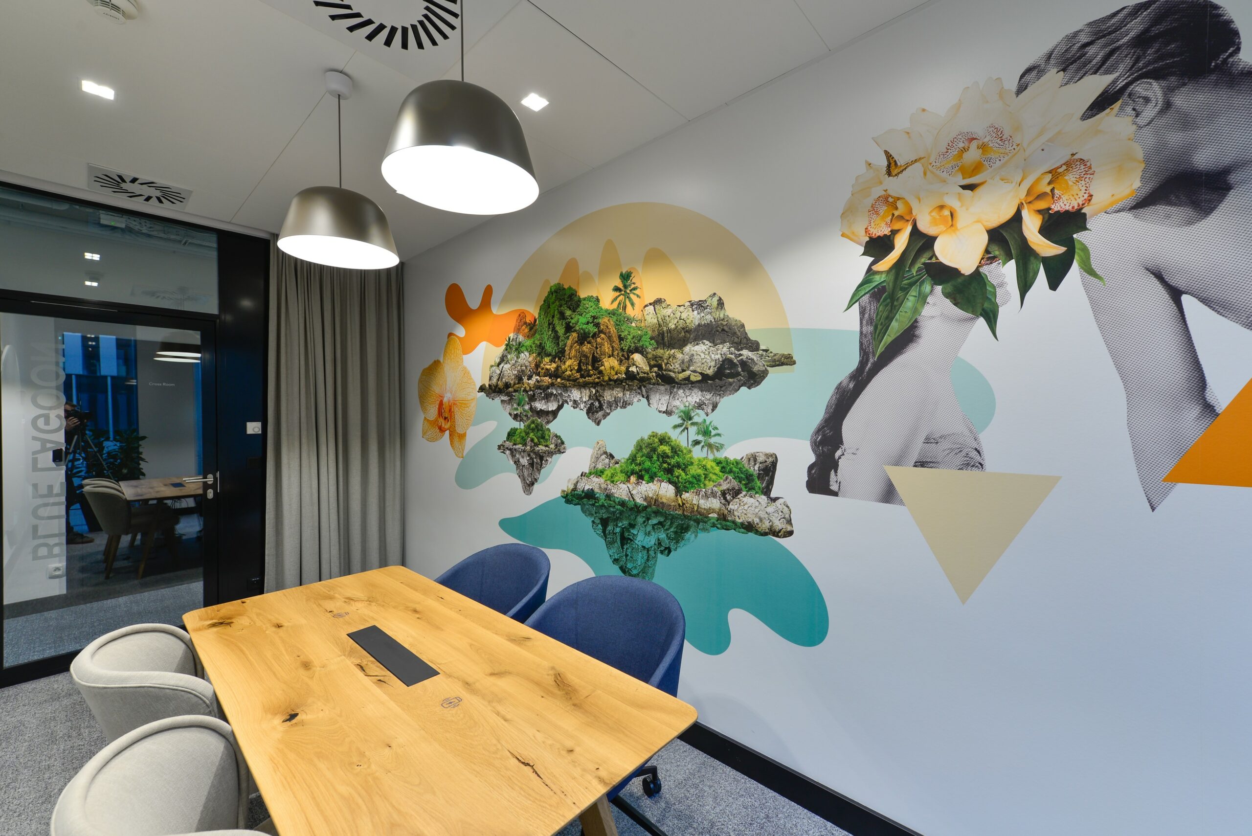
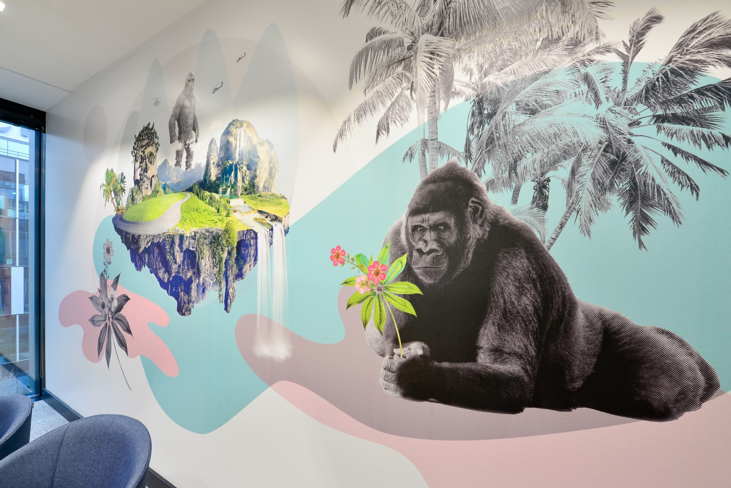
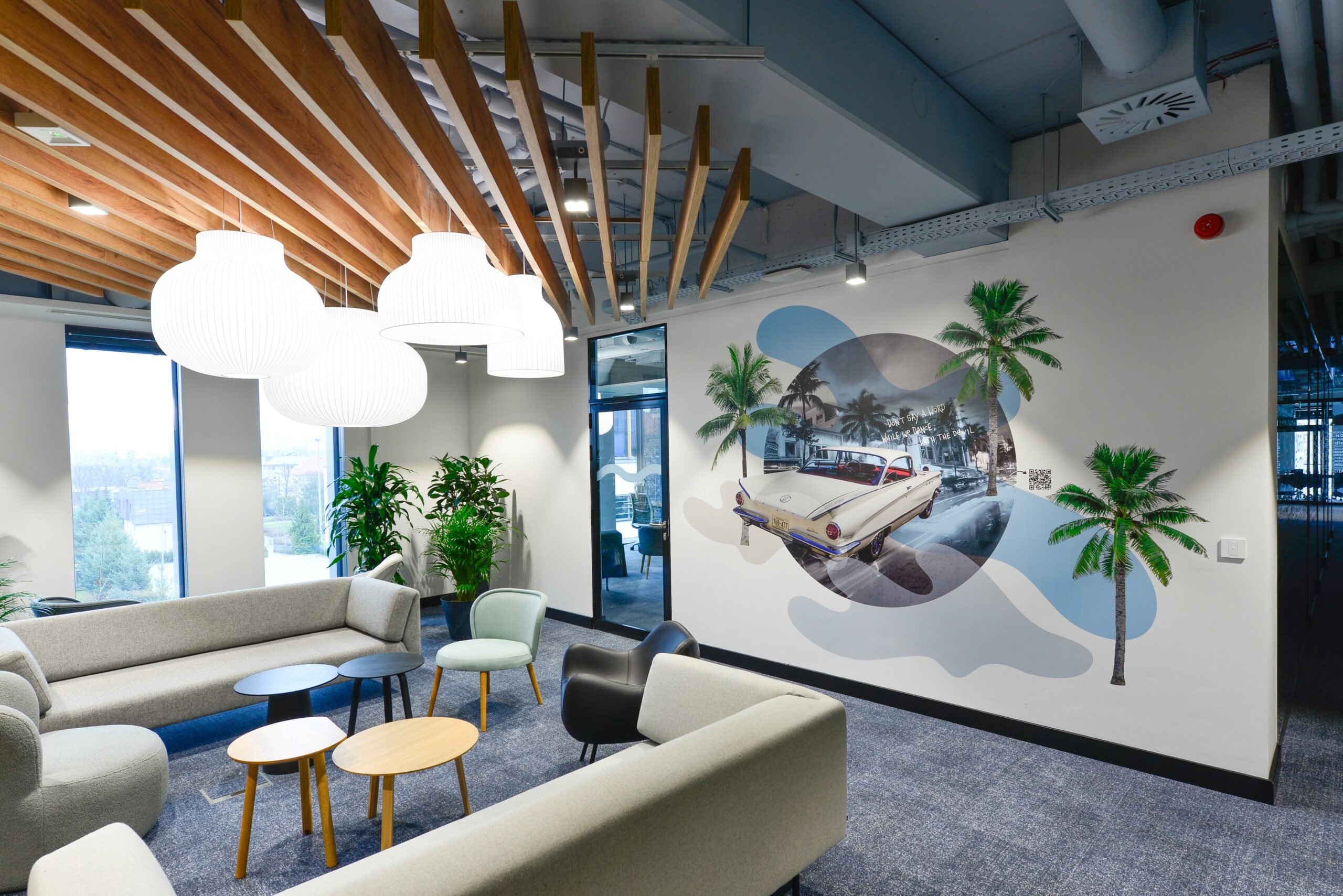
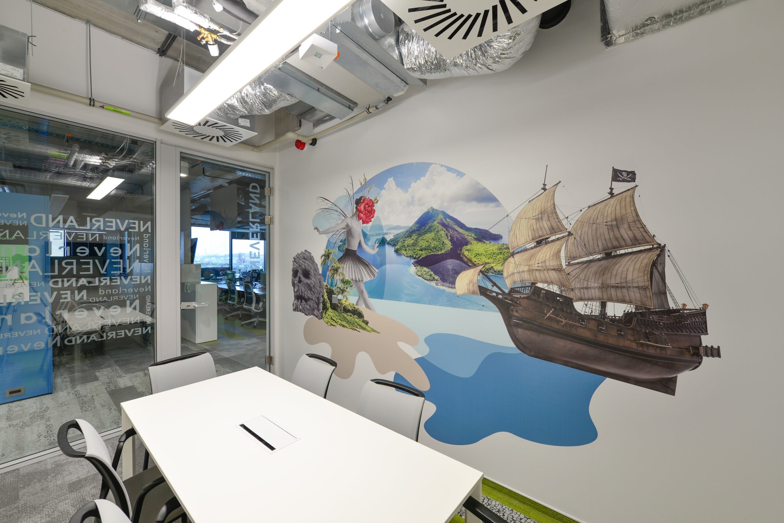
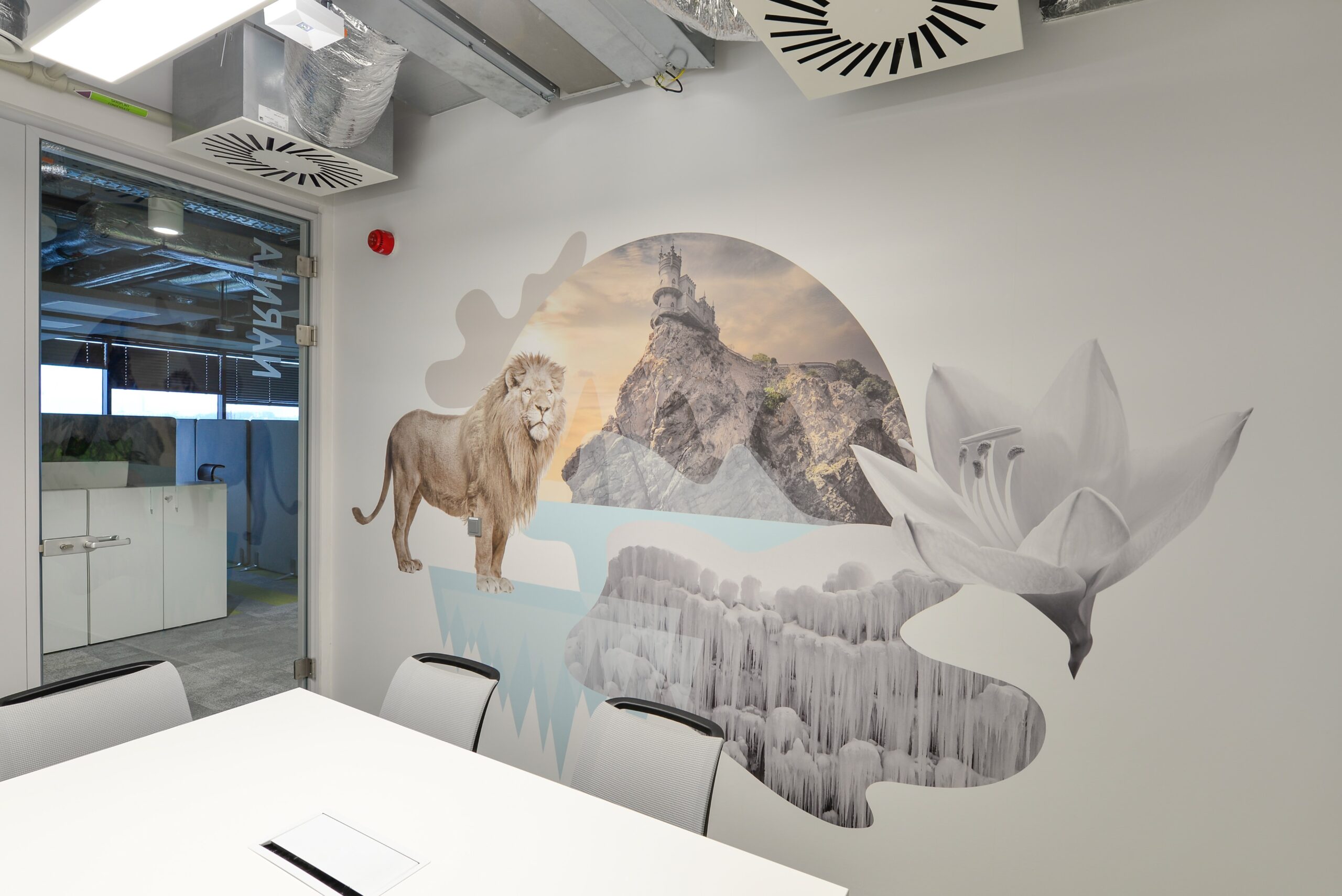
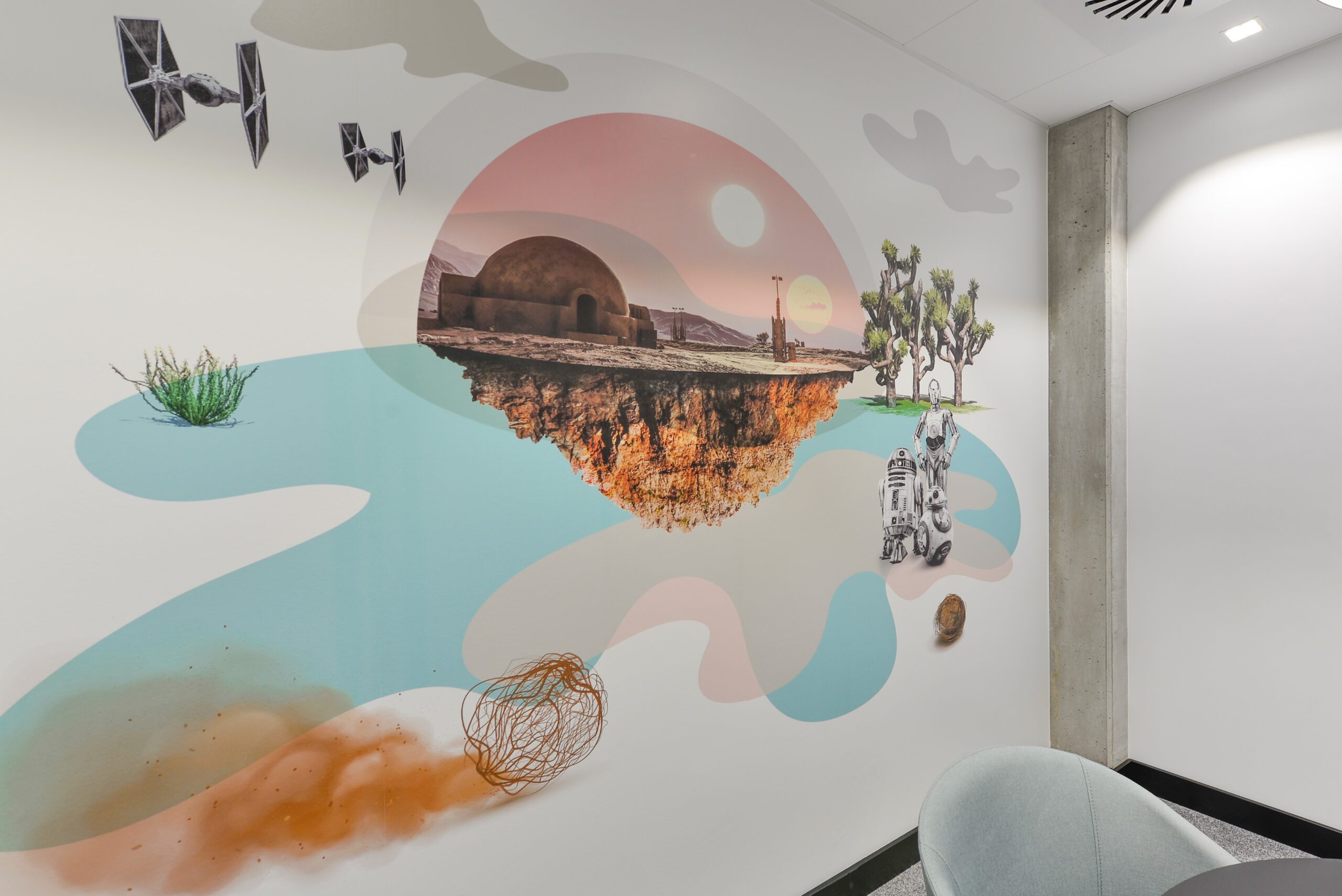
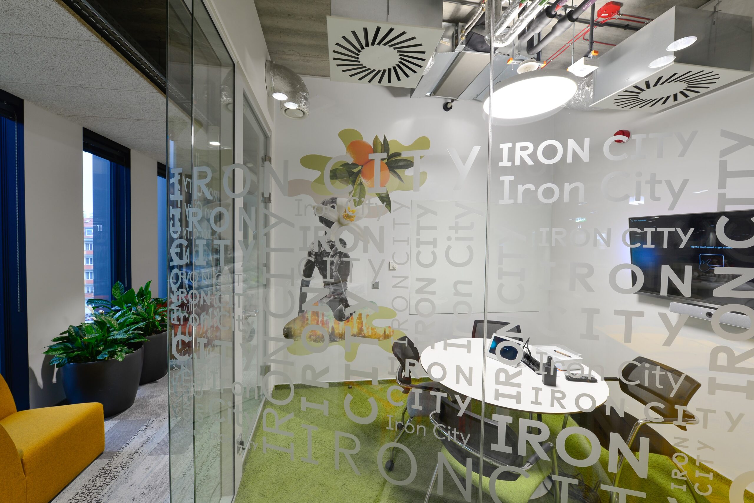
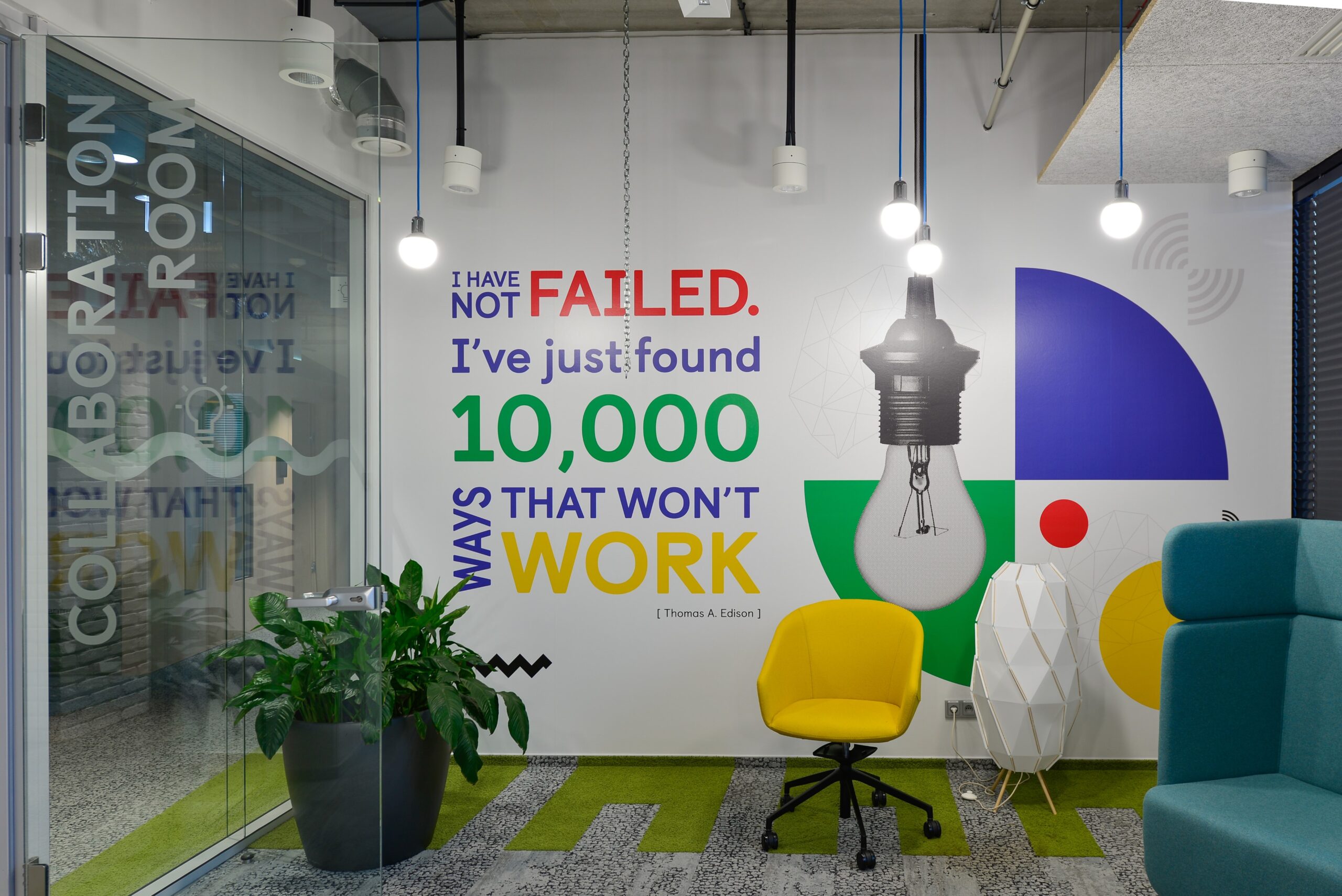
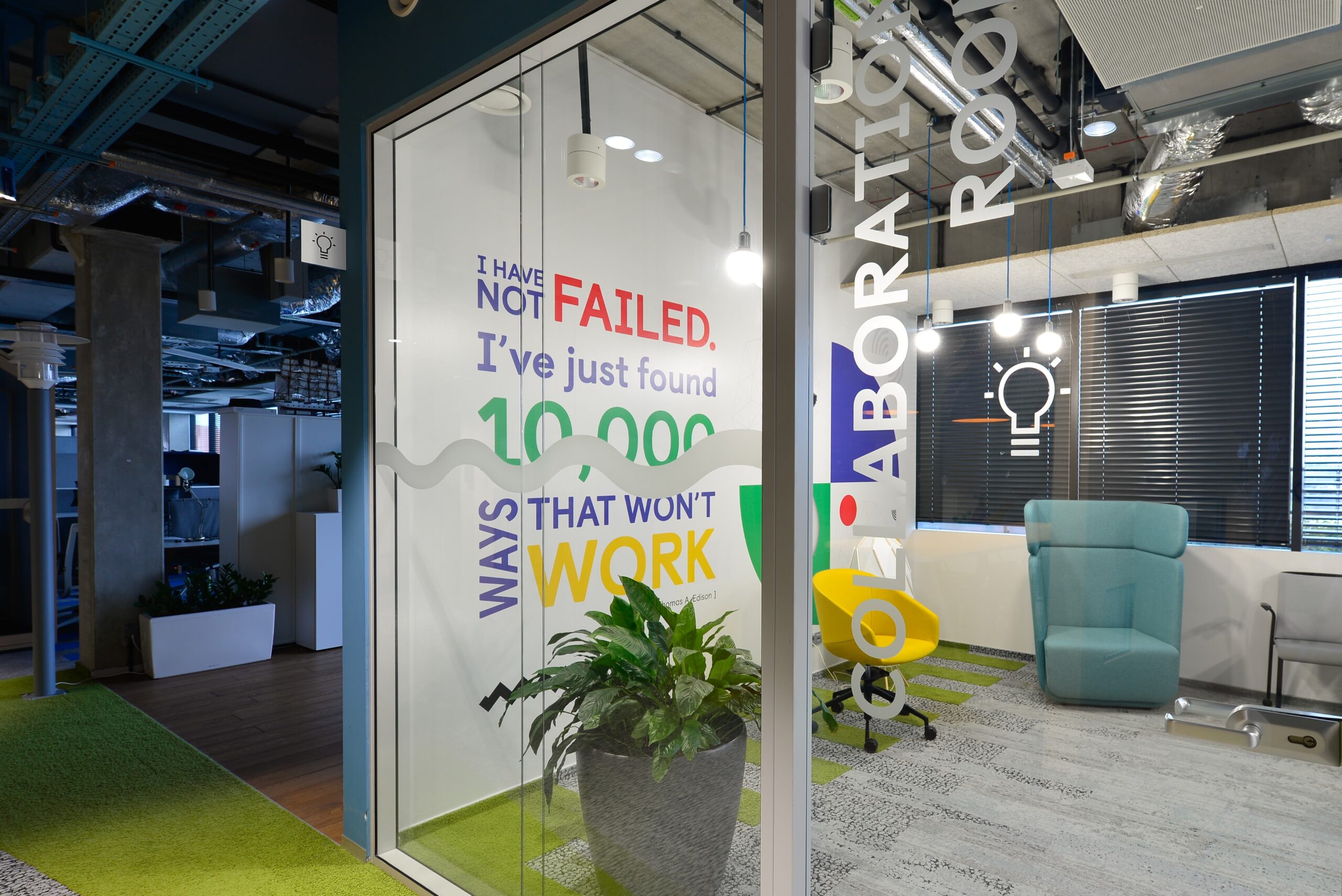
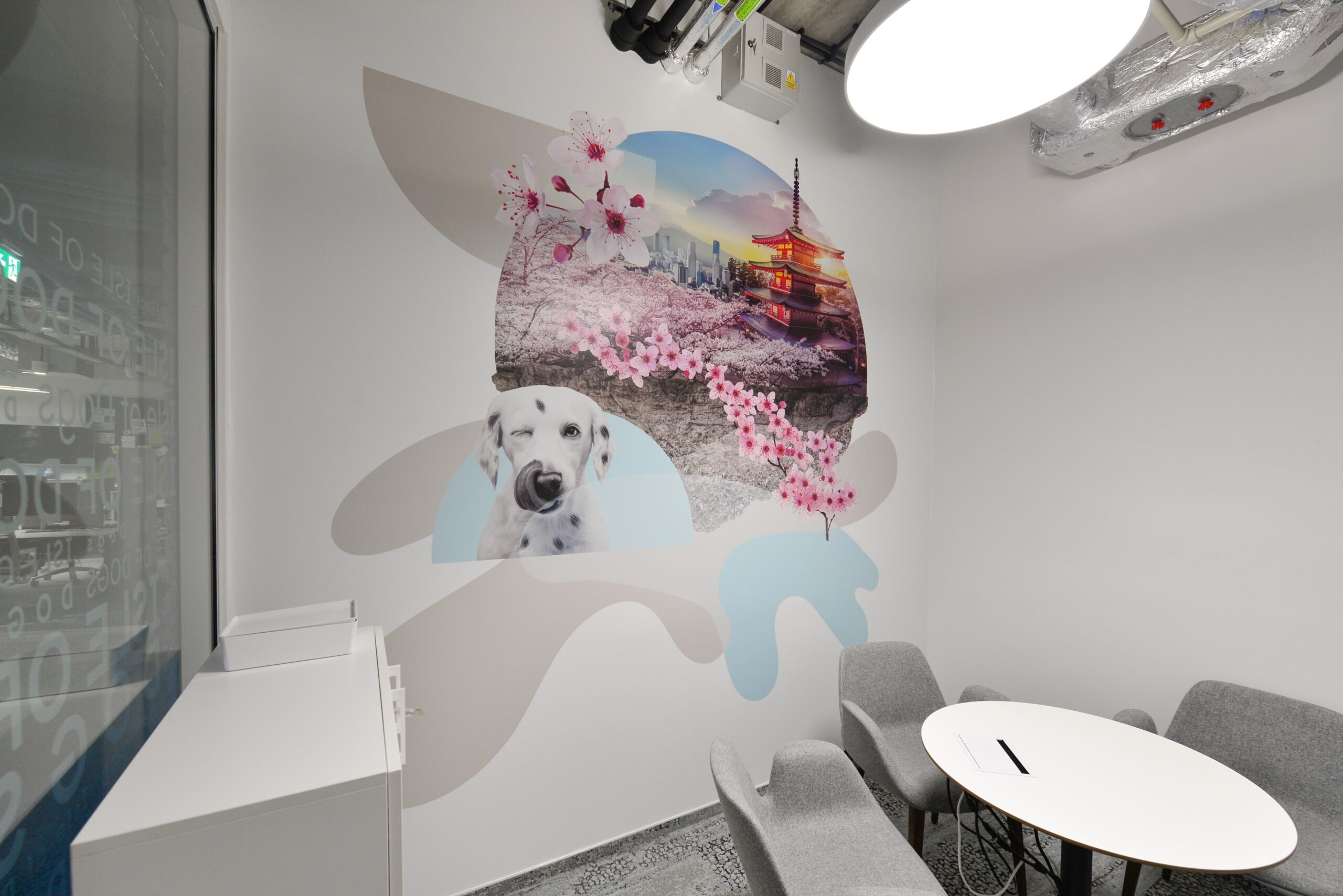
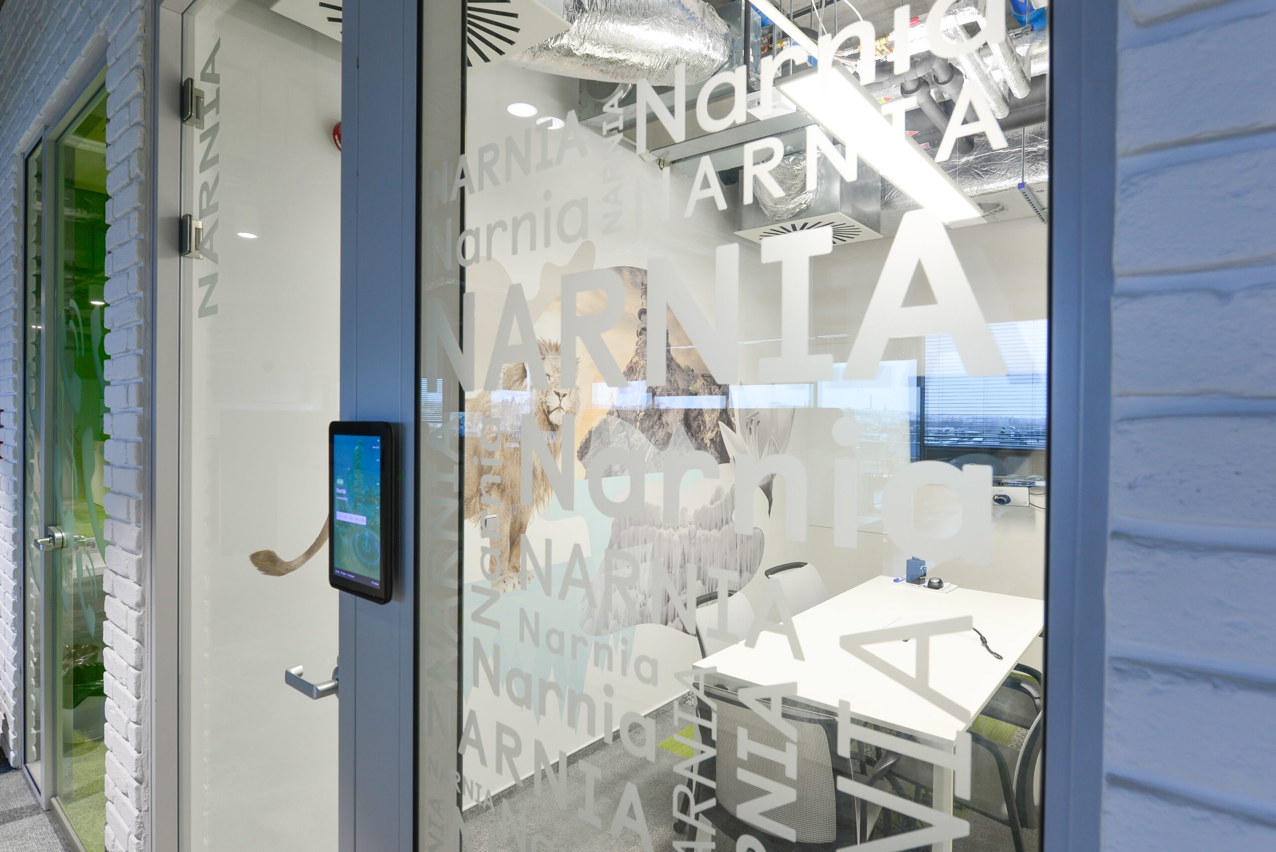
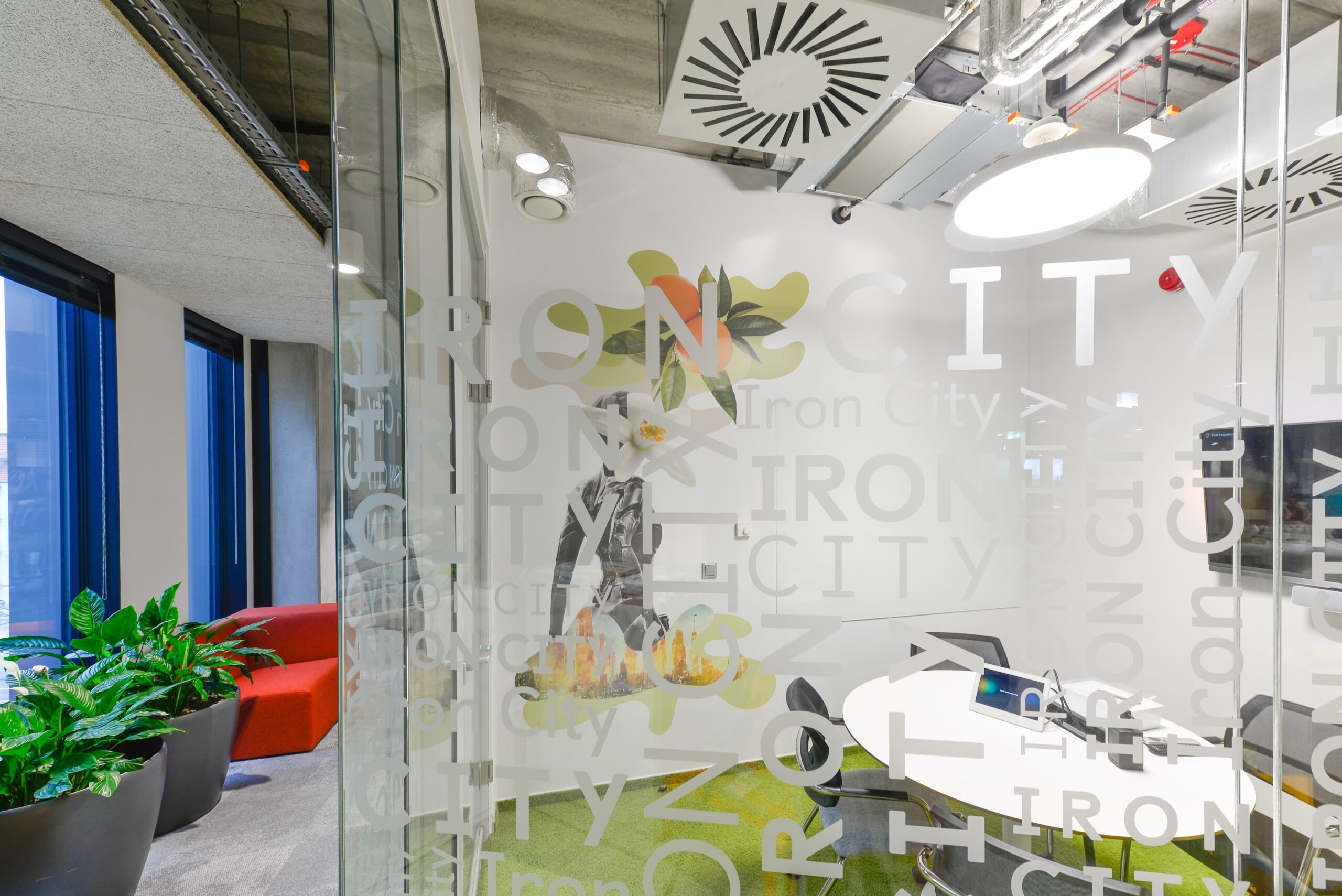
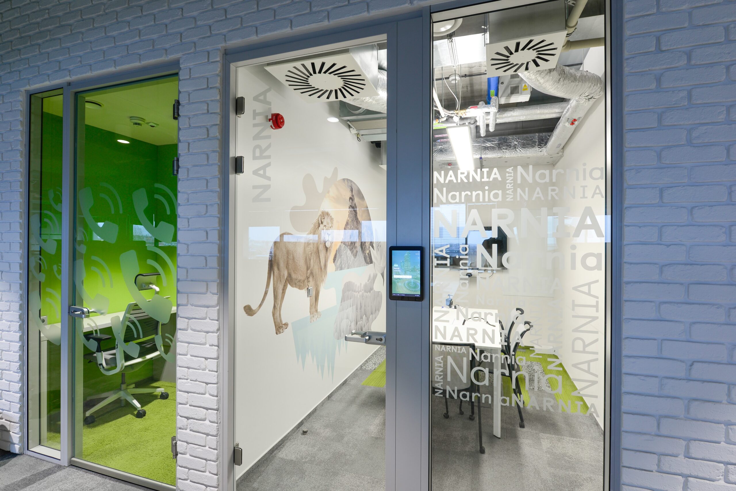
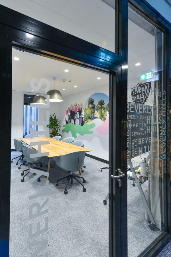
Another challenging and extremely complex project is behind us. This time we worked in Poznan, at the headquarters of a well-known and respected brand, and our task was to create stylistically consistent wall graphics for dozens of meeting rooms. The naming of the rooms, and thus the graphics placed in them, were inspired by places, lands and universes from pop culture in the broadest sense.
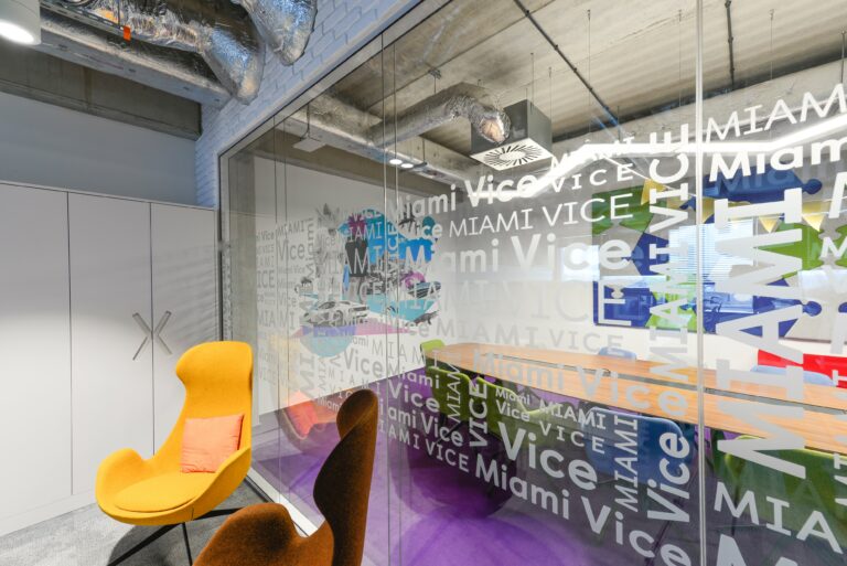
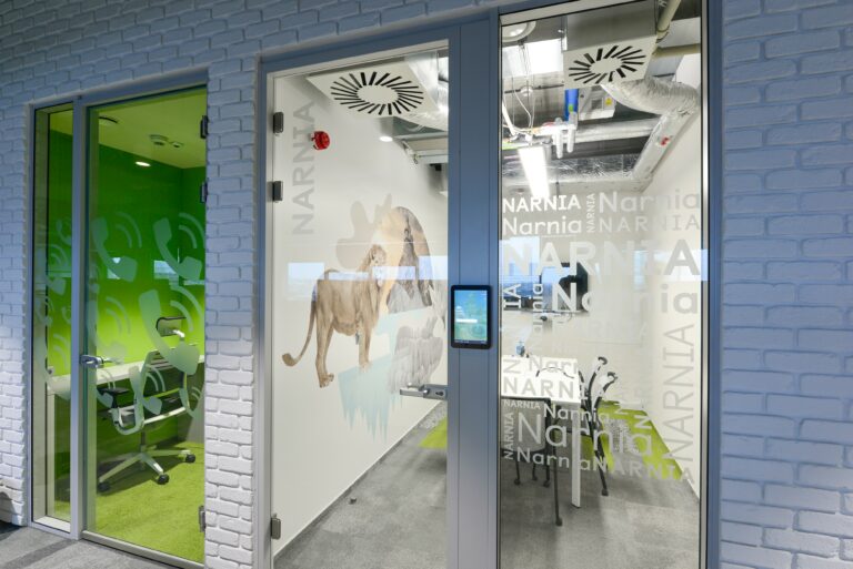
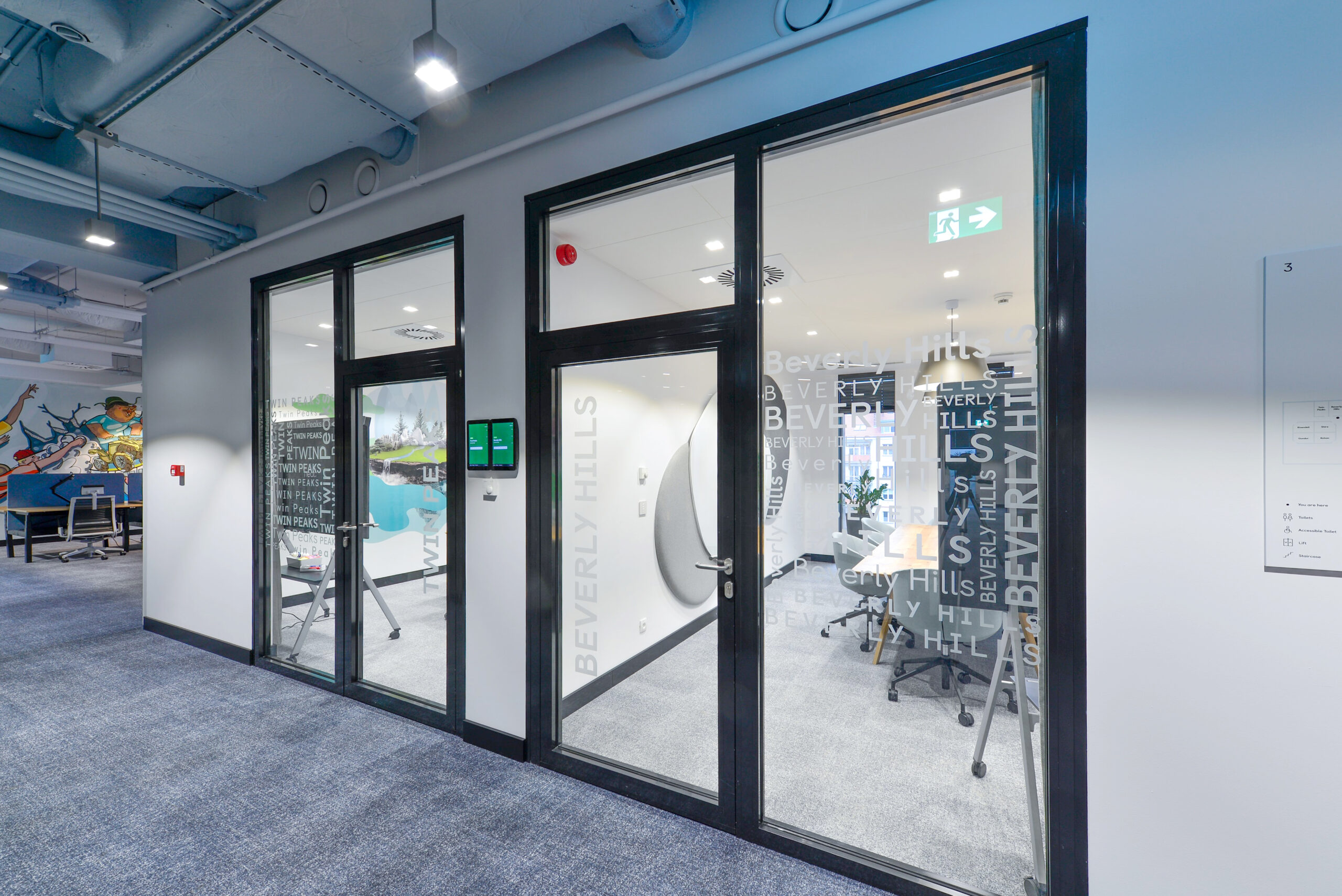
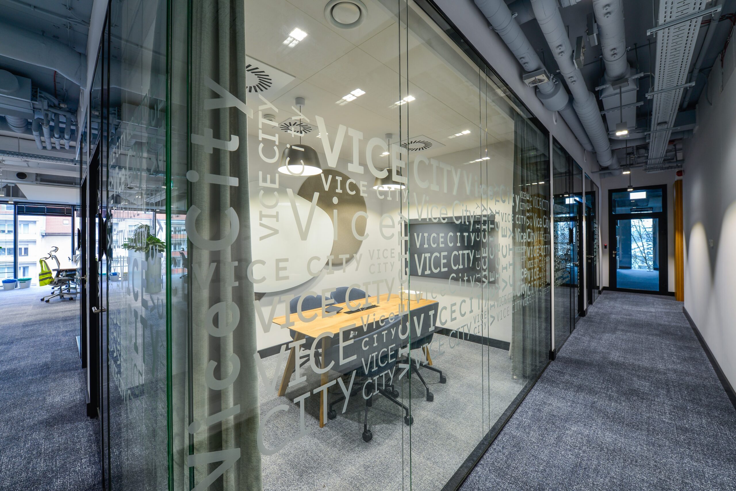
We also made consistent frosted film designs for glazing, as well as a complex wayfinding and signage system.
Choose your universe
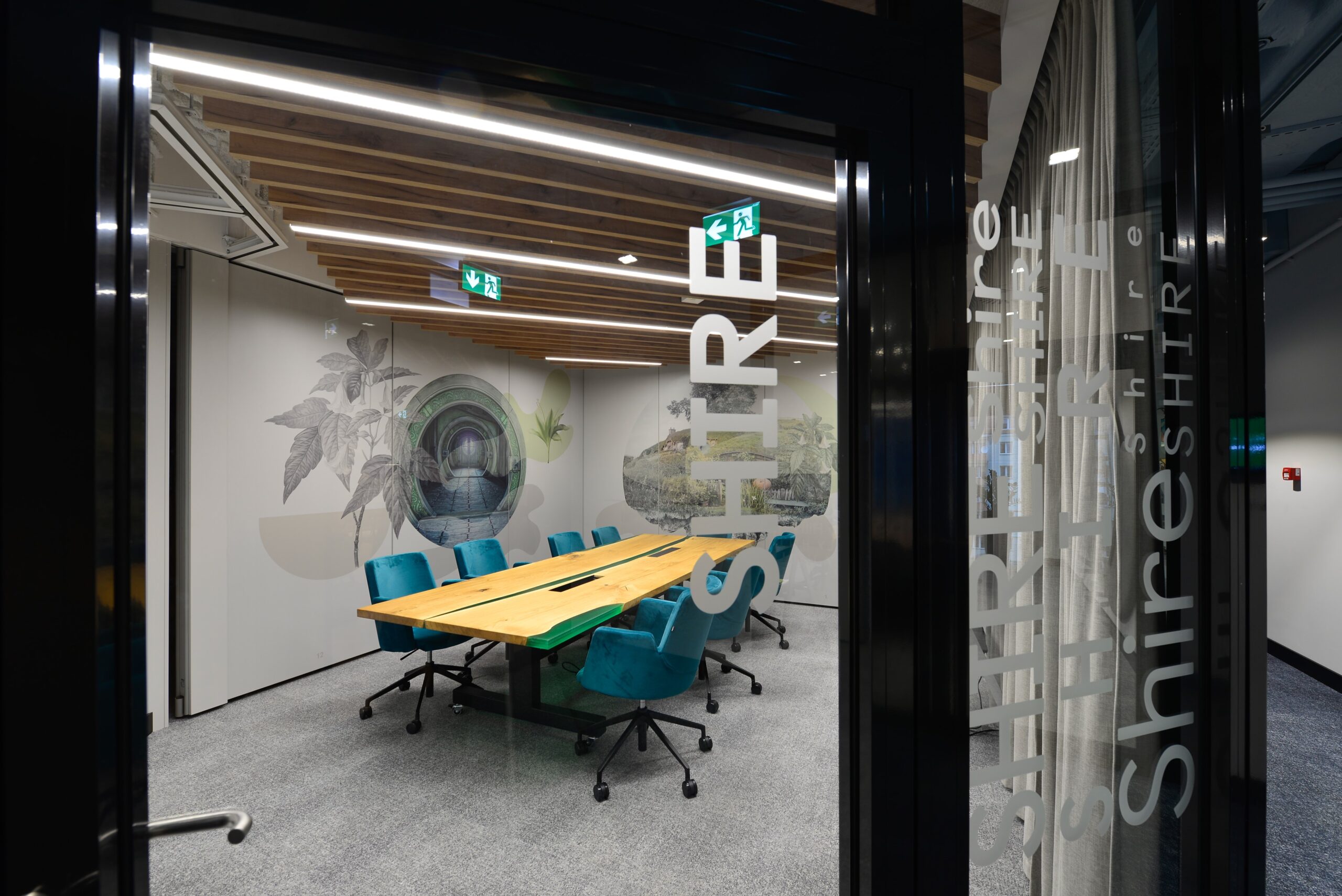
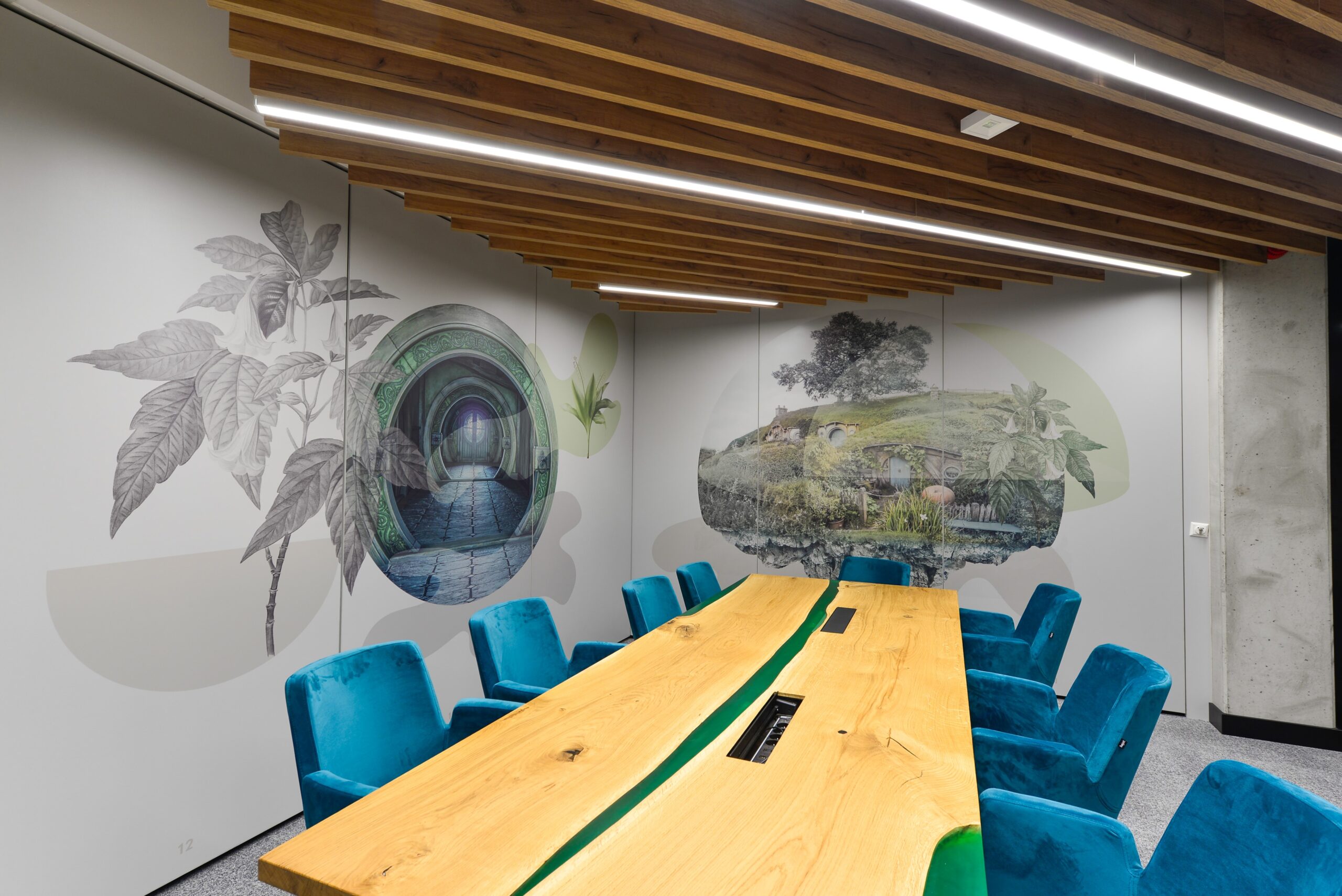
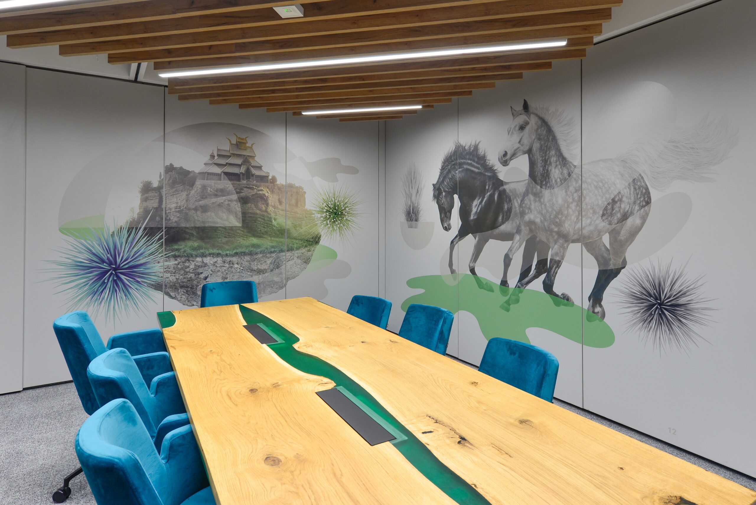
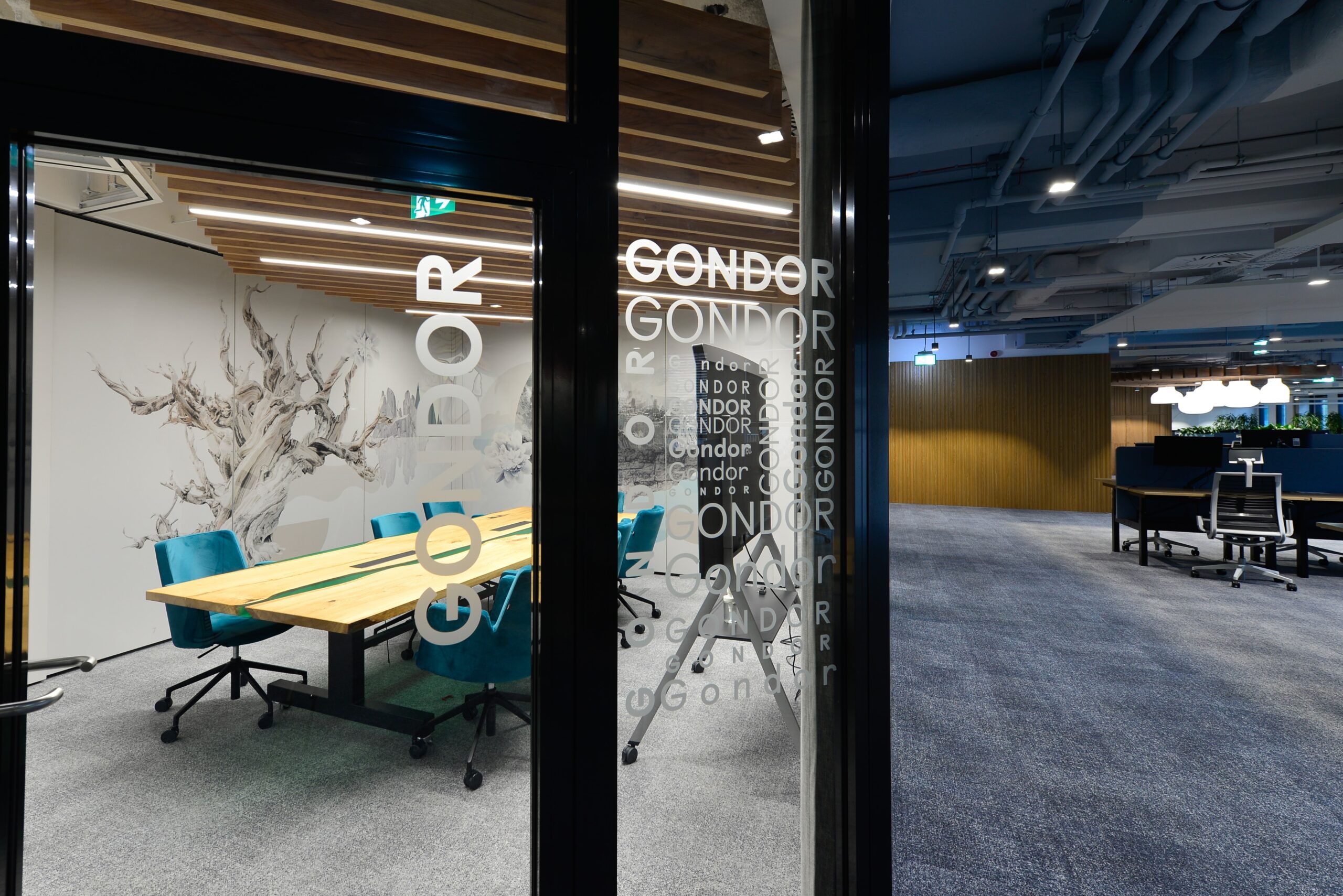
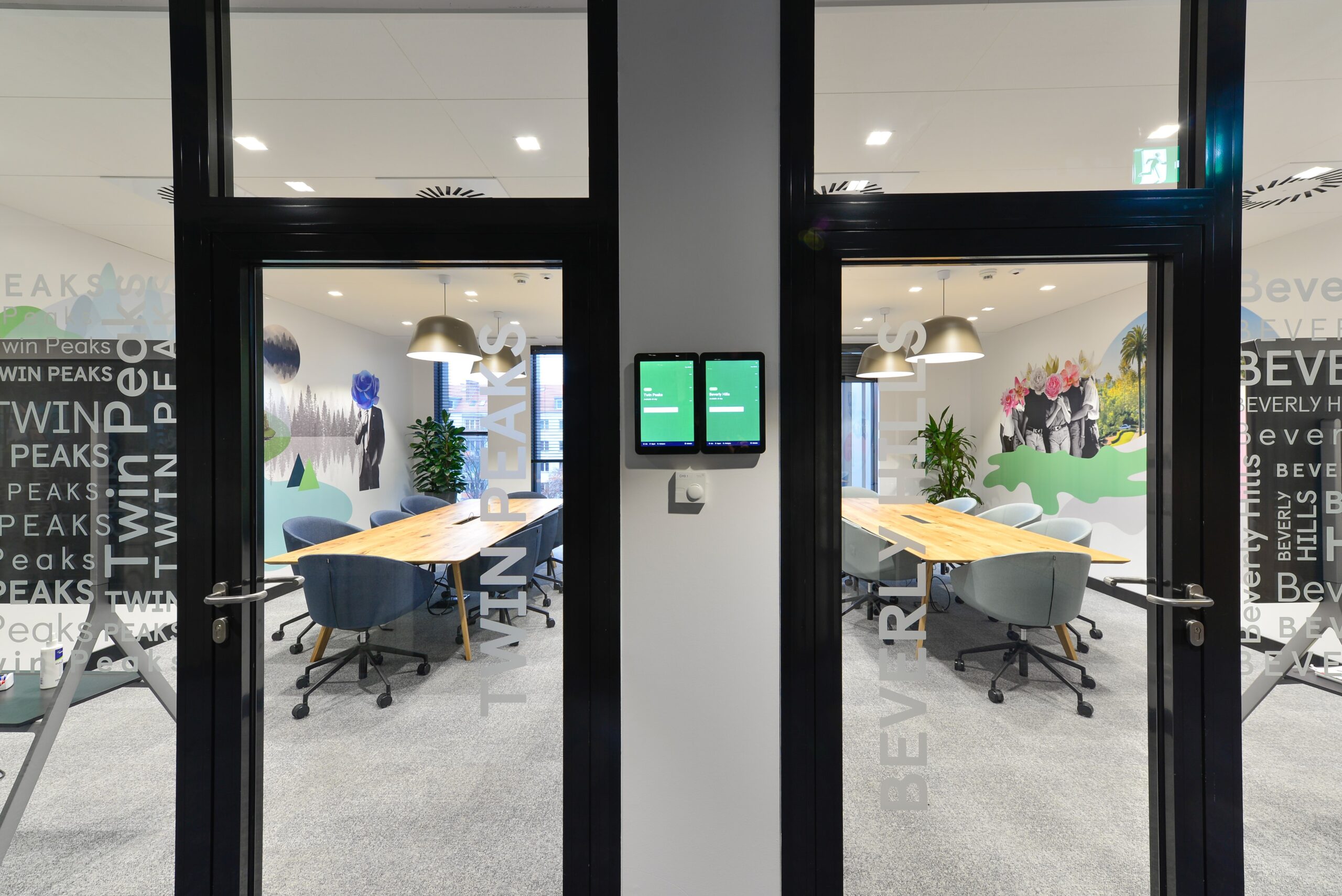
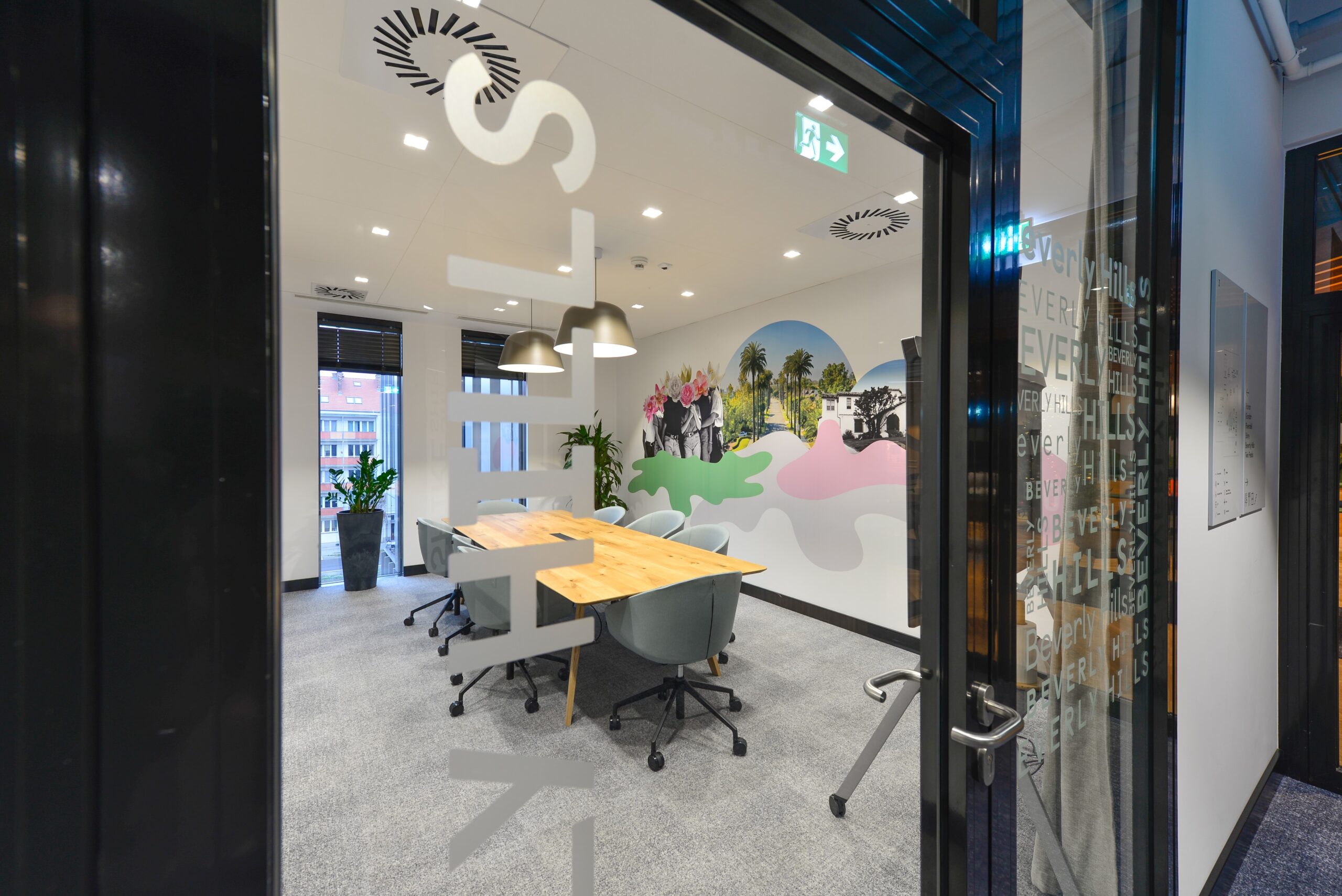
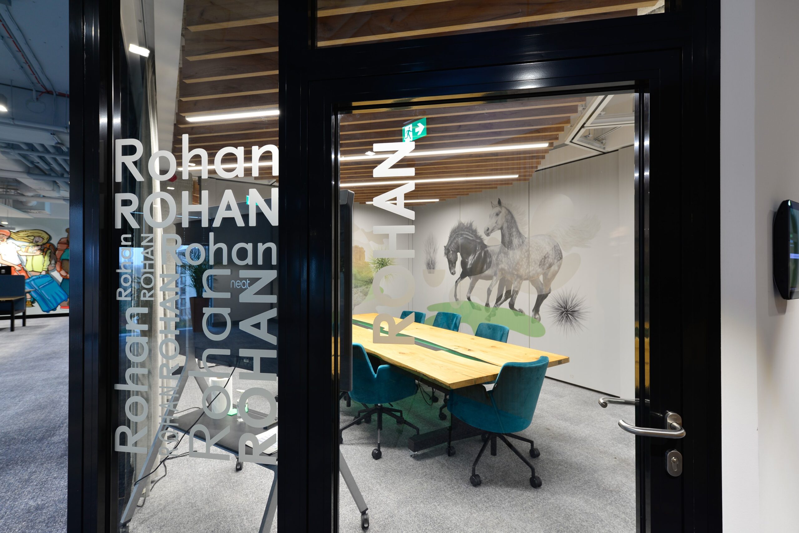
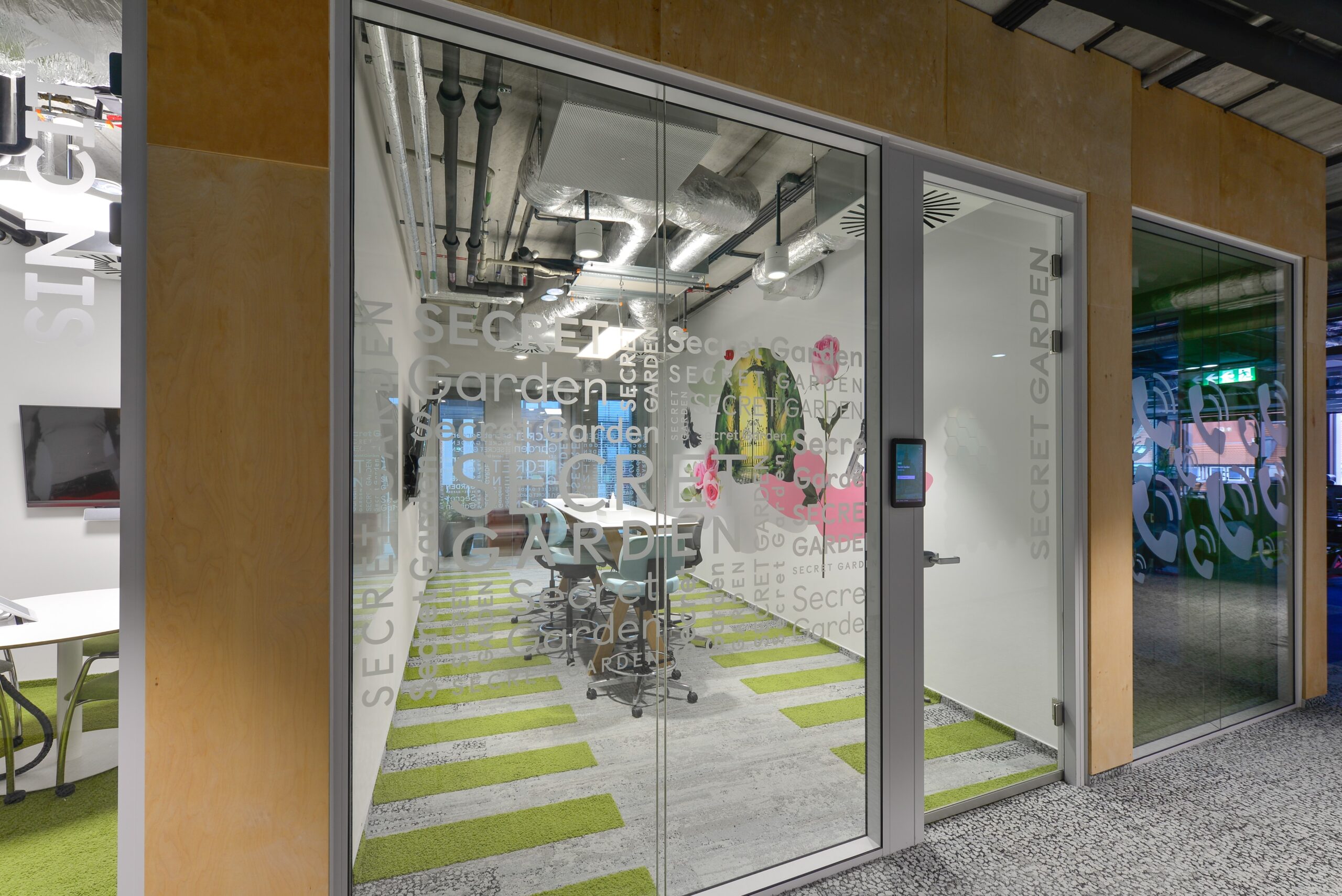
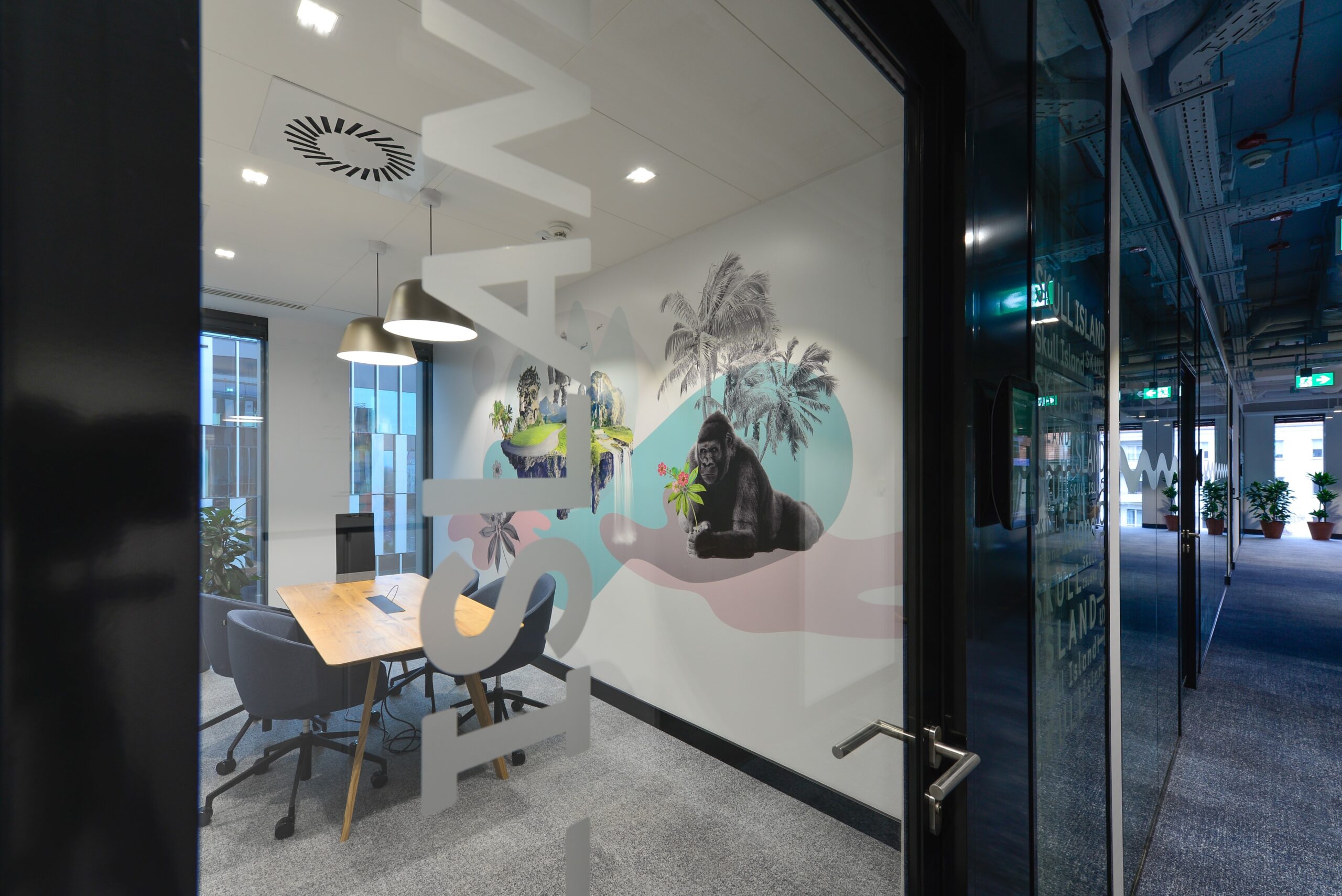
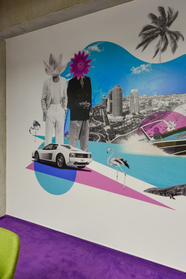
Together with the client, we selected various works of pop culture – movies, books and classic stories – and the locations appearing in them, and then created original collages, composed of elements characteristic of the plot or symbolism of a given universe. On the glazing we placed, weaved from frosted foil, typographic patterns with duplicated names of the rooms. In this rich juxtaposition, everyone will find something they know well and that will bring back fond memories. The executed graphics invite the user to find the meaning of the various elements of the collage.
For this type of project, we could not use original art bags from movies or games, so we proposed to create stylized collages that consisted of relevant elements, obtained legally and in a non-infringing manner, but associated with a particular land. In addition to symbolism specific to the universe, its characters and content, each graphic also featured specific plants appearing in the plot of the chosen story. Graphics created in this way are not only a decoration for the office and a way to distinguish the numerous meeting rooms. In addition to their space branding function, they are an element of interaction, triggering interesting discussions or a fun way to read the symbolism of the graphics.
Mobile wall graphics
For the 4 rooms, which we gave the names of the lands from The Lord of the Rings (Shire, Gondor, Rohan, Rivendell), we developed appropriate graphics – printed on transparent film, and pasted on sliding partitions.
The challenge here was to create four designs in such a way that each consists of two graphics that can function independently on the mobile walls and at the same time coordinate with the designs from the other halls. This way, when the individual walls are assembled and combined, the Gondor room can meet Rohan and the Shire will join Rivendell, with the styling and new composition being consistent and elegant with each wall combination.
Wayfinding & Signage
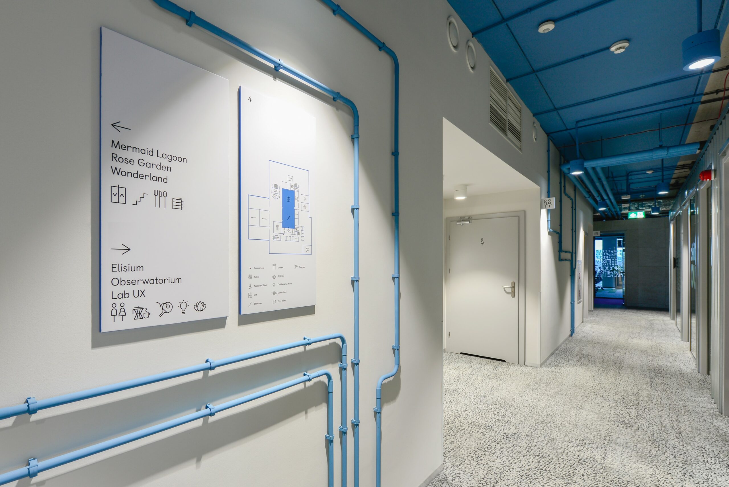
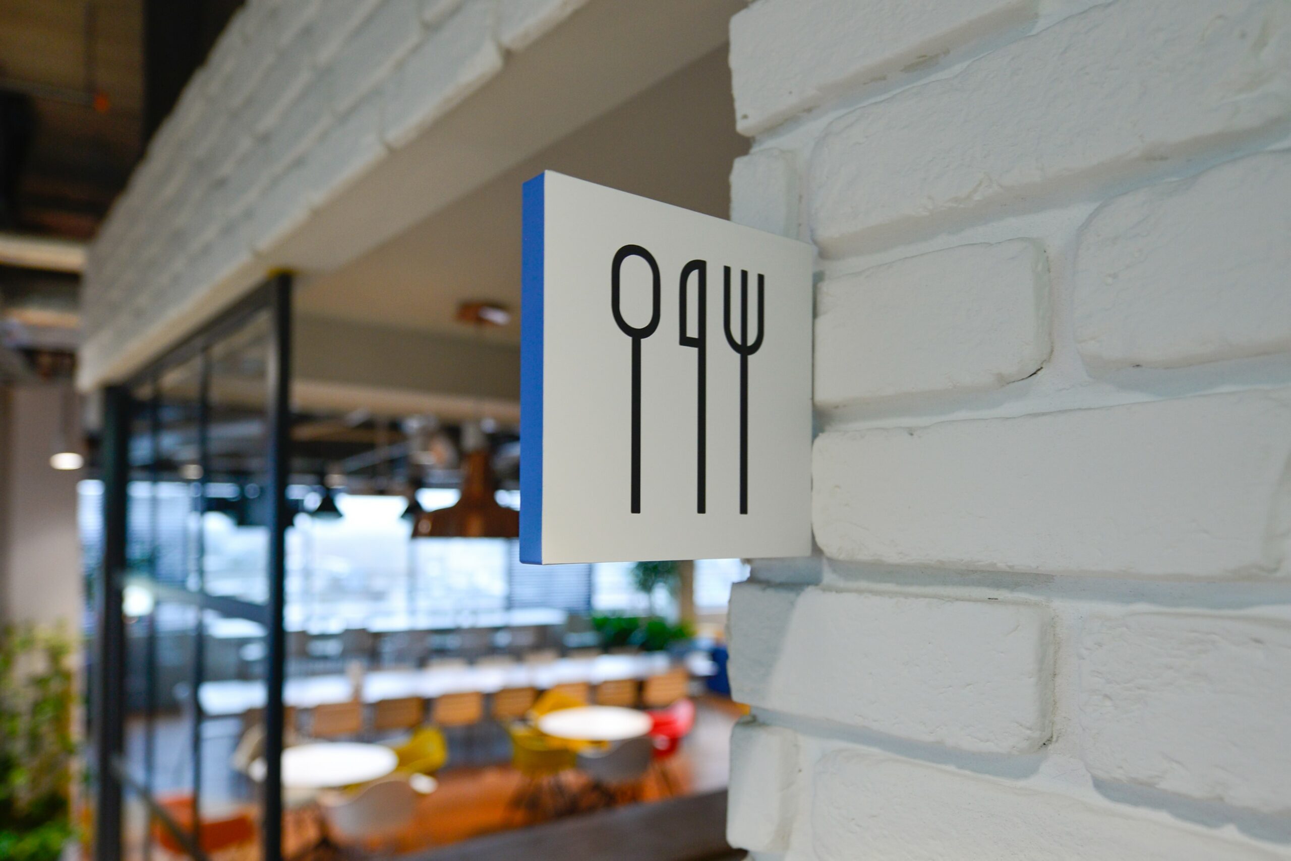
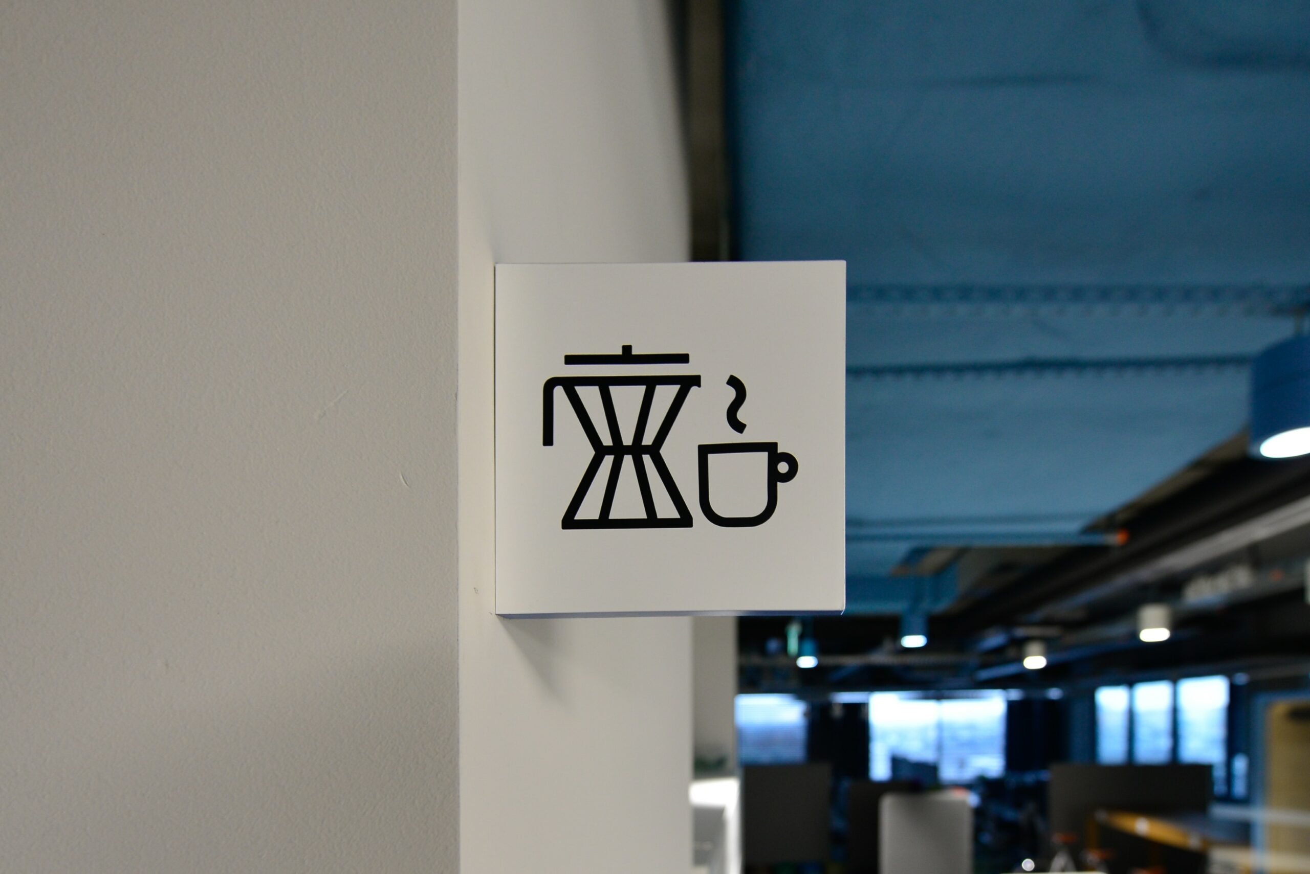
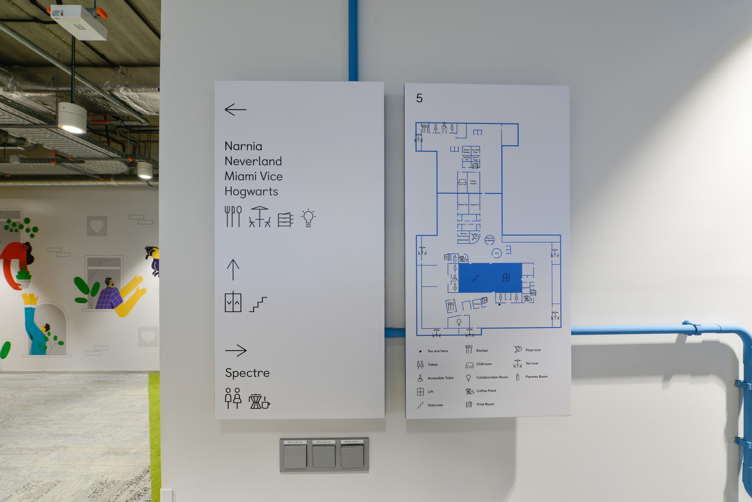
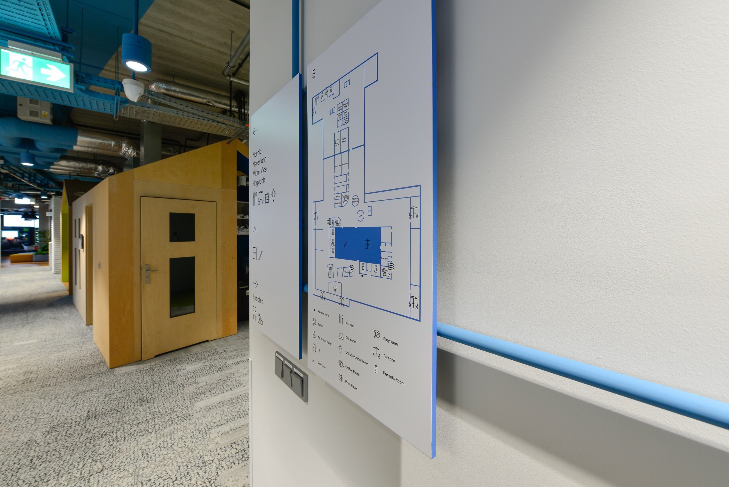
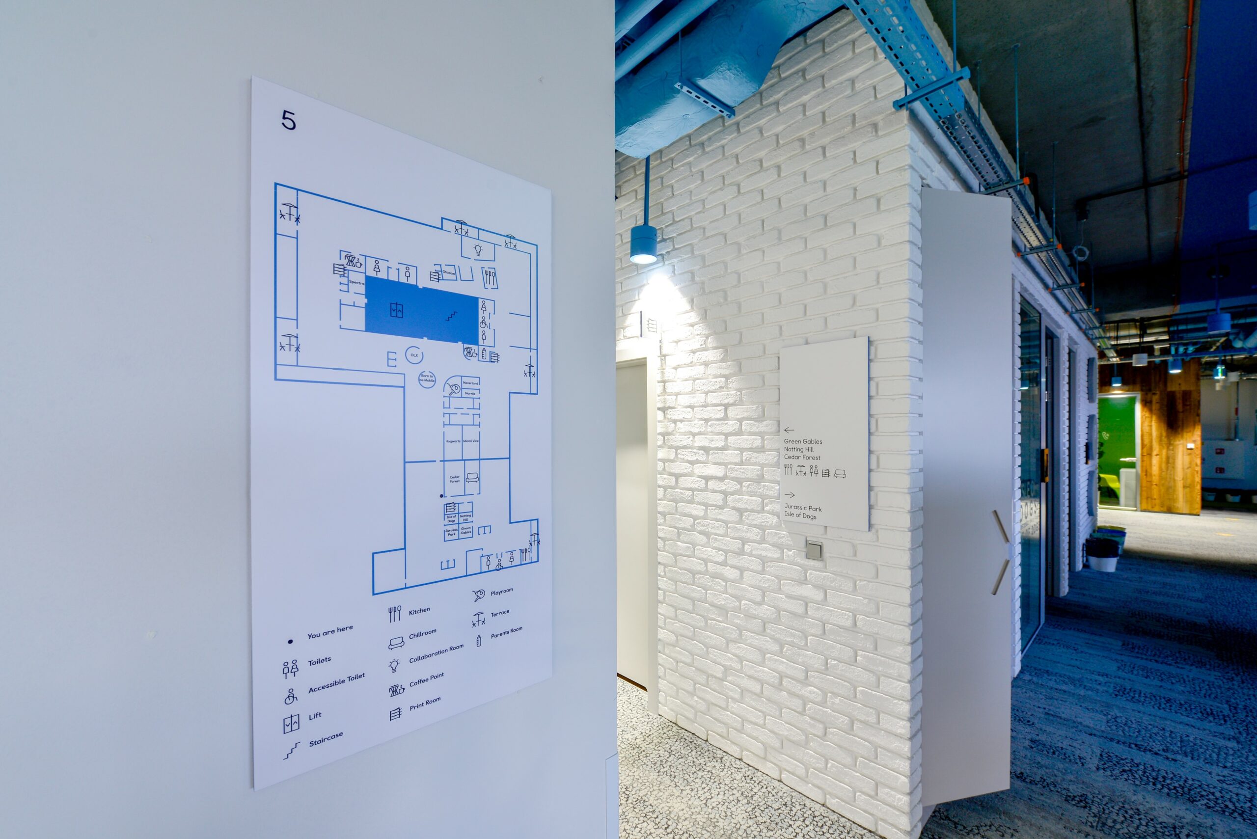
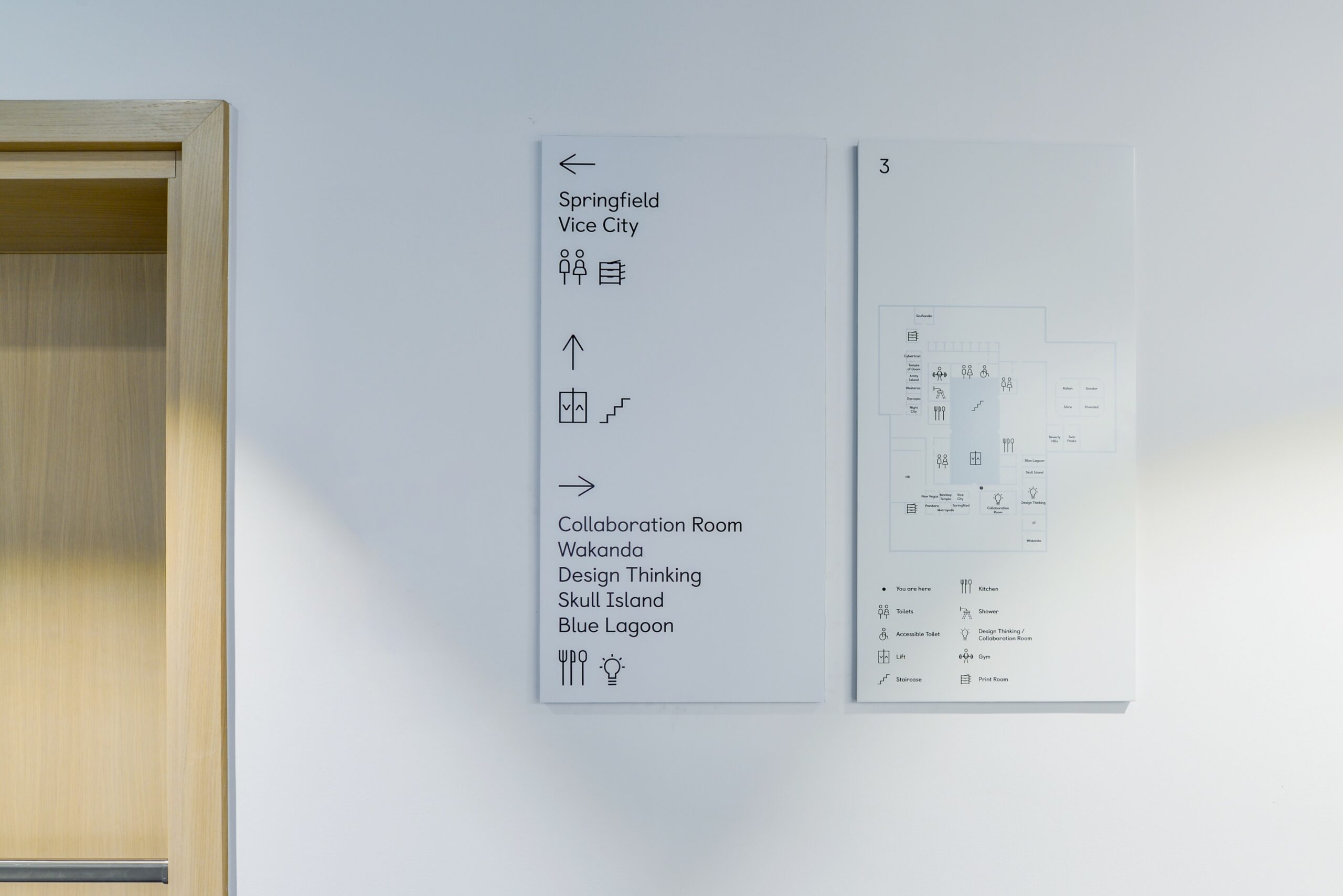
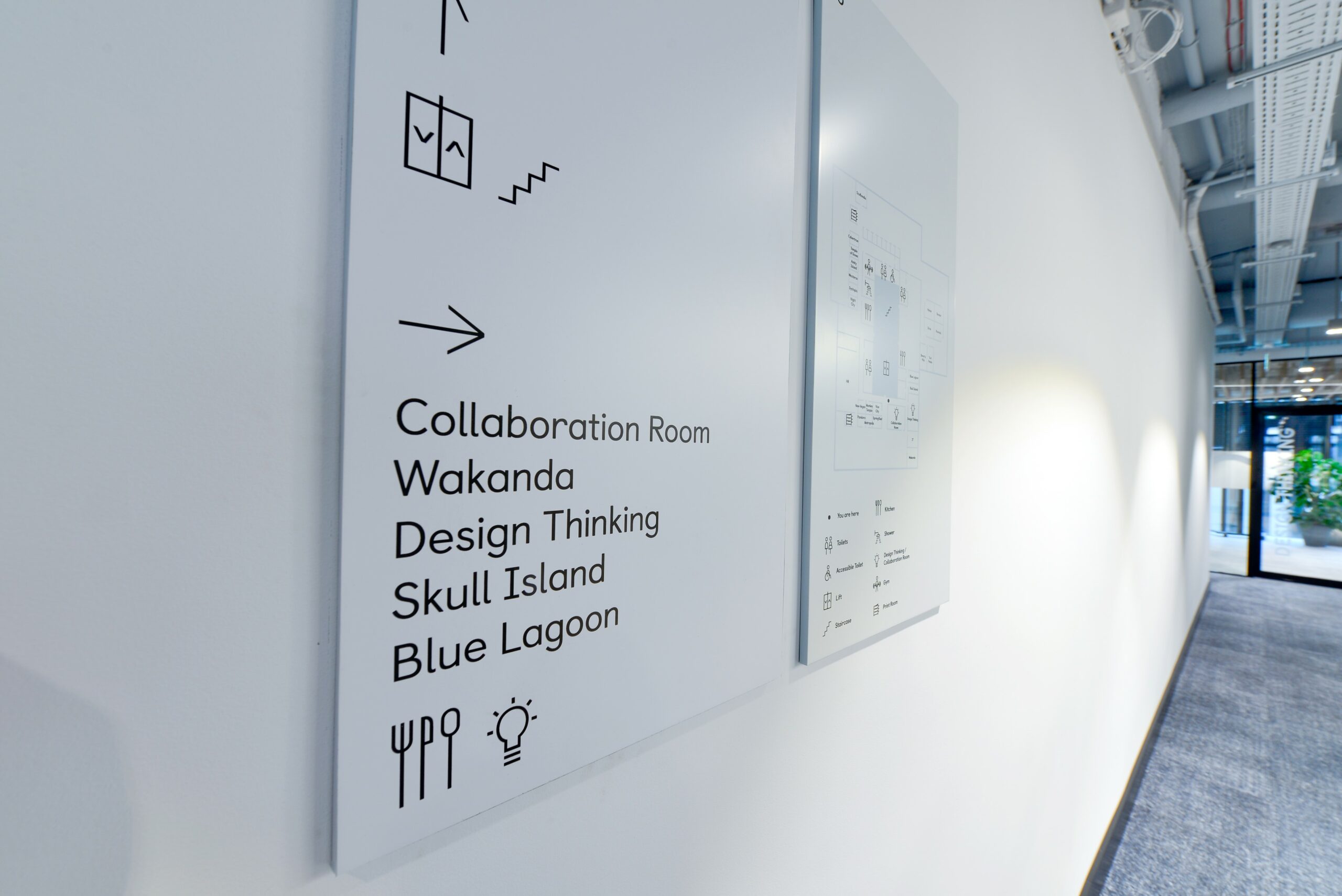
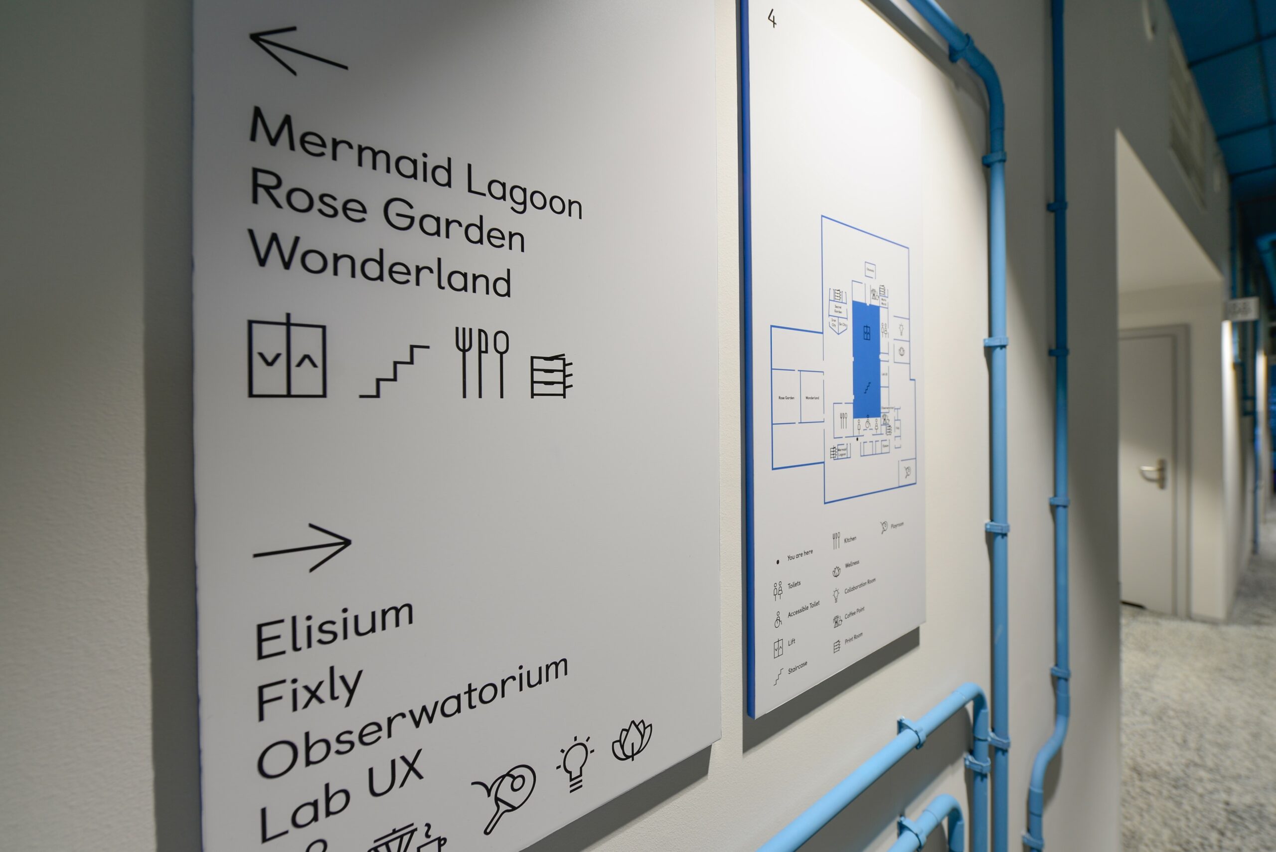
Users are helped in navigating the office space by a signage system we developed. It includes directional signs and maps at decision points and semaphores at function rooms, for which we created a set of proprietary pictograms.
Wayfinding in color refers to the shades of the ceilings. Therefore, the edges of the boards and the selected content are in the given hue. Icons were designed to be consistent with the character of the Castledown font from the brandbook. The whole system fits unobtrusively into an office space rich in color and graphics.

