Tasty Wayfinding
Wroclaw
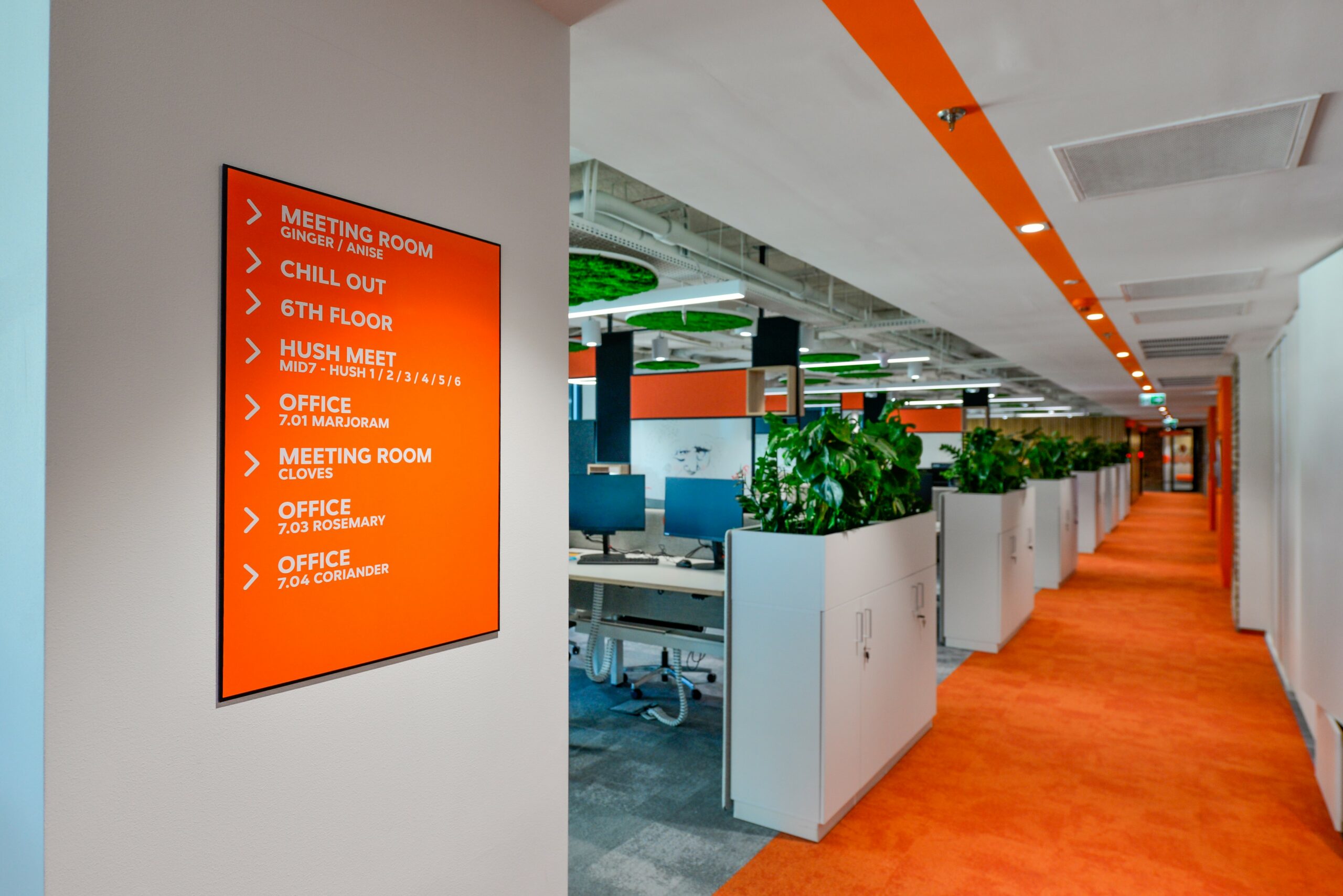
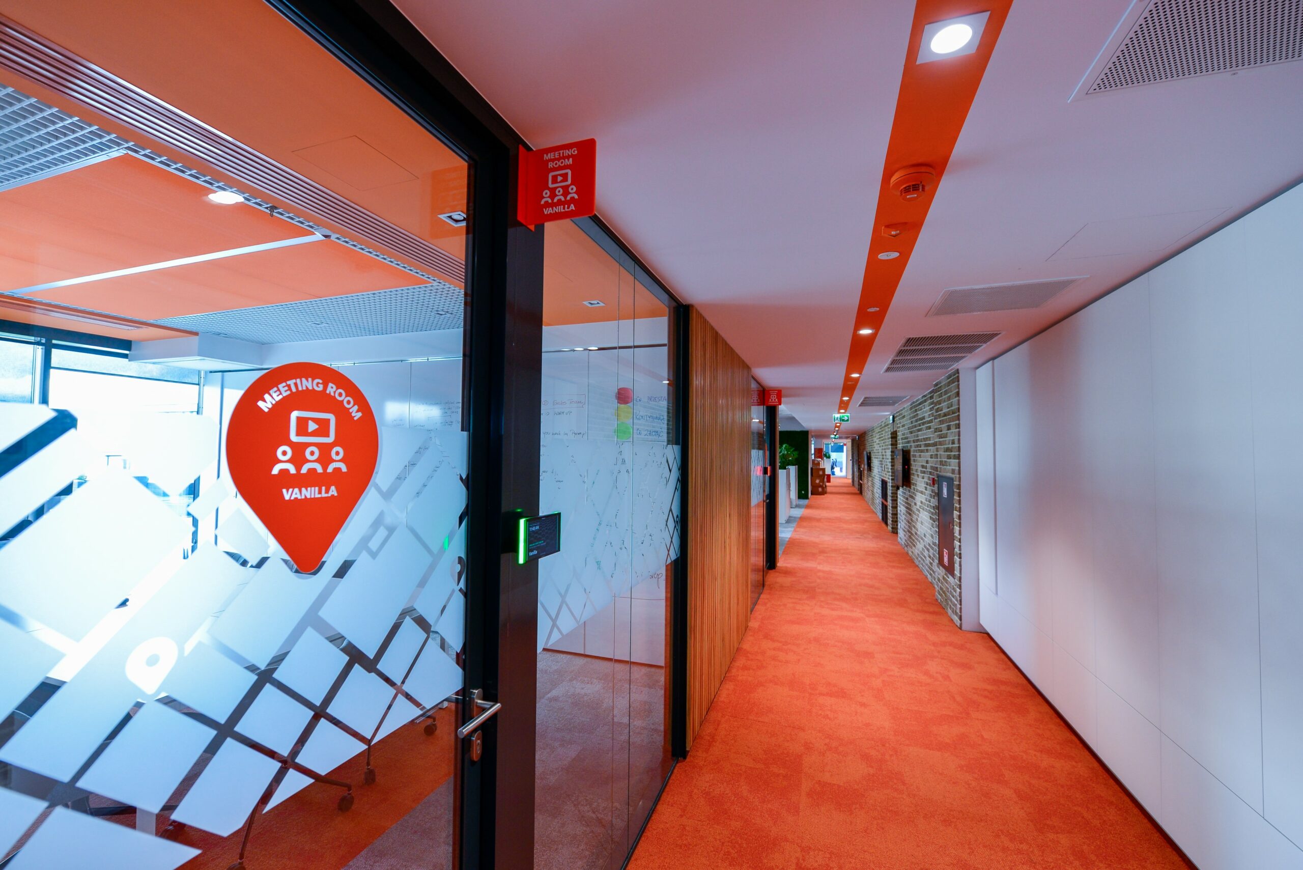
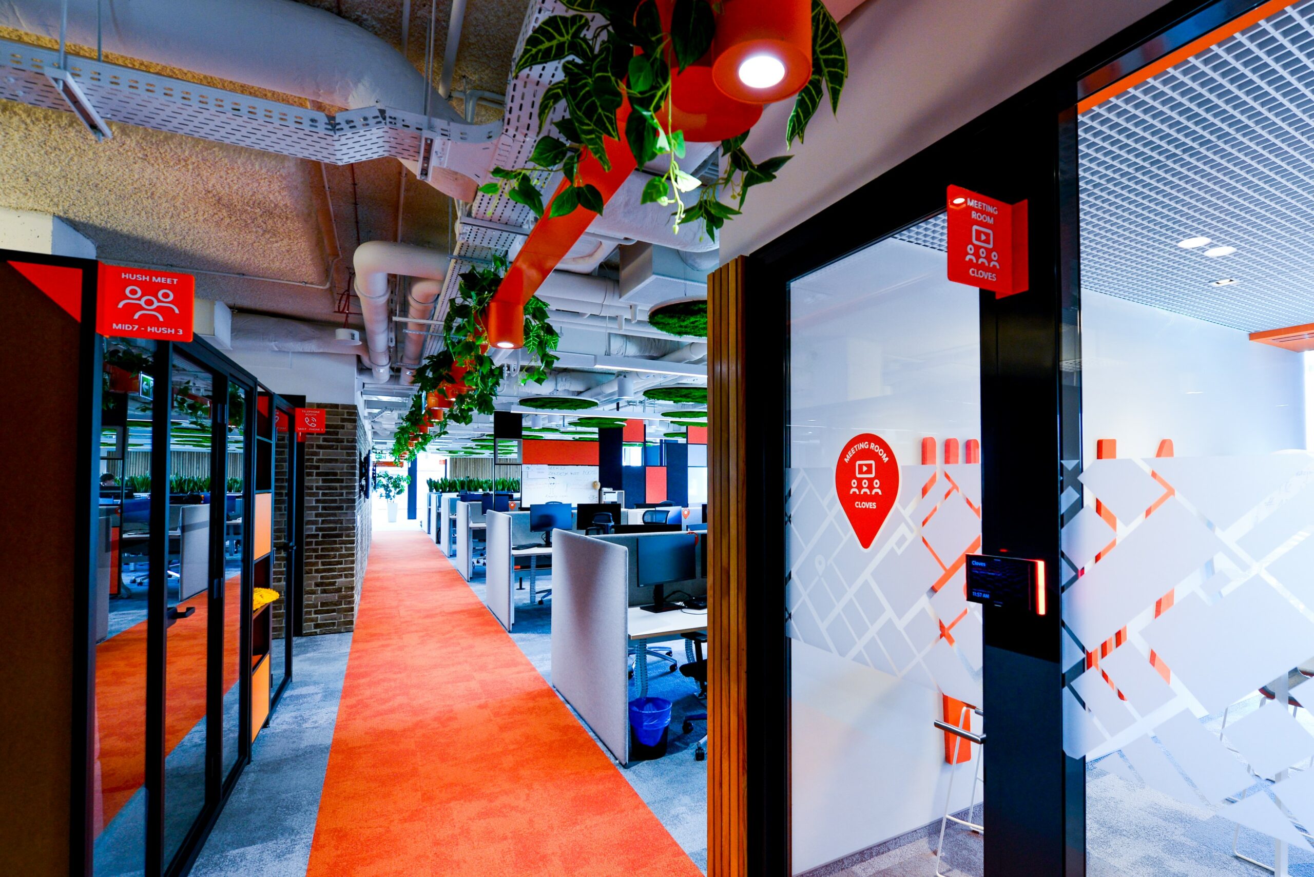
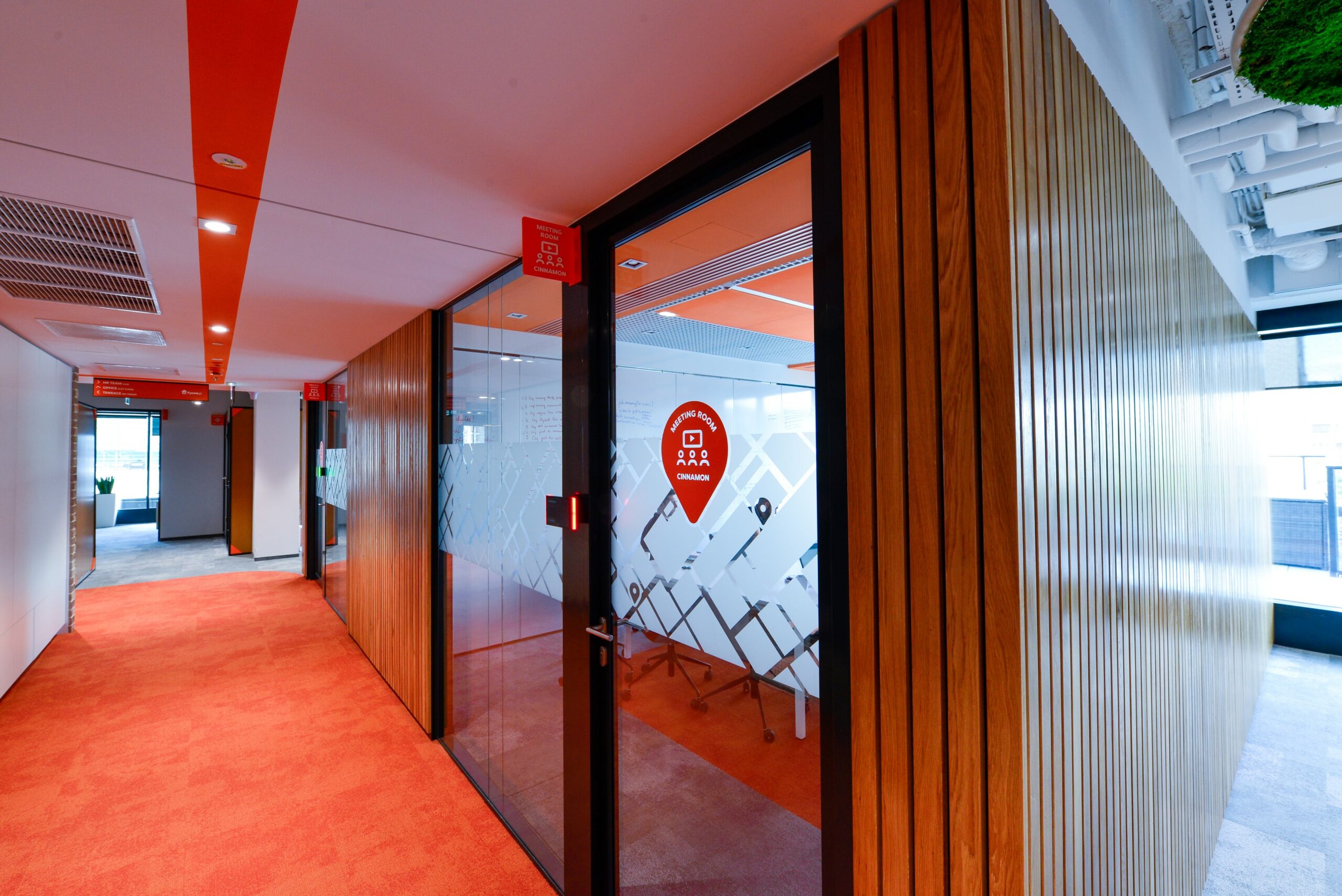
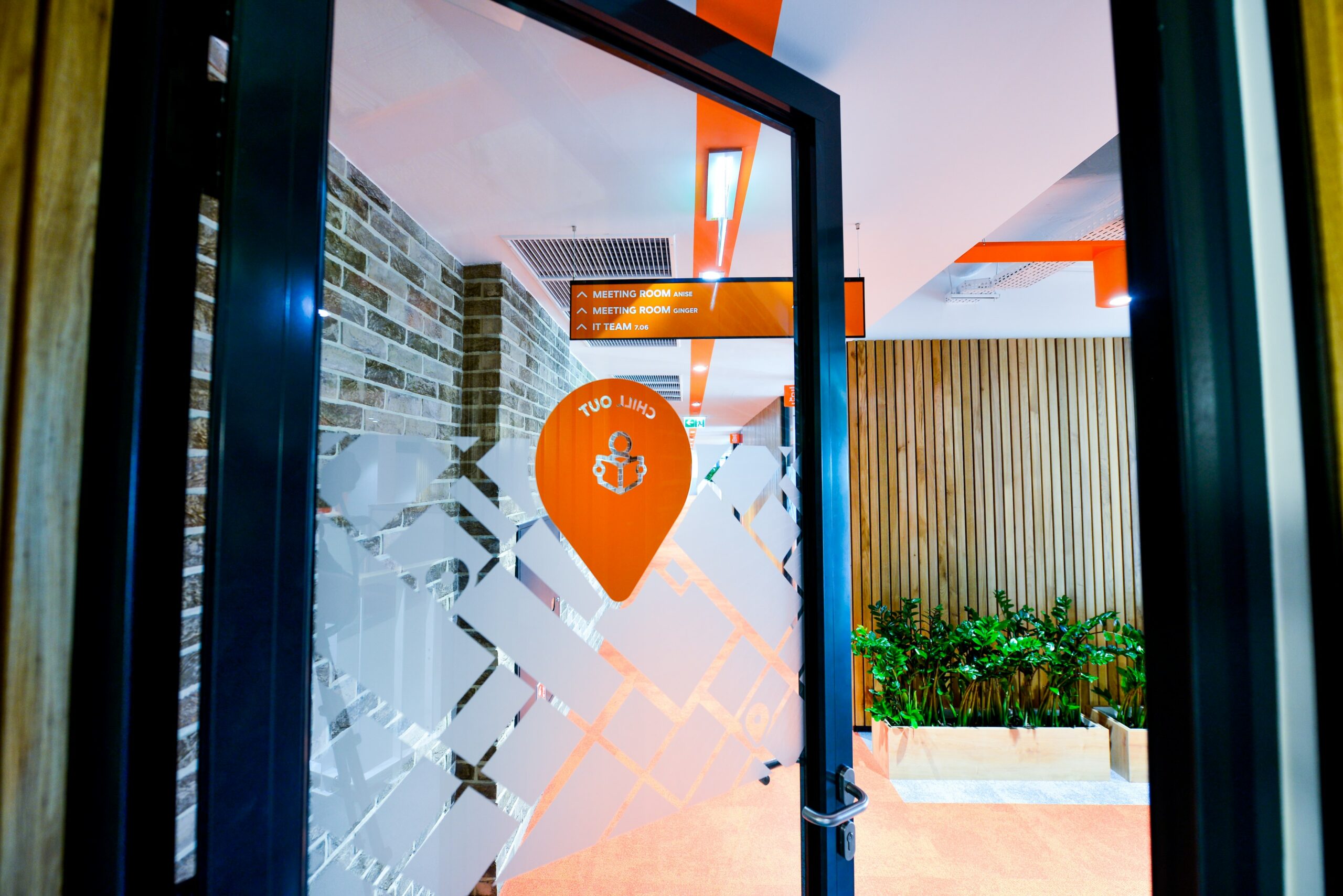
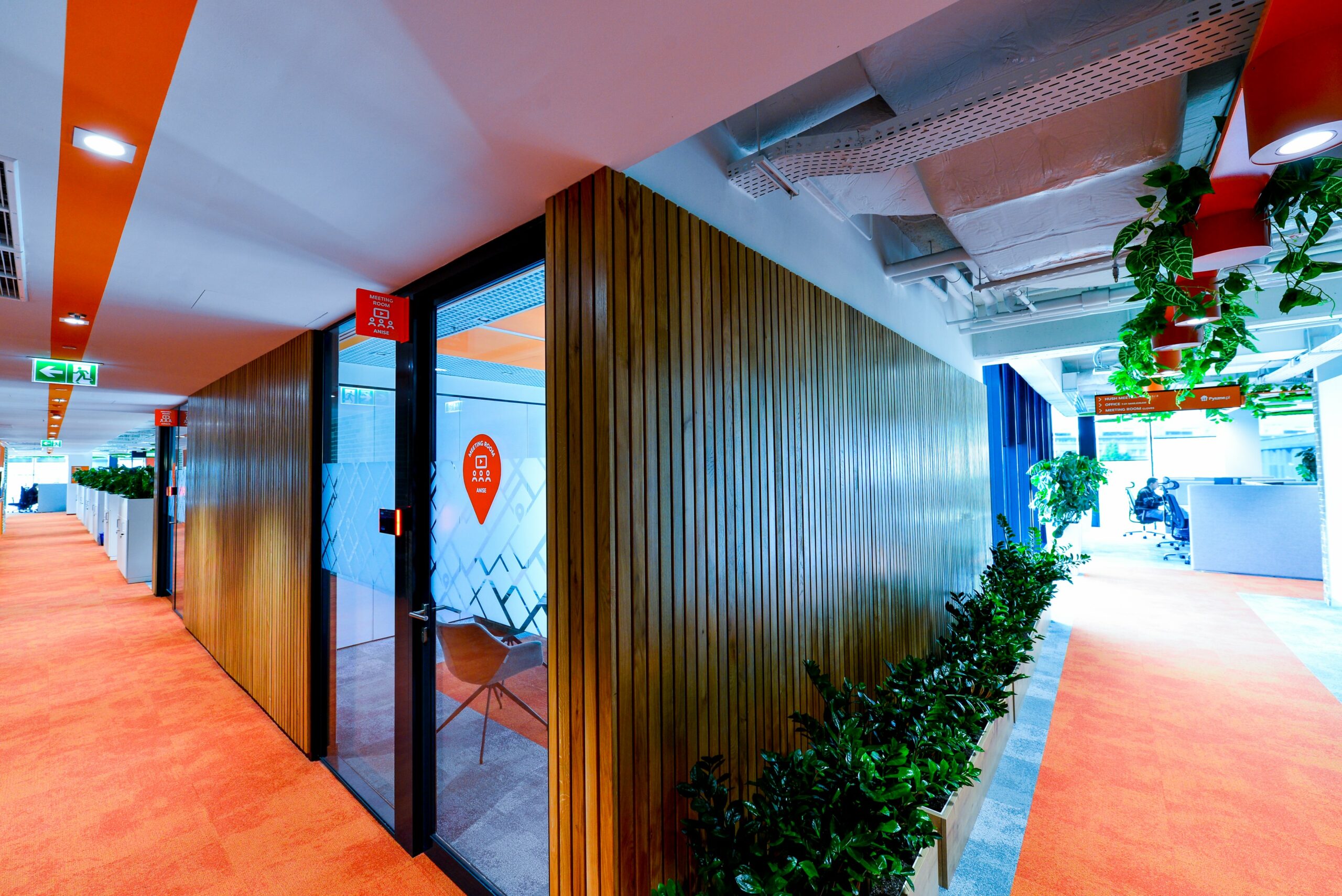
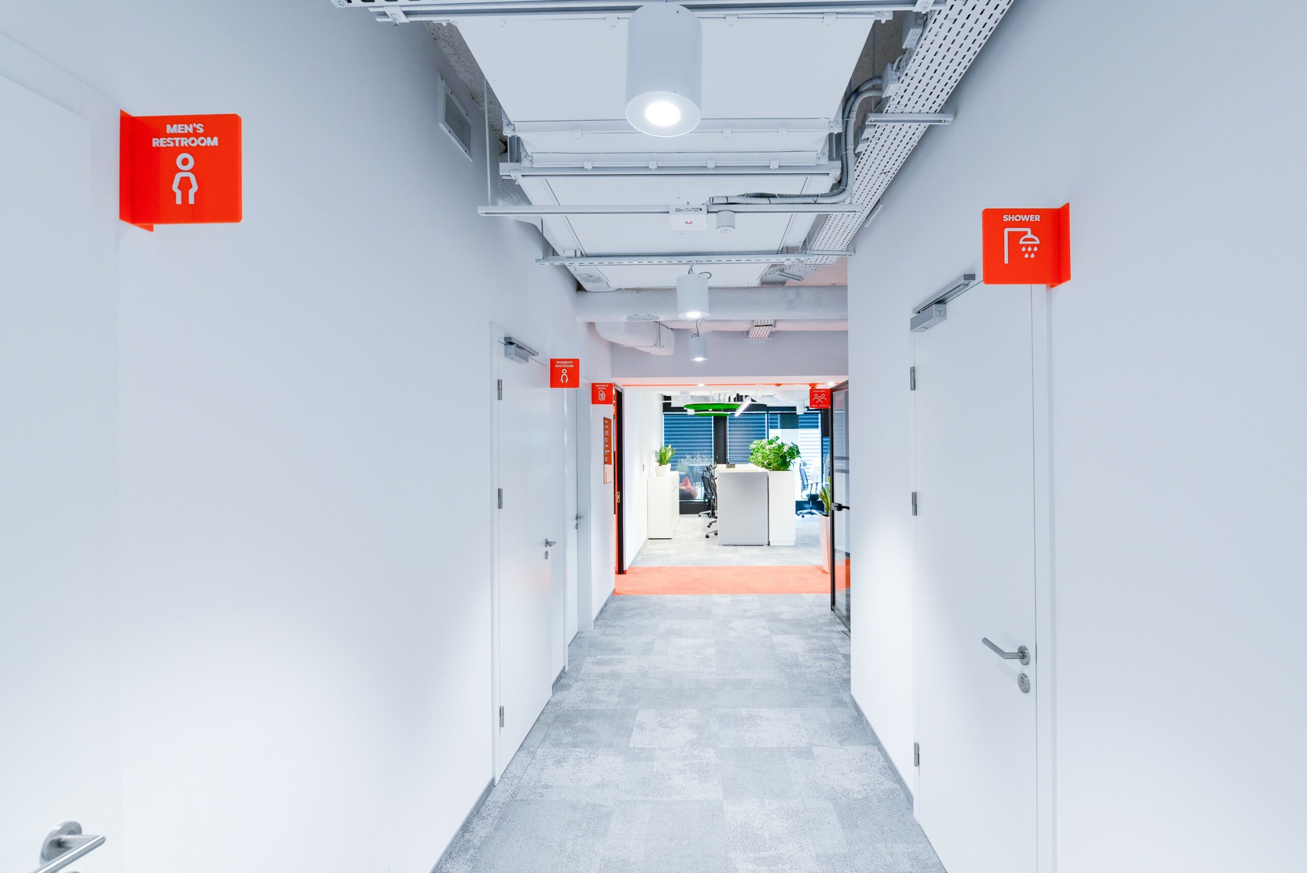
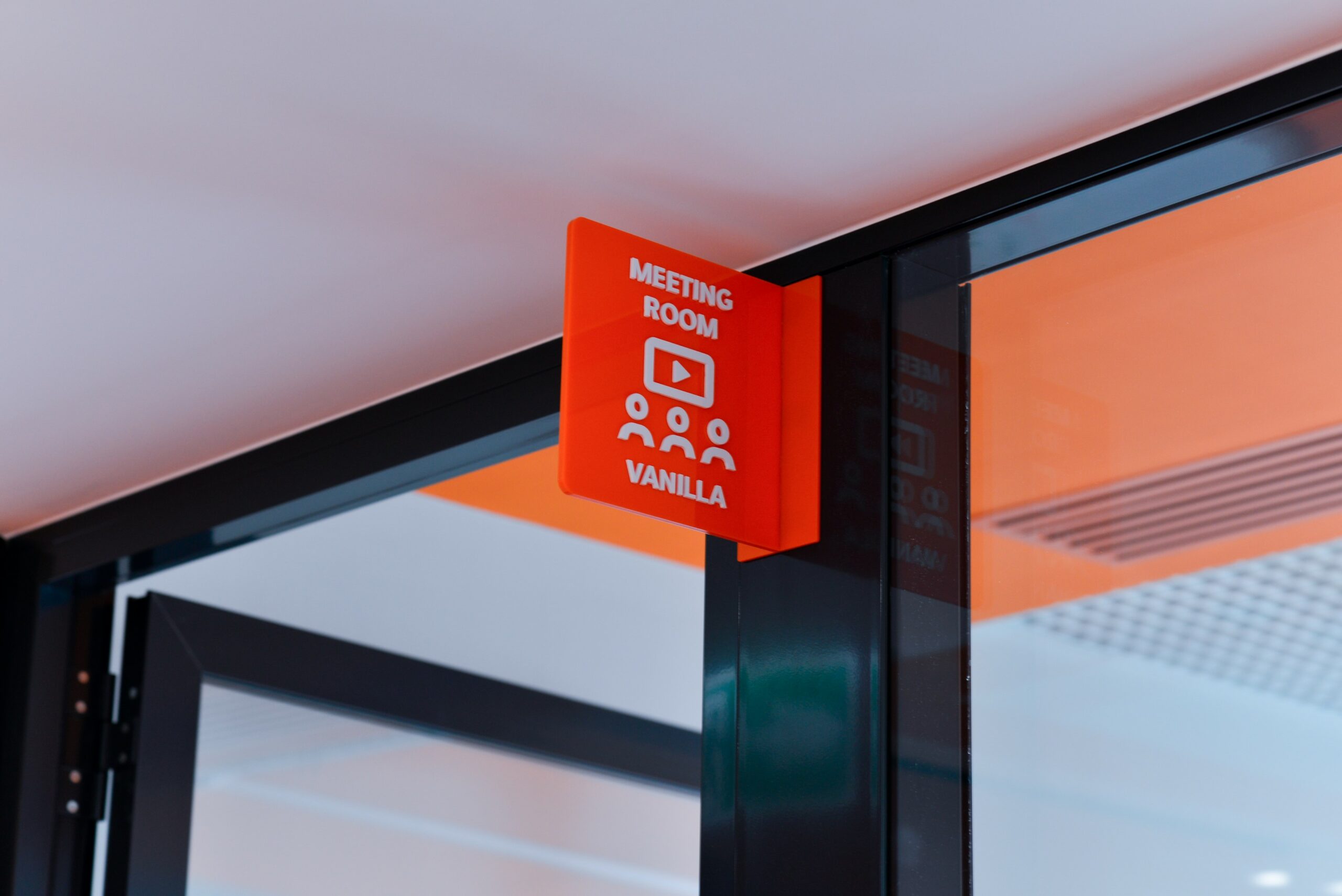
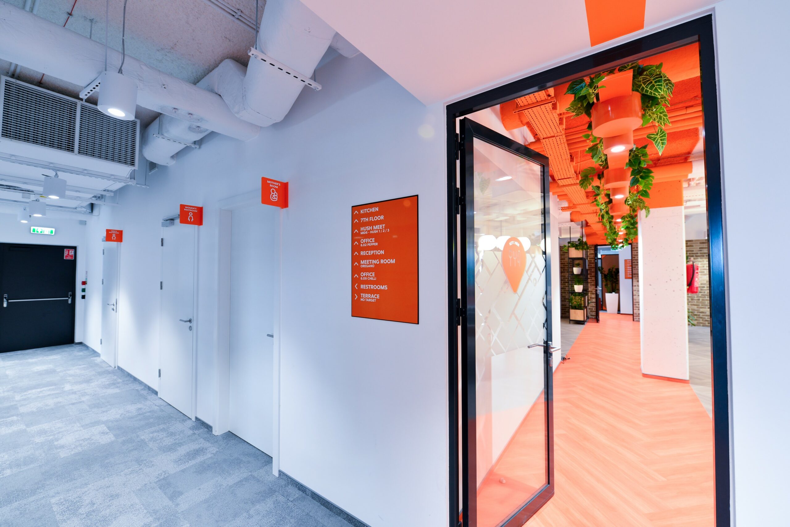
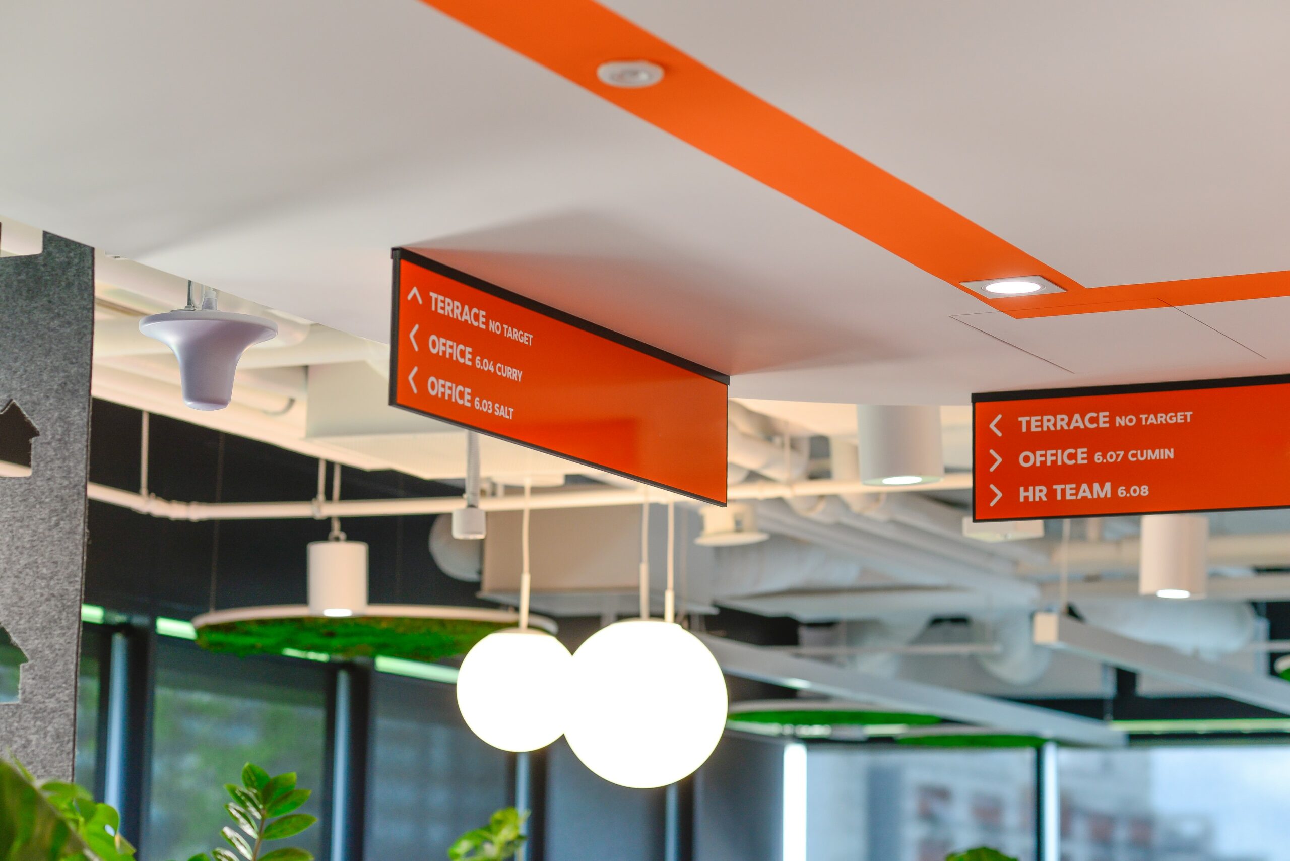
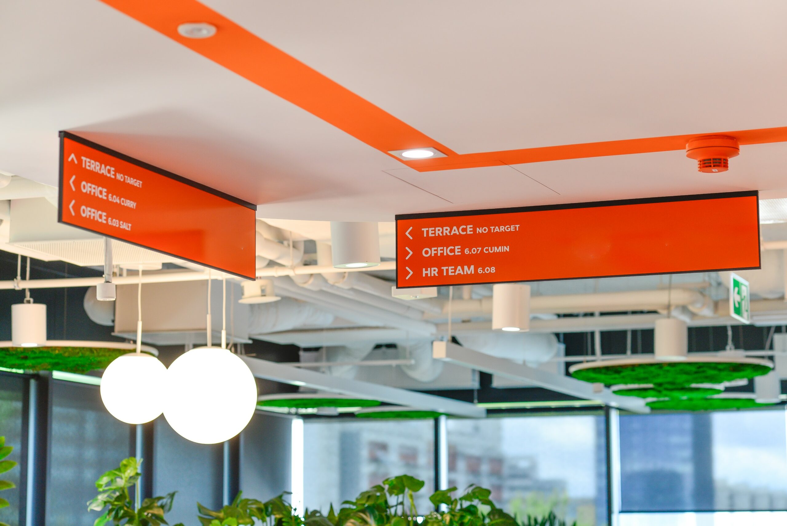
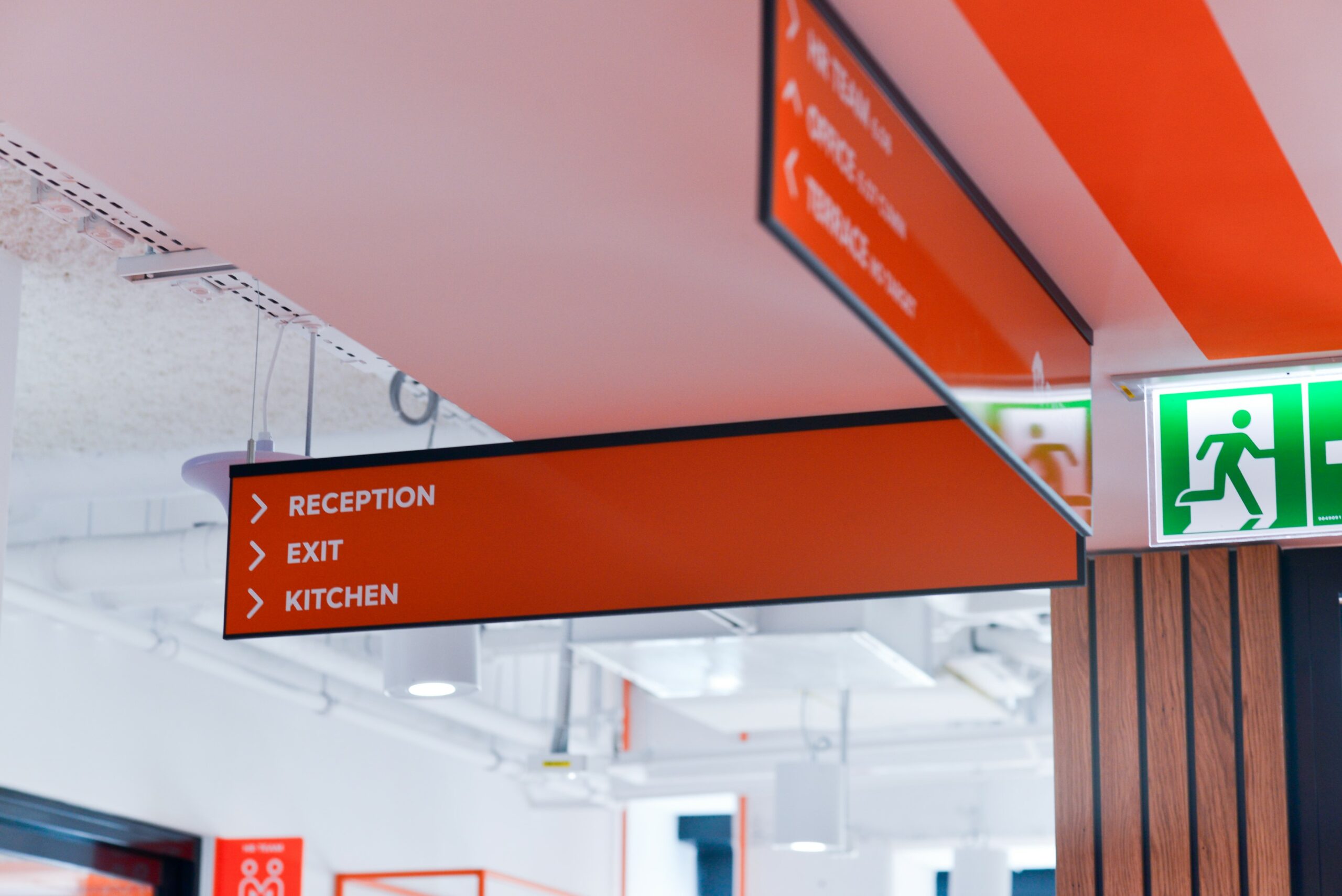
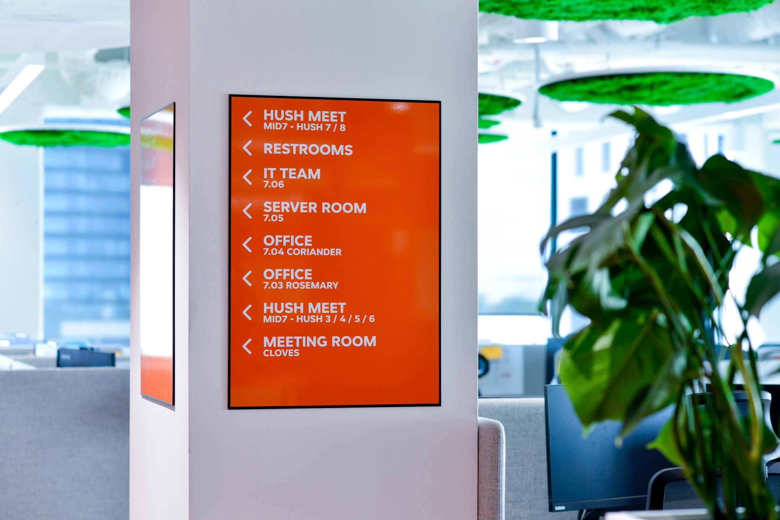
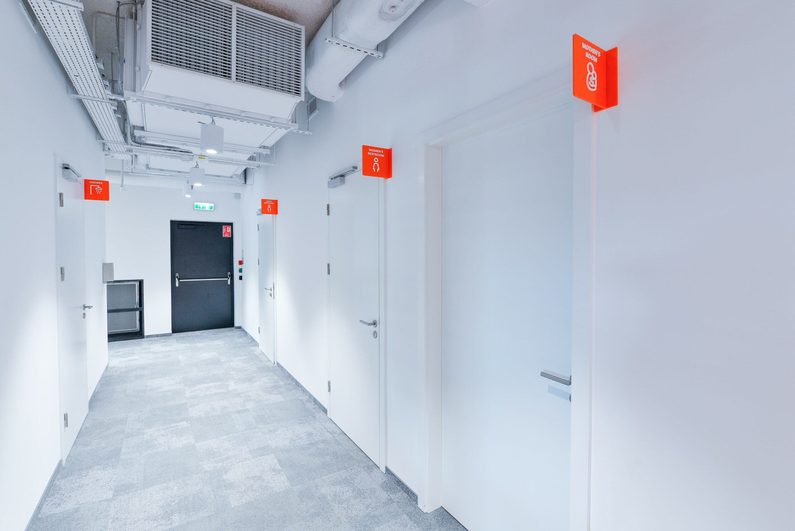
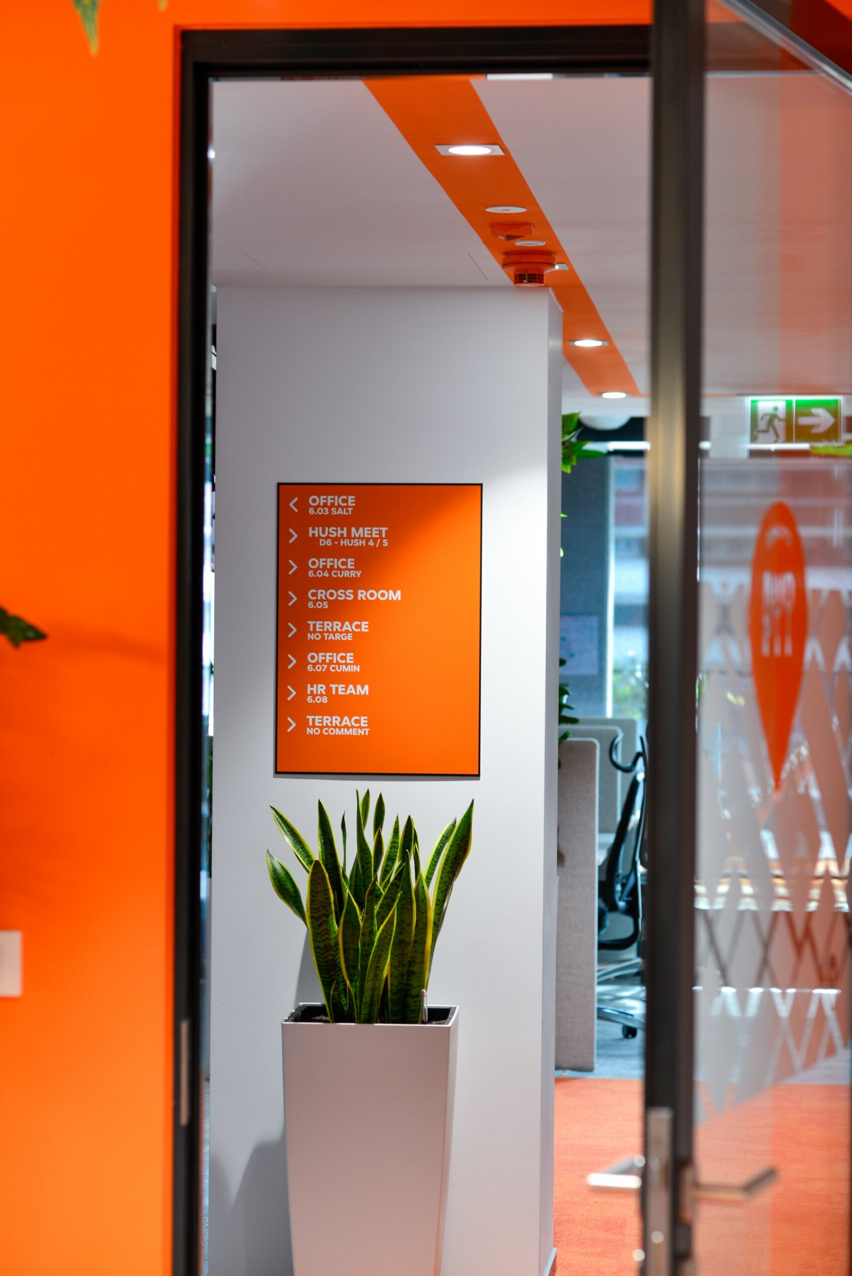
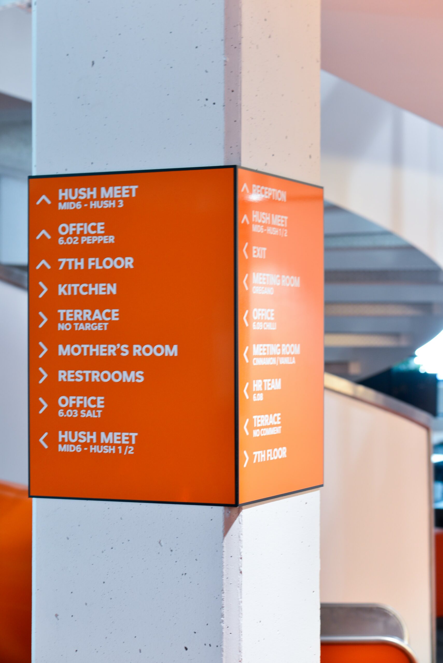
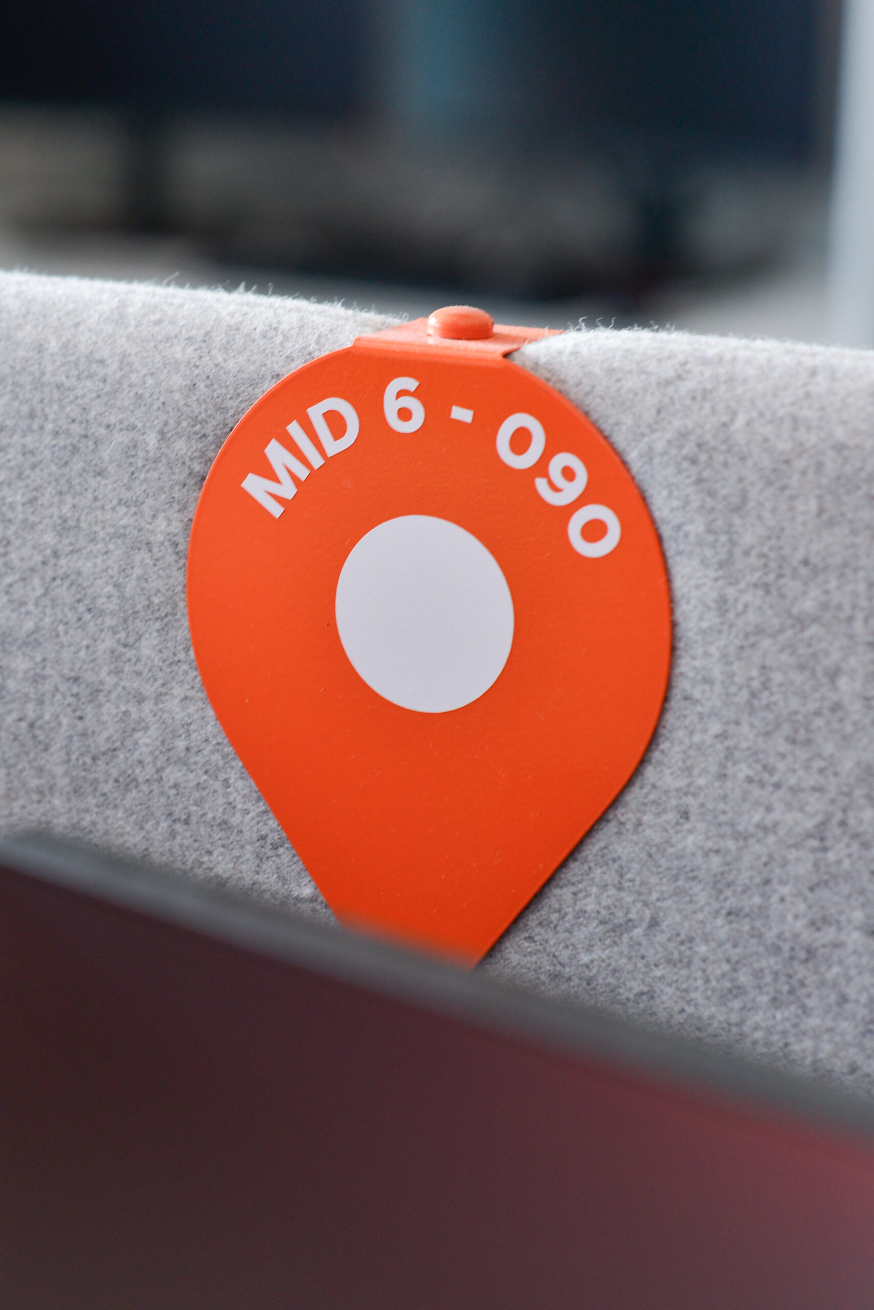
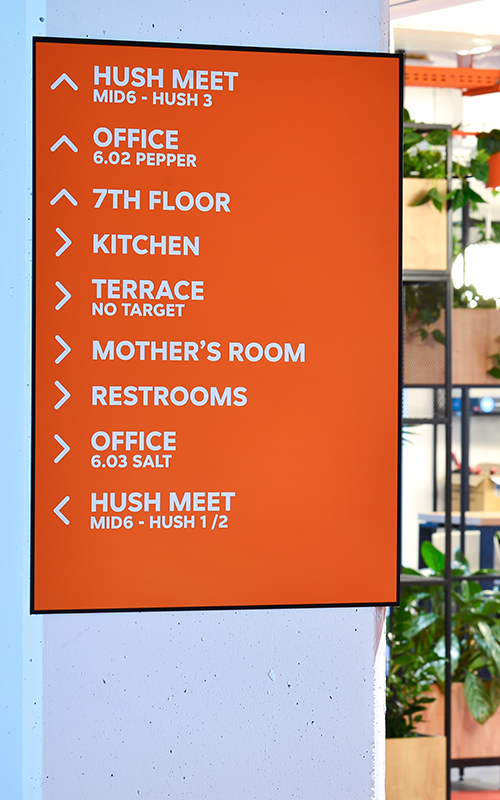
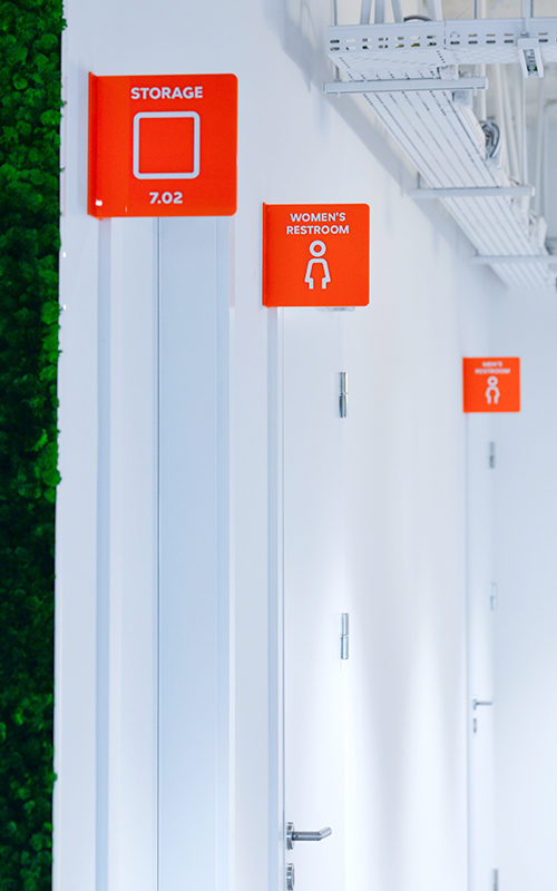
In this project we used intense colors, juicy like Sicilian oranges. Of course, these were not randomly chosen colors, but a color scheme modeled on the client’s brandbook. We juxtaposed the shade of orange with classic white, and used this combination in the room signage designs. Authorial icons and creative names referring to the industry in which the company operates worked perfectly.
We also designed and executed the foiling of the glazing and doors, again opting here for industry associations. And so maps were created on the glass surfaces, with orange pins in the delivery areas – do you already know what the company is? 😉
Wall-mounted and suspended directional signs completed the whole concept. After all, we couldn’t allow anyone to get lost in this space, full of conspicuous markings. The final element of the system was the desk markings.

